Happy freezing Thursday! Can someone hire me to design their home in Barbados, stat?
If you follow me on Instagram, you may have already seen these photos I shared. I worked with these clients (a couple with two young boys) last year to decorate/update their living room, family room and kitchen. Today, I’m sharing the living room/dining room. It’s one long, narrow room that you see as soon as you enter the home and is typical of the homes in my neighbourhood.
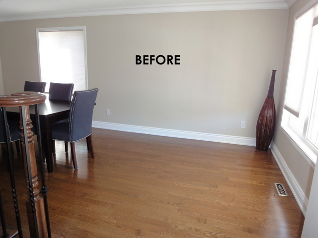
But first let’s look at the Before.
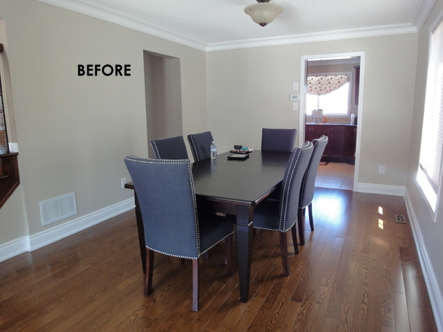
Pretty much a clean slate except for the dining table and chairs that they recently bought so they were staying. The room basically sat empty for nine years. I see this all the time. Clients are unsure what to do so they live with an empty or half finished room. This is one of the benefits of hiring a designer – they can get you “unstuck” so that you will have a space that you will use and love.
I thought that the two rows of nail heads on the chairs were a bit too much of a good thing, so my client painstakingly removed one row and they look much better. (I think she will eventually end up selling them as she realized they were the wrong scale for the small room.) We were going with a vibe that was not so “blingy” and more in keeping with the house and their lifestyle.
They had two leaves in the table so I suggested that they remove the leaves as they only had large gatherings infrequently. This way we could orient the table in the other direction and create an actual living room in the space.
This is how the wall to the left of the opening to the kitchen looks now:
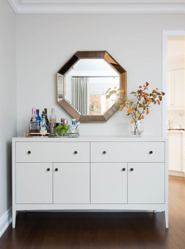
Notice how we changed the yellowish paint on the wall to something more fresh and clean – a light grey (Benjamin Moore Balboa Mist.) This alone drastically changed the feel of the house and this colour has been my go-to lately (which if other clients are reading this, they will know what I mean. 
They needed more storage for dishware etc so I sourced this buffet and had it painted a shade slightly darker than the wall colour (Benjamin Moore Collingwood.) I love its clean lines and it fits perfectly on the wall. The bronze knobs are more stunning in person but again are simple in design. (If you scroll from the Before photo above to this one you can get a sneak peek of what we did in the kitchen. Quite a transformation.)
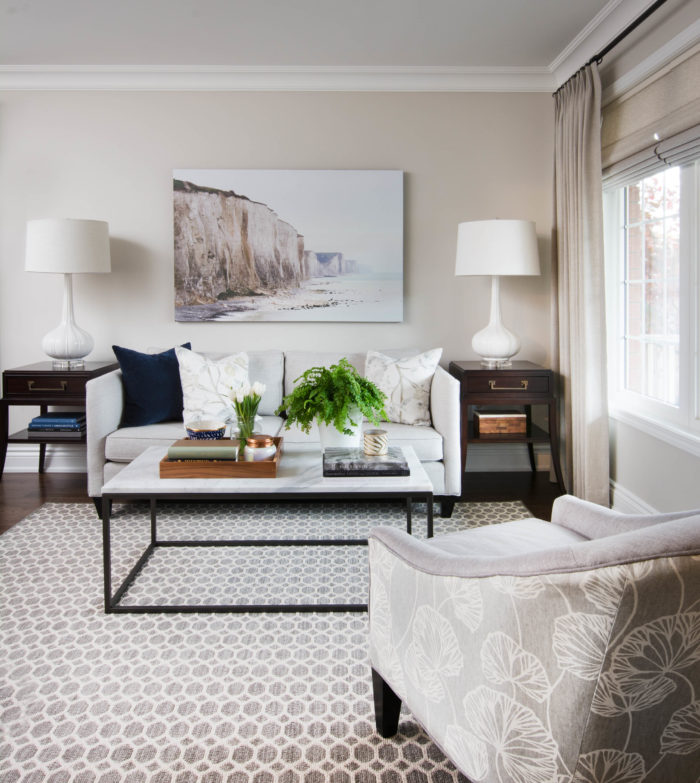
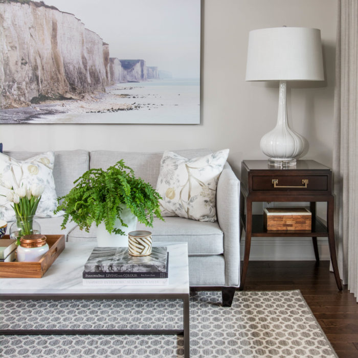
And this is their new living room. We took our cues from the serene colours in the art which is a photograph on canvas from Anewall. We only placed one chair (with a pattern on the back) in the room as it is a very tight space and we needed a walkway from the front hall to the dining room. We added roman shades and layered them with linen drapes. The coffee table is one of my faves and it is from West Elm. It is the perfect size for a small space and I love the simple metal base paired with the marble top.
We needed some pattern underfoot and this broadloom we had bound is an economical but impactful solution. It has become my go-to area rug of late as it comes in a few different patterns and many colours. Update: For those that have asked below, it was sourced from a local supplier and it is broadloom that I had cut to size.
Photography: Stephani Buchman
I love having clients spaces photographed because that means we are accessorizing and styling – getting everything camera ready. Oftentimes, I am called in by clients to select just the furniture ensuring the scale is perfect but then we don’t take it to the next level which includes the area rug, the draperies, lighting, accessories etc. This space would have been fairly nondescript and neutral if we hadn’t layered it with pattern and textures in the area rug, the velvet pillow, linen drapes, wood, marble and the greenery.
Almost 5 years ago, I interviewed Margot Austin, Senior Design Editor at House and Home magazine and I never forgot what she so eloquently said:
“I think many people don’t decorate at all, they merely furnish. To decorate – even for a modernist or minimalist – you need a plan (the furniture is only one part of that plan). To decorate is to create a whole environment – the walls, the floor, the ceiling, the art, the accessories, the windows etc etc etc. I compare it to eating a meal: Meal A is steak frites, Meal B is a 5-course bistro meal with aperitif, appetizer, entrée, cheese course etc etc. Both satisfy your body’s need for fuel (and can cost the same amount) but the 5-course meal is a complete and complex experience. Most people opt for the Meal A of interiors. It’s a missed opportunity.”
I love how this room turned out but most importantly, so do the clients. In one of her recent emails she said “The pictures look awesome, can’t believe it’s my house.” Yes it is your house and I’m so glad you love it!
We took a blank space and created this layered, comfortable yet elegant living room. I will be sharing the family room and kitchen which I worked on as well in the coming week.




Arlene
January 8, 2015What a beautiful transformation, Vanessa. You make it look so easy. But for many people they just don’t know where to start, especially with all the choices today. I can see why your clients were thrilled. Enjoyed reading your post too!
Vanessa
January 8, 2015Thanks beautiful sister and thank you for all of your support and kind words all the time! Love you lots!
Lisa Goulet
January 8, 2015It is just beautiful Vanessa. And I love what Margot said as well, it decorating is so different from furnishing. Those finishing touches make your room sing!
Vanessa
January 8, 2015Ah, thank you Lisa! Yes, furnishing requires certain skills but decorating can make a room sing as you said. Love that you always take time to comment here. xo
Pam
January 8, 2015Vanessa, I love what you did with this space, you are such a talent!! It’s all really, really good! You didn’t mention the lamps or the end tables, but I love the clean lines of the tables combined with the curvy but simple statement lamps. Your clients must be over the moon. Great job!!
Vanessa
January 8, 2015I love you Pam! You always have such nice words to share. xo
Lisa @ Wicked & Weird
January 8, 2015Awesome awesome quote from Margot – it is so very true and such a clear way of putting it! I just love that buffet vignette, amazing mirror above. You get better with every post!!
Vanessa
January 8, 2015Yes, that quote is one of my favourites! I’m hoping Margot will let me interview her again so she can share more words of wisdom. Yes, I do feel I am getting better with every project. Thanks so much Lisa!! xo
Dagmara @ GlamistaHome
January 8, 2015What a great make-over. The two rooms look so much more cozy and functional. A really welcoming space. I like what you did with the white cabinet to the side of the kitchen and how you’ve decorated the coffee table. Love the color palette. Thank you for sharing!
Jordana @WhiteCabana
January 9, 2015Wonderful transformation, Vanessa! The buffet in the dining room looks to be just the perfect size, and I’m sure it’s put to very good use!
carol Jane
January 9, 2015Beautiful room. Wish I had your talent. Love the soft paint colors. Stay warm!
Michaela
January 9, 2015Beautiful transformation!
Michelle @ AM Dolce Vita
January 9, 2015It’s perfect, Vanessa! You are a genius!
Vanessa
January 11, 2015Genius? Not quite, but thanks Michelle.
kristen
January 9, 2015Pretty cocktail table…where is it from? The room looks lovely!
Grace @ sense and simplicity
January 9, 2015The living room is beautiful and simple and livable – all the things it should be. Well done!
Carey
January 10, 2015What is the source for the coffee table? I LOVE it!!
Anne
January 10, 2015Love the rug!! Can you share where you purchased it?
Emily
January 10, 2015Can you tell us where you got the rug?
Margaret
January 10, 2015What a lovely room. Would you please share the source for the rug?
Vanessa
January 10, 2015Thanks for all your comments! I have updated the post to include the source of the coffee table – West Elm. The area rug is actually broadloom that I had cut to size from a local supplier. So check your local carpet stores for something similar.
Michelle @ Eamonn & Jack
January 12, 2015What a stunning room Vanessa! I’m drooling over every bit of it – well done!
Lindsey
January 14, 2015This room reveal is simple and beautiful!
I’m also very interested in the rug. I know you said it’s a bound broadloom carpet, but after searching for something even similar at my local store, I can’t find a carpet like it. Could you share the Manufacturer? I know the names of the same carpet pattern vary from store to store, but the manufacturer will help greatly.
We have a 9’x12′ concrete slab in our living room, and the hardwood around it, and I need a big rug to cover this. Finding something interesting has proved to be difficult for years now!
Thank you in advance. Your work is beautiful!
Lindsey
January 15, 2015Nevermind… I found it
lauren sessa
November 15, 2016CAn you share the source of the living room buffet?
Kristen
March 27, 2017Beautiful! I’m a new follower- I pinned your bedroom dresser vignette a while back and that is exactly how I want to decorate my new bedroom dresser so I am recreating it in my own home! I have a question about this room- may I ask why you decided to put a full rod and drawing drapes instead of 2 stationary panels with the roman shades? I am learning about all the different ways and am just curious what your thought process was… love learning from others. Thank you!