Hi there! Happy Wednesday and welcome to the second week of the One Room Challenge! If you missed it, you can read last week’s post here where you can find out what this ORC business is all about and see the Before photos of the bathroom I am working on.
 I couldn’t wait until today to share some of the design decisions made re my daughter’s bathroom makeover. So, I did show this sneak peek on Instagram which shows the overall design direction:
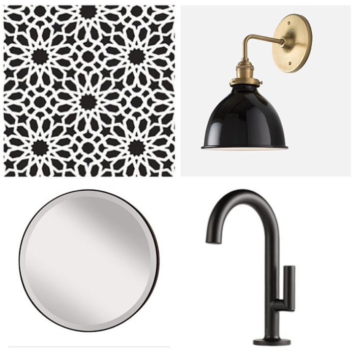
1) The wallpaper is Schumacher’s Agadir Screen in Noir from Decorator’s Best, one of the ORC sponsors. If you scroll back on my Instagram feed about 93 weeks (you have nothing else to do, right? 🙂 ), you would see that I shared my love of this wallpaper when it first came out. It took almost two years but I am finally using it in my own home. I actually had chosen another more subdued patterned wallpaper but when it arrived, I (and my daughter/client especially) just wasn’t in love with it. So we went in a completely different direction and we are both happy about that. You really can’t go wrong with a black + white bathroom – see my bathroom pins which are mostly of black + white bathrooms or all white bathrooms.
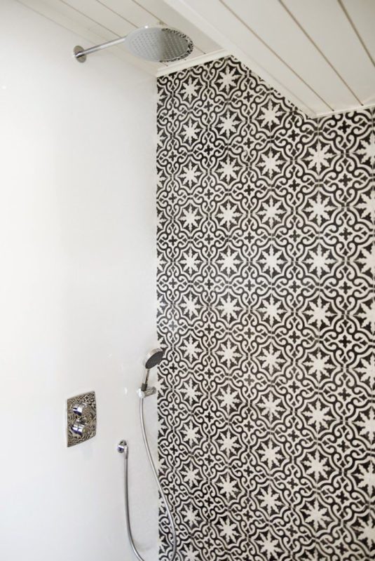
The wallpaper reminds me of Moroccan tile similar to the one in the photo below. But it’s not as big a commitment, i.e. it’s easier to change wallpaper than tile if you tire of it. I’m just installing it on the vanity wall as I think it would be be too much to plaster it on all walls. (I had also thought of applying moulding/trim to the bottom part of the wall and wallpapering above but I know from my powder room, that it’s really difficult to keep clean especially when painted white. Dust and dirt seem to collect on all the nooks and crannies!)
via Pinterest
2) Now what about those sconces? I have loved these for ever! They are these ones. The black and brass is stunning. There will be one on either side of the mirror rather than the one wall sconce above – much better/flattering lighting placement for a bathroom.
3) Love black faucets and this matte one is the Odin from Brizo. I think my daughter is the happiest about this!
4) The mirror is a simple yet substantial round one from Wayfair, another ORC sponsor.
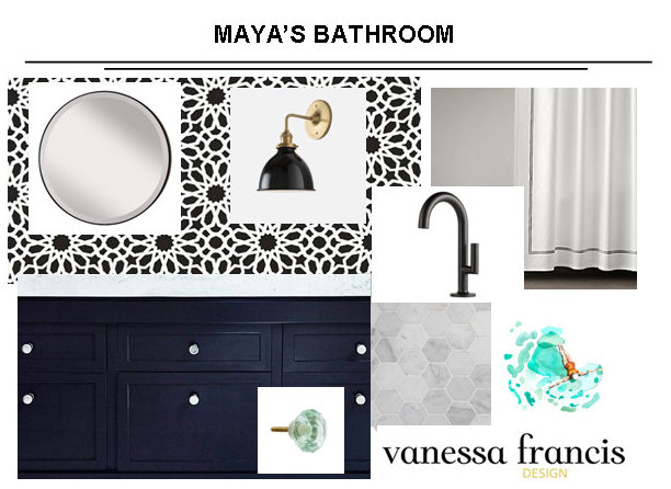
I’m thinking of bringing in another colour like mint just to add some interest. This would be in the art, hardware, shower curtain etc. but this isn’t carved in stone yet – still deciding! Here’s how it’s coming together – on paper anyway!
Other than getting everything ordered and the trades lined up last week, there was no action happening in the bathroom itself. I’m hoping it all comes together in four short weeks. Here’s what needs to be done:
1) old floor tiles removed and new tiles installed (will talk about tile decisions next week.)
2) remove old counter and arrange for quartz counter template and install
3) plumber to install new faucet and new toilet
4) remove large mirror and do drywall repair
5) hang wallpaper and new mirror
6) paint walls
7) have vanity painted and install new hardware
8) electrician to install new sconces
9) hang new shower curtains, hang art, install new towel hooks and style everything pretty
10) photo shoot
Here’s hoping it will all get done on time!
Now go check what these talented ladies (hey Linda, we need some men on board next round!) are up to:
Jana Bek
Autumn Clemons
Coco+Kelley
The English Room
Greige Design
Hi Sugarplum
I Heart Organizing
Jenna Sue Design
Stephanie Kraus
The Pursuit of Style
Julia Ryan
Savvy Home
Simple Details
Simply Grove
6th Street Design
Jill Sorensen
Swoon Worthy
Waiting on Martha
Kimberly Schlegel Whitman
Trademarked by Calling it Home
Don’t forget to also check out what the Linking Participants are up to tomorrow. Did you see that there were a record 154 people that linked up this past week?
Enjoy the rest of the week! It’s going to be a busy one for me – two new clients and then a dance competition on Friday.
Chat soon!


Julia Ryan
April 8, 2015What a fun scheme this is!
sherry hart
April 8, 2015Well…of course black and white is how I roll so I am all in on this one:) Love love the wallpaper!
Kim Macumber
April 8, 2015Love the black and white Moroccan wallpaper … fantastic!
Sabrina @ pink little notebook
April 8, 2015The wallpaper is just absolutely stunning Vanessa. I can’t wait to see everything pop with the mint green!
Dana
April 8, 2015I share your love for those sconces. They stop me in my tracks every time I run across them. Beautiful design, Vanessa!
Vel
April 8, 2015That tile is a killer! Can’t wait!
Michaela @ The Lodge on Haydon
April 8, 2015Love the direction your heading, and the wallpaper is amazing!
Linda @ Calling it Home
April 8, 2015Love the wallpaper with your other choices. Yes it does look like tile. Very cool.
Elisa
April 8, 2015You really can’t go wrong with a black and white bathroom, and no matter your outfit, you always look great putting on makeup in such a clean palette. Love it!
Jenna Sue
April 8, 2015This is going to be so fabulous! Ah I can’t wait to see it unfold! My to-do list is very similar to yours… fingers crossed we pull this off in time!
Sarah Walker | The Curated House
April 9, 2015I love it all, Vanessa! The wallpaper, those sconces {what a deal!} the hexagon floors. This is going to be one gorgeous “after!” xo
Pam @ Simple Details
April 9, 2015That wallpaper and the sconces are so fabulous, this is going to be on chic bathroom!!
Tiffany Leigh
April 14, 2015This is going to be one sexy bathroom! Can’t wait to see more!