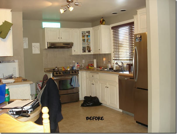
In a previous post, I spoke of my love of Ikea kitchens. I also have mentioned, just a few times, the classic appeal of white kitchens. This client wanted not only to update her small kitchen but also make it more functional.
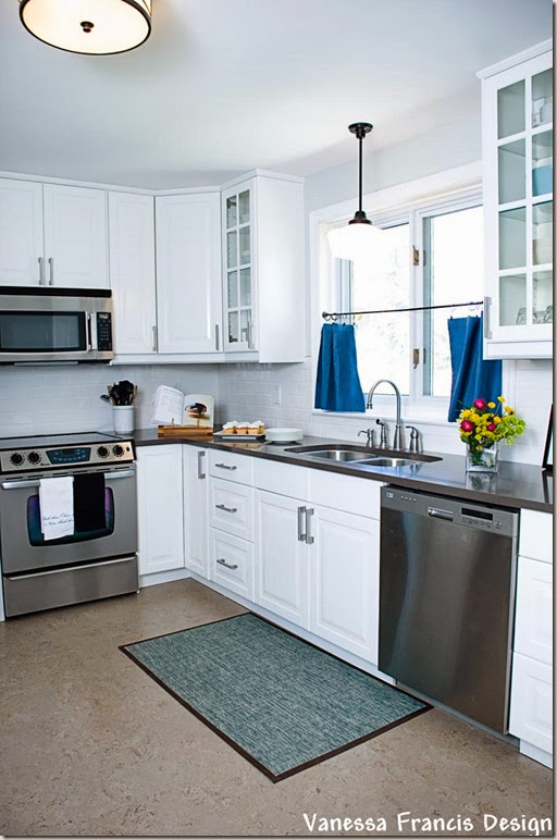
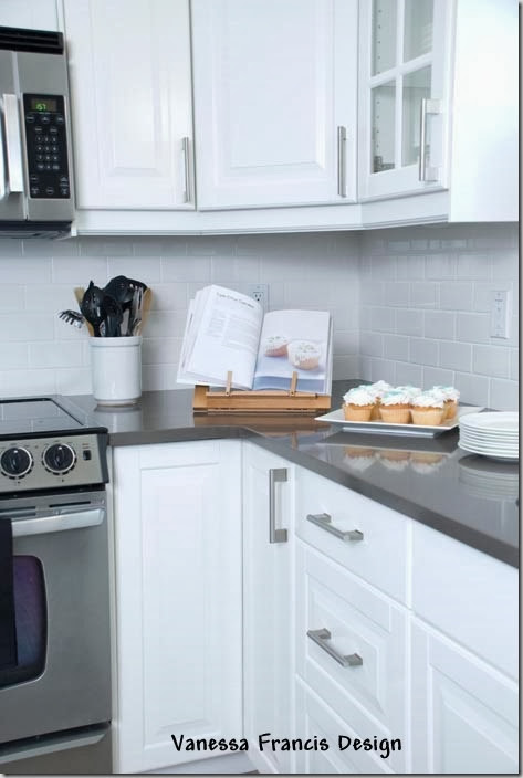
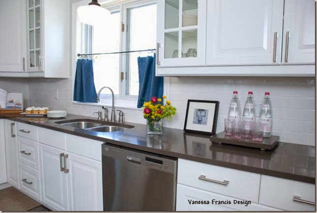
The only change to the layout was to move the refrigerator to the opposite wall with a narrow pantry for all her food items. This gave her a 5’ run of counter space for food prep where previously she only had about 2’ to the right of the sink. We also saved on counter space by installing a new microwave above the range.
We gained additional storage space by extending the cabinets to the ceiling. This also gives the impression that the ceiling is higher than it is.
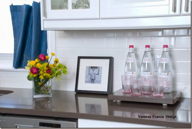
We added symmetry to the room by installing glass front cabinets on either side of the window. The client can display her pretty dishes. A new white subway tile backsplash is timeless and works well with the white cabinetry.
My favourite part is the counter which is a quartz in a beautiful grey brown colour (it’s not quite grey, yet not quite brown). We replaced the dated, small ceramic floor tiles with cork which is environmentally sustainable as well as soft on the feet and legs.
We replaced the lighting with an inexpensive pendant from Home Depot and one of my favourite ceiling fixtures from Robert Abbey. My client says it looks like a cake! We painted the walls a soft blue grey.
I loved working with this client and she LOVES the transformation of her kitchen from boring beige to classic white.
If you need help with a kitchen reno or any other design project, please contact me at vanessa@vanessafrancis.com.



Marcus Design
April 23, 2010Wow Vanessa, what a transformation!!! I love that you took the cabinets up higher to the ceiling, so smart. And I love the light fixture you chose, it looks like a classic ‘schoolhouse’ fixture (which I think are pretty pricey!), very chic!
Nancy
DesignTies
April 24, 2010Awesome job!! The new kitchen looks fabulous!! The glass front doors are a nice touch, and great idea to bring the cabinets all the way up to the ceiling.
I’m sure your client must be thrilled with her new kitchen 🙂
Kelly
DesignTies
April 25, 2010I’m always a fan of cabinets that reach – or are very close to – the ceiling. Great job Vanessa!! Love the fresh look of this space! Would you consider divulging the cost of an Ikea kitchen like this?
Victoria @ DesignTies
Marija
April 25, 2010Congratulations! This looks terrific! So clean, fresh and simple! Marija
Nichole@40daysof
April 26, 2010It’s funny because it looks so similar and yet is so different. Amazing improvement. Did you have to cover a window over the stove? Was that a big deal? Every time I see an Ikea kitchen I am more and more impressed. I bet your client was so happy to have your help. Even a place like Ikea where they have everything set up for do it yourself people is intimidating.
Ann
April 26, 2010Now, that is a pretty kitchen! So clean and inviting. I just love the white cabinets and the pendant lighting.
Thanks for sharing the photos.:)
Londen @ Sixty-Fifth Avenue
April 26, 2010Beautiful job! I love a white kitchen too, you can’t go wrong.
Those light fixtures are fabulous!
thedomesticfringe
April 26, 2010This is really beautiful! Love the hardware on the cabinets and the curtains on the window. Adore the light fixture. I actually thought the counterops were stainless before I read about them. Everything is just perfect. Very updated.
-FringeGirl
Greet
April 26, 2010Hello Vanessa,
You did a wonderful job! I love the fresh look of that same kitchen! Well done!
xx
Greet
A Casa da Vá
April 26, 2010oh my what a difference, you did a great job! my kitchen is SO outdated but i live in a rental… any advices?
^_^
Stephanie Lynn
April 27, 2010This space is stunning! I love what you have done! The hardware is gorgeous! Thanks so much for stopping by and sharing at the Sunday Showcase Party! I greatly appreciate it! Hope you have a great week! ~ Stephanie Lynn
The Zhush
April 27, 2010What a great before and after! Well done!
Maria Killam
April 29, 2010That is so beautiful now! You are so talented!
Tyler and Shelley
April 29, 2010I love the subway tile and the whiteness of the kitchen. The cork floor is awesome!
Lila Ferraro
Queen Bedroom Sets
Jen of Made By Girl
May 2, 2010WOW gorgeous….I really like subway tiles…they always look great no matter what! :))))
DesignTies
May 4, 2010Just want to let you know that we’re having a Mother’s Day giveaway over at DesignTies. Drop by if you have a minute and enter to win a beautiful Lisa Leonard necklace 🙂
Kelly
DesignTies
May 7, 2010Thanks for adding a link to our giveaway on your sidebar 🙂 Good luck!!
Kelly
Catherine
May 7, 2010Great transformation.
Julia @ Hooked on Houses
May 11, 2010What a great kitchen makeover. I love those countertops!