One of the lovely Christmas gifts I received from Mr. Decor Happy was Farrow and Ball’s latest book Living with Colour. I just had to share some of the beautiful images with you.
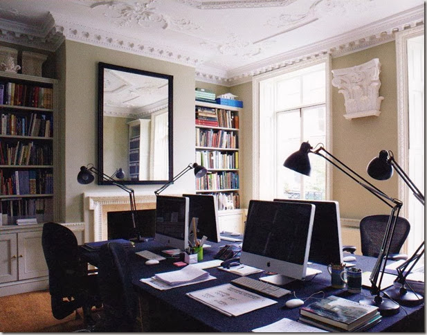
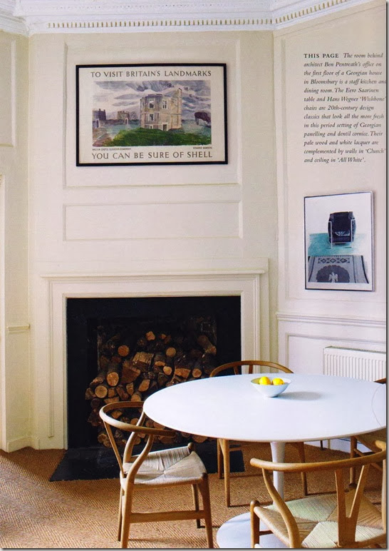
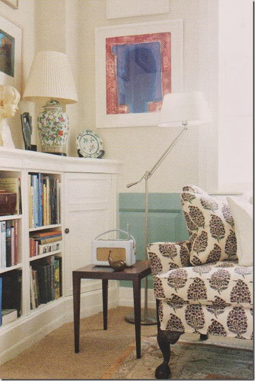
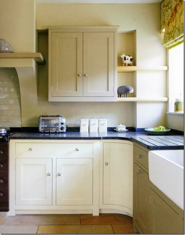
If you love Farrow and Ball paint and wallpaper, this book should be part of your library. If you have never heard of the UK based company, don’t want to spend money on their paint (it’s a wee bit pricier than other brands) or colour match their paint, you will become a fan. It shows their products in a wide range of interiors – from modern spaces to cottages to Georgian style homes. The photography is gorgeous and you can see and learn how light plays an important role in paint colour selection.
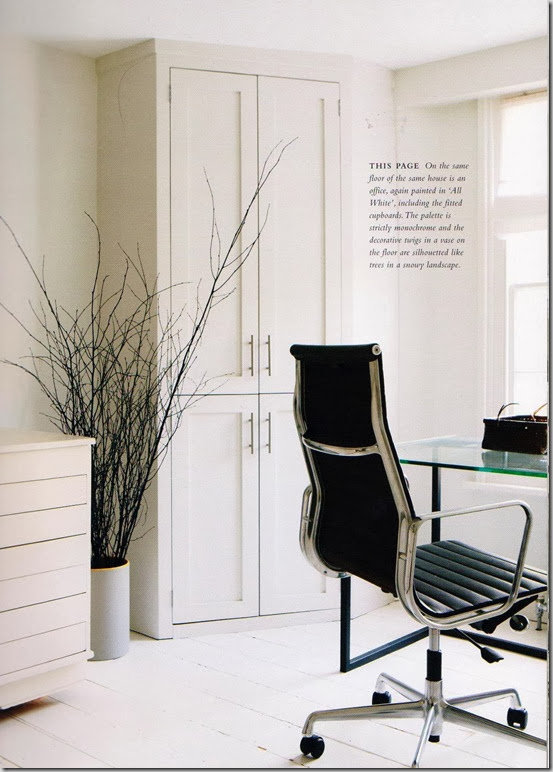
The two previous images are the offices and staff dining room of an architect’s office in a Georgian home. Wouldn’t you love to work here? I love the modern furniture played against all of the beautiful architectural details and mouldings.
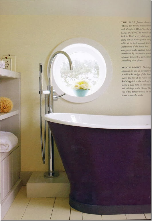
The bathtub is painted Pelt – a deep purple. Don’t think I have seen a purple bathtub before but I must admit, I love it.
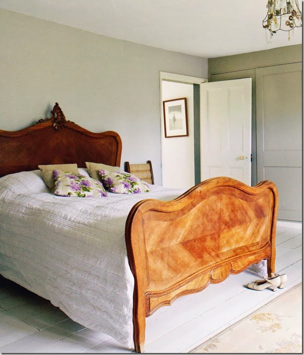
I must have white painted floors somewhere in my house!
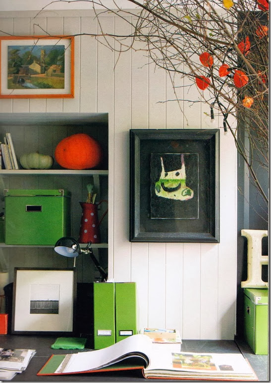
This is one of my fave images from the book. The styling, the children’s art, the use of colour and the “matchboarding” as they call it in jolly, old England all equal brilliant in my book.
And speaking of Farrow and Ball, they have added nine new colours to their collection. You can see them on the Style at Home site here. The stony grey colour on the door below, Dove Tale No. 267 is my favourite.
Cllick here to read my previous post on Farrow and Ball and why their products are a cut above the rest.
Have you used Farrow and Ball paint or wallpaper? What are your thoughts?
If you need decorating or paint advice, please contact me at vanessa@vanessafrancis.com.




Designwali
January 7, 2011I think this one is going on my must buy book list!
Kelly @ JAX does design
January 8, 2011I have a sudden need for a dark purple bathtub – love it!
I’ve used Farrow & Ball Mahogany on an accent wall in the bedroom (which was later painted over and then wallpapered) and on the vanity in the ensuite. I don’t know if it’s the paint or the varathane or a combination of both, but there’s not a scratch or scuff on the vanity after more then 4 years of daily use.
The one thing I find with F&B paint is that it splatters a lot. Maybe it’s just me, but I’ve never had such a bad splatter problem with other paints.
Wendy
January 8, 2011love your favorite pick! my kitchen redo is in F & B ‘white tie’ — we love it!!!
Lena
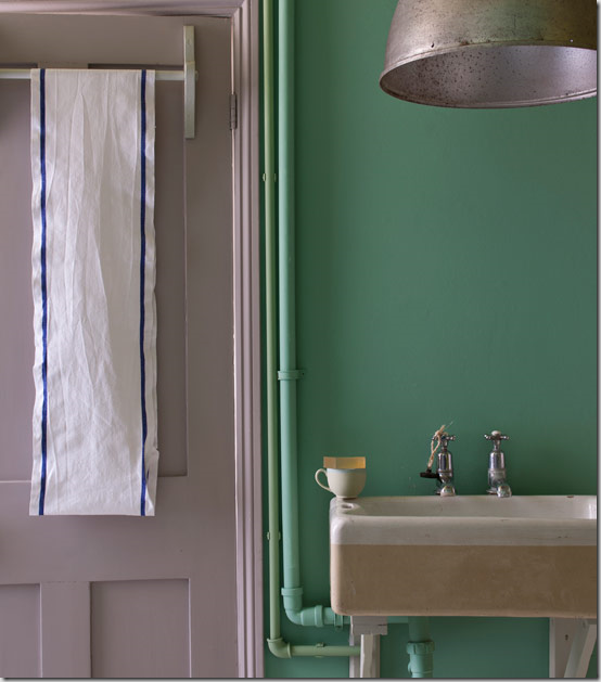
January 8, 2011love how the problem of exposed pipes becomes a quirky feature painted teal and green.
Design Elements
January 8, 2011wonderful book! great pick!
SHERRY HART
January 8, 2011I love all of their new colors…….
Tabitha
January 9, 2011I always use their paint. My house was built in 1870 and no one else offers the dead flat period finish that they have
Marcus Design
January 10, 2011This looks like a great book! And way to go hubby on knowing just what you wanted 🙂
Nancy xo
*sarah berry design*
January 10, 2011Beautiful! This book is on my list now, I just love design books. F&B simply do the best colours, you really can’t go wrong with them, especially their front door colours – perfection!
Calmly Chaotic
January 11, 2011I love farrow & Ball. Once you try it you can never go back. I’ve used Down Pipe, Conforth white, Therea’s Green, Lamp Room Gray, Skylight and a couple of others. I am obsessed! The book sounds great!