Be sure to tune in tonight to episode 9 of Sarah 101 (9:00 EST on HGTV.) I think this was my favourite episode yet!
Sarah and Tommy transformed a dark and dated kitchen in a mid-century bungalow into a bright and happy space.
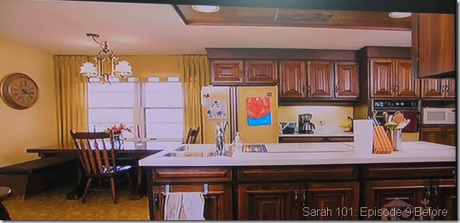
Before I show the beautiful “Afters”, here is a photo of the Before which I took from my TV screen. You have to see the Before to fully appreciate the After!
Notice the awkward placed sink on the island! I’m a big fan of painting your cabinet doors if they are of solid construction and in good shape like these were. Why do a full blown reno when you can be easy on your bank account and the environment by simply painting your cabinetry?
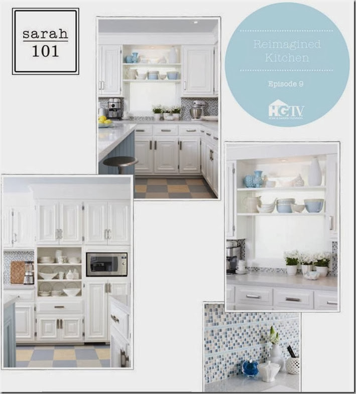
What a difference! This kitchen hadn’t been touched in 40 years. The only change to the layout was to move the fridge to a small wall and relocate a range to where the fridge was. This leaves the island with just a sink – much preferable. Update with paint, new flooring, appliances, counter, backsplash and lighting … et voila!
Tips from Sarah and Tommy:
- figure out what mood you are going for. A colour scheme of fresh blues, creams and yellows transforms the space into a bright, happy place.
- the colour scheme is reflected in the Marmoleum floor tiles and the glass backsplash.
- paint the ceiling using 1/3 of a colour used elsewhere in the space. In this case, the gorgeous robin’s egg blue on the island is repeated on the ceiling. (My peninsula is painted a similar colour (BM Woodlawn blue) and I love it but may need to add some beadboard to it like they did here!)
- with all of this colour, keep your walls neutral
- hang your pendant lights 36” above the counter
- raise a desk to counter height for one long run of counter and so that you can use the same counter height stools from the eating counter.
- purchase cabinet handles before you paint to determine whether you have to fill the holes .
- use graph paper to sketch out your tile pattern if using square tiles.
What else I loved about the design:
- the chrome pendant lights and vintage industrial stools
- quartz counter (I tend to recommend over granite because of the low maintenance factor.)
- the round mirror reconfigured into a bulletin board with gorgeous fabric. This was my favourite part!
Overall, a brilliant outcome! You can hardly believe it’s the same kitchen! You can see photos here and the Shopping Guide here.
You can read my previous Sarah 101 posts here and here. What did you think of this episode?
As I mentioned in this post, Sarah’s House 4 airs this Fall. I had an opportunity to view the house recently during an Open House as it is currently for sale. You can see some photos and information here. She worked with a builder to design and decorate a new home from the ground up. To sum up the home in one word – stunning!
If your kitchen requires a facelift, please contact me at vanessa@vanessafrancis.com.


christine {bijouandboheme}
March 1, 2011I skimmed through because I’m excited to see the after tonight- will pop back over tomorrow to read your review. xo
Rambling Renovators
March 2, 2011So funny – we wrote very similar recaps, even mentioning Sarah’s House 4! I too loved this episode. Not only was it a great transformation, but it seems S&T have found their groove with the new series. Lots of great ideas in this space. I couldn’t believe how good the cabinets looked afterwards!
Kelly @ JAX does design
March 2, 2011Hahahah! I had to include some “before” shots in my wrap-up post too! It just SCREAMED ’70s!
This was such a fantastic makeover, and the cool thing is that most of it was done with paint. LOVE the robin’s egg blue island, and the lighter version of the blue on the ceiling. The chrome pendant lights are great too. And the modification to the pass-through is pretty genius! It really looks like a window now.
Kelly @ JAX does design
March 2, 2011Oh, and THANK YOU for voting for me in the HomeSense contest! I really appreciate it 🙂
Style Attic
March 3, 2011Oh, I love Sarah! I missed this episode. Yes, I agree, paint can take a space to a whole new level without a demo and reno!! I just finished the same project. Had my kitchen cabs painted and it’s a whole new space! I did 2 posts about it. Have a great day! XO
Lazy Gardens
March 3, 2011I love it!
This is one of the few times I have seen a busy backsplash that really works, probably because it’s repeating the floor and the counter and cabinets are so simple.