Hi there! Did you enjoy the balmy weather on the weekend? Let’s hope it lasts for at least a few more weeks.
I’m finally working on my kitchen makeover. I know I have mentioned it once or twice on the blog over the years. Well, the stars have aligned and things are in motion to finally get this done. So exciting!
I’m also excited to be participating in Linda’s One Room Challenge Linking Event where anyone who wants to transform a space in real time in 6 weeks can do so. Each week the participants will provide progress on the room. How’s that for impetus for transforming a space?
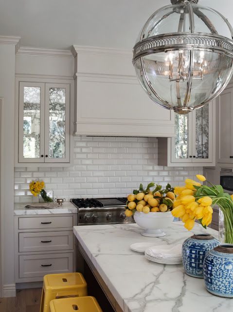
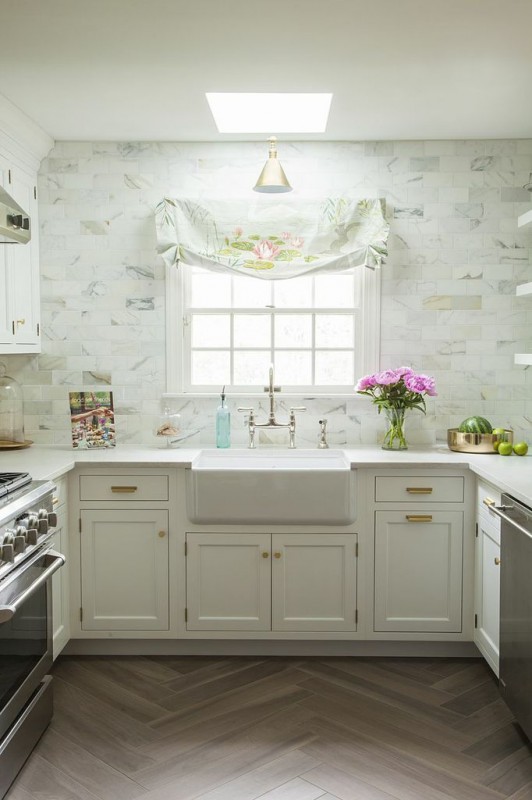
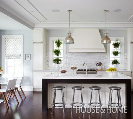
This week’s post is about inspiration and my plan for the kitchen. I have always loved this kitchen designed by the talented Benjamin Dhong. I think the range elevation can look much like this, the only difference being the cabinet colour and his counter is marble.
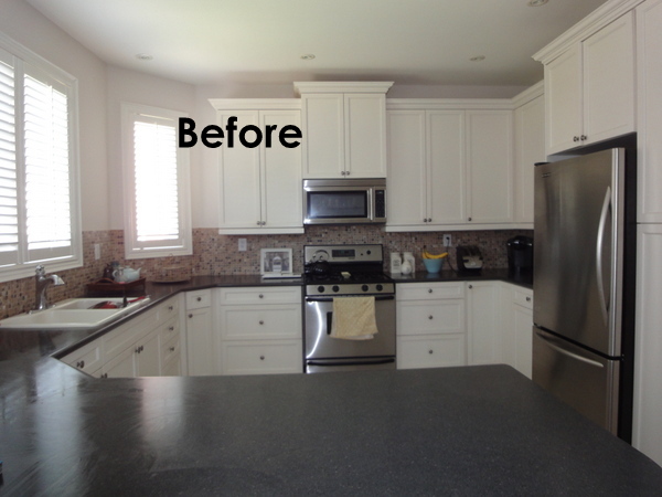
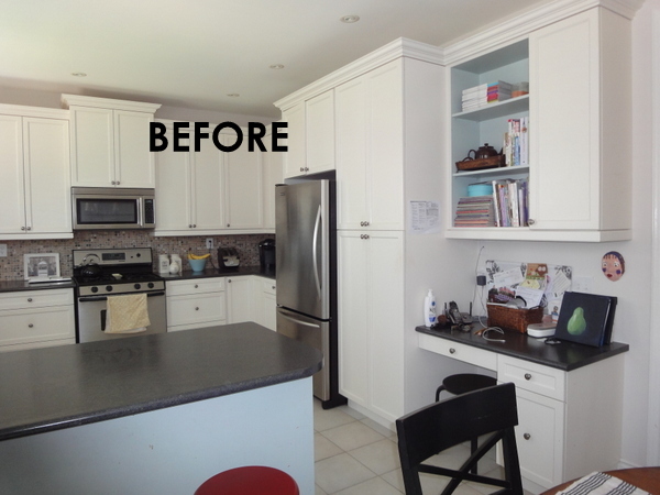
I have only showed a couple photos of my kitchen on the blog over the years as it certainly is not the kitchen of my dreams. We upgraded the cabinets with the builder when we bought the house 10 years ago. They are painted maple – an off white colour very similar to Benjamin Moore Dove Wing OC-18 and they are staying.
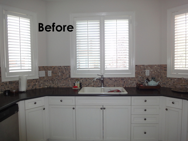
But a few things have bothered me over the years and now it’s time to fix them. I never liked the microwave over the range and that the cabinets don’t reach the ceiling which is 9′ high. And although I did like the tumbled marble and onyx backsplash when I chose it a decade ago, it’s too busy and dark so I want to lighten things up.
I would love to remove the shutters and replace with romans in a gorgeous fabric but that’s not going to happen. I live in the burbs where your backyard neighbours are ohsoclose so privacy is important and you can’t beat shutters for that.
This is the other side of the kitchen where I decided to paint the bookcase and island one of my favourite blues. Although I still love the colour in the bookcase, it has to go on the island. And the red stools? Yes, I was in a red phase 10 years ago. (That was slightly embarrassing to show you these photos.)
To wallpaper or not to wallpaper?
It’s a pretty straightforward makeover (or as they call it in the US, a remodel 🙂 ) but there has been one decision that I have laboured over. Do I tile around the windows with a marble subway tile? Or do I replace the backsplash with a 3×6 white subway tile (one that has a handmade quality) and only install it where the tile is now and wallpaper above.
I asked a few designer friends and they all said, do the marble backsplash to the ceiling- no question! So, that’s the route I was going to go as I have always loved that look anyway. See Caitlin Wilson’s kitchen below which was House Beautiful’s Kitchen of the Month early this year and was also published in Rue magazine.
And then my sweet mother spent the day with us on Saturday and pointed out that the counter to ceiling backsplash tile may make the kitchen feel cold and wallpaper would definitely warm things up. So true as I can’t use any fabric because of the shutters on the windows and I have tiles on the floor. Do what will make you happy, she said. Such good advice Mom and that’s what I tell my clients all the time and write this blog called Decor Happy. Wallpaper does make me happy! (By the way, the apple doesn’t fall far from the tree. I got my love of wallpaper specifically floral wallpaper, from my Mom. All of our homes growing up had at least one or two rooms with wallpaper, including grasscloth.)
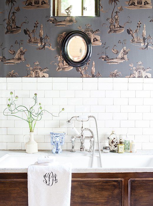
If you Google wallpaper in the kitchen, very few images come up – it’s not something that you see often. So, I took it as a sign when I came across this Pin while my Mom was over – wallpaper above white subway tile (although this is a bathroom, it would look similar in my kitchen.)
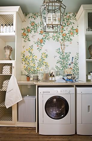
This gorgeous laundry room (below) was the standout in a show home in DC a few years ago. Can the Gracie wallpaper be any more beautiful? As you know I love wallpaper but only if it is a painterly floral, botanical, vines, trees etc. Not really a fan of geometric wallpaper or heaven forbid, damask! I will provide more details on the wallpaper I chose in a future post (still not 100% decided) but this is kind of the idea. Just a hit of wallpaper for interest.
So here is what I am planning:
1) Upgrade the range to this beauty from Electrolux. (I had it installed last week and already the kitchen has kicked it up a notch.)
2) Replace the laminate counter with Silestone Lagoon – suede finish. I have this in my bathroom and love it.
3) Change the sink to this Blanco one. I have installed this with two clients recently and they love it.
4) Change the faucet to the Waterhill from Moen.
5) Extend cabinets to the ceiling with a frieze and new crown moulding (as in the first inspiration photo above.)
6) Add glass (or antique mirror as in the first inspiration image) to the four uppers flanking the range. (And buy all new white dishes so it looks pretty!) I thought (for a few seconds) about eliminating the uppers altogether and just having gorgeous tile with shelves but that wouldn’t really work for me. The glass will make it seem more airy though.
7) Finish off the peninsula with a more decorative end panel and banish the blue.
8) Change the hardware – not 100% decided but need to order stat!
9) Purchase a smaller microwave for the counter.
10) Purchase a hood fan insert.
11) Install white subway tile.
12) Wallpaper above the subway tile.
13) Convert a pot light over the sink to an electrical box to hang a pendant. Have my painter patch and paint.
14) Replace the counter stools.
15) Clean the grout! Although I would love to change the flooring, it is not in the budget. The grey-white porcelain tiles were an almost $5K upgrade with the builder and cleaning the grout to it’s original colour will make a huge difference. (I can’t believe I paid that much for the upgrade – still annoyed by this all these years later! Namaste Vanessa, namaste.)
16) Style it pretty and get it photographed.
Phew! I’m exhausted just thinking about this. Let’s hope everything goes according to plan. Did I mention I have less than 6 weeks to get this done?
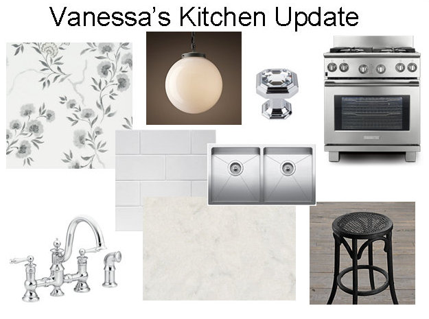
And here are the products mentioned above so you can see the look and the potential:
More details on all of the products in future posts.
My awesome cabinetmaker is making a range hood (similar to the one in the first image above) to match the cabinetry and I would love it to have the stainless detail like this one. :
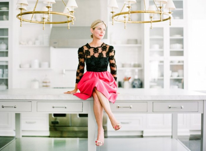
And yes, I want to be looking as fashionable in my new kitchen in a few weeks as this lovely lady!
So stay tuned for multiple updates on this project with the final reveal being the first week of November. Wish me luck! Don’t forget to check out what the other ORC linking participants are up to as well here and to see who the 20 designers/bloggers are and what they are working on go here. Tons of inspiration, so click on over!
Have a great week everyone!




Steph
September 29, 2014Good luck! You’ve got this, and I can’t wait to see the final reveal. Even better though, what’s the first great meal you’re going to make in your beautiful (and functional) space?! A kitchen is only as good as what is created in it.
Vanessa
September 30, 2014Aww…thanks Steph! Not sure what that will be yet but my new range already has me whipping up some gourmet meals. I’ll be sure to Instagram photos of my cookng adventures. 🙂
Heather
September 29, 2014wow! incredible plans and sooooo lovely! I love all your ideas!
Vanessa
September 30, 2014Thanks Heather!
Michelle @ Eamonn & Jack
September 29, 2014Oh wow – I can’t wait to see how your room comes together! I rather love the wallpaper in your moodboard. and the range. Gosh I wish I could have a range like that!
Vanessa
September 30, 2014I can’t wait either. Yes, love that wallpaper too – have used in a different colourway in a client’s powder room. And that range is everything! Thanks for stopping by Michelle!
Jamie
September 30, 2014I LOVE kitchens and your white dreamy inspiration kitchens are perfection. We just did our kitchen reno recently and I love it! So glad I found your blog 😉
Hugs, Jamie
Vanessa
October 2, 2014Thanks for stopping by Jamie. I love your kitchen!
Naomi Stein
October 1, 2014yay! you know I Love kitchens and this is going to be fab. Glad you decided to add paper. It will really be a nice touch. I’m excited to see this hood of yours 🙂
mrs. V | Chez V
October 2, 2014Love your plan. Huge fan of wallpaper and marble backsplash. Either is a great choice or both! Did paper in my kitchen the last ORC and don’t regret it a minute – adds such luxury to an otherwise workhorse of a space! Look forward to watching this one come together!
Vanessa
October 2, 2014Thanks! Yes I loved the wallpaper in your kitchen. Will be following along on your bathroom update as well.
Vanessa
October 2, 2014Yes, I keep looking at the paper sample on the wall – excited about that. The hood is nothing fancy – nothing like the gorgeous black and gold one you did. Mine will be very humble by comparision. 🙂 Can’t wait to see your kitchen – I’m sure you will knock it out of the park as usual.
Improvement List
October 2, 2014Isn’t it so hard to make a decision! I do agree with you though that while all tile on the walls would look great, adding wallpaper would give it that pop of color that an all white room would need. Looking forward to following along and seeing how this all turns out!
Vanessa
October 2, 2014Thanks for the support Frances and good luck on your library project!
Christine Dovey
October 2, 2014I’m so happy you decided to go the paper route- it’s going to add such a dramatic element to the kitchen. I’m also quite invested in that antique mirror idea…especially now that I discovered your original inspiration image is the one I sent you covered in mirror! Definitely a sign:)
Can’t wait to watch this kitchen come together!
Vanessa
October 2, 2014Thanks for your encouragement and support C! We are definitely on the same page. Yes, I am doing the antique mirror but it’s touch and go whether it will be ready in time. Who knew antique mirror takes so long?
Veronica
October 2, 2014You have quite a list to accomplish, but I am sure you will pull it off beautifully
Lisa
October 2, 2014Vanessa, I am looking forward to seeing your kitchen progress over the ORC. You have a great starting point and with your changes it is going to be gorgeous.
Kim@ The Green Room Interiors
October 2, 2014Saw you kitchen paper on your instagram feed and loved it. I can’t wait for this!!
kate@willowinteriors
October 2, 2014This is going to be amazing! I love the idea of the wallpaper and mom is always right. 🙂 Can’t wait to see more and good luck!
Erin
October 2, 2014I also consult my Mom before doing any big ‘commitment’ project too 🙂 I love all your plans and especially that you are going with your gut instincts. Also – seriously, don’t you swing off the counters wearing an haute couture lace blouse? 😉
Lesley Metcalfe
October 2, 2014Love your inspiration pics! That’s a very nice space you have to work with. I love the idea of wallpaper in the kitchen, it’s so fresh. Looking forward to following your progress and seeing the reveal!
Kathleen
October 2, 2014Wow Vanessa, I love all your choices! The wallpaper back splash combo are especially awesome. Good luck finishing everything over the next six weeks. You have quite a list 🙂
Kimberlee
October 2, 2014You’re off to a great start already! I love all of your inspiration photos & I’m excited to see the final reveal. I’m in the middle of a kitchen remodel myself. Have you thought about layering the roman shades over the shutters by mounting them above the trim? Fabric roman shades are so pretty and would add a nice amount of softness to your space….
Erin@Suburban Bitches
October 2, 2014So excited to see your progress in this room! Kitchen remodels are the best!
Linda @ Calling it Home
October 2, 2014I love your plan and I hope you take a picture of yourself on the island like the last shot. Ha! I am also interested in hearing about the silestone.
Laura Ingalls Gunn
October 2, 2014What a lovely space this is going to be. I love your kitchen inspiration images. I cannot wait to see your progress and how it all unfolds.
I too am participating in the One Room Challenge. My challenges? I just moved to a completely new state (Texas) last week and therefore have no idea where to source things other than Wal Mart and Home Depot. 🙂 I am currently battling strep throat and just want to lay around and eat soup as opposed to painting a 30 year old polyurethaned oak coffered ceiling that has never before seen paint. The accompanying powder room rivals the worst gas station stall ever. But a bonus is that the previous owners installed a wine glass and bottle holder on the ceiling of the bathroom. I kid you not. Come take a peek.
Elaine
October 2, 2014Vanessa – Your inspiration boards are beautiful! Plus I love the gal’s black and pink dress! Stunning!
Can’t wait to see all the rooms at the end of the six weeks. I’m also a participant, redoing my foyer and hallway. Enjoy this journey!
Elaine
http://www.OMGlifestyle.com
celine@aquahaus
October 2, 2014Long to-do list, but the end kitchen is gonna be amazing!
Melissa @ A Prudent Life
October 2, 2014Your inspiration kitchens are gorgeous! I can’t wait to see your progress over the next few weeks. I’m exhausted looking at your list 🙂
Shelia @ House of Highlands
October 3, 2014I can’t wait to see your progress! I love the idea of wall paper – it will be beautiful!
Shelia
tara
October 3, 2014your ideas are AH-mazing! Kitchen updates are my favorite to follow {perhaps because mine needs one so badly} cannot wait to follow your progress. xoxo.
Erin
October 3, 2014What a beautiful kitchen you have already, Vanessa! What a great room to add some updates too. I’m participating in the ORC challenge too and updating a bathroom. I’m also going to be using wallpaper…eek!!! Good luck with the next step. Can’t wait to watch this unfold 🙂
Jen
October 4, 2014When I think of you, I think “wallpaper” so I think you should follow your heart in this room too. Plus, wallpaper + tile in the kitchen seems very fresh and unique. Did you catch the Ikea pullout in the recent House & Home? There was a kitchen with dramatic wallpaper in it. Love the plan, can’t wait to see you bring it all together.
Krista @ the happy housie
October 5, 2014Such stunning inspiration. I am swooning over Caitlin Wilson’s kitchen…that gold hardware is stunning!
Tiffany
October 6, 2014I love your ideas. I think wallpaper is going to look gorgeous in your kitchen. Can’t wait to see how it turns out!