Happy Thursday!
I’m here with a quick update on what has happened this past week with my kitchen makeover (the short version is – not a heck of a lot!) Now, I don’t really like the word makeover (sounds like I should be talking about blush and lipstick!) but the fact is, this isn’t a full blown reno. My cabinets are only 9 years old and are in good shape with a classic shaker style and the layout is fine. But there are things that I have wanted to change for years that I didn’t get around to, aka no budget. So this is a story about how to upgrade a basic kitchen. Go here to see the Before’s and read about my plans, choices and what has transpired to date .
And for those of you who are new readers, The One Room Challenge Link Up is when a number of bloggers (I think there were 94 in total on last week’s link up) complete a room reno/makeover/remodel/decoration project in just six weeks.
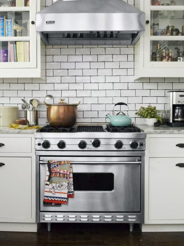
Genevieve Gorder’s kitchen with a similar backsplash to mine
Even though my makeover seems pretty simple, there were still many trades to schedule: demo crew (backsplash, counter), tiler, cabinetmaker, counter installer, plumber, electrician, wallpaper hanger and painter. Neither my husband and I are handy, so we always leave things to the professionals. I so admire some of the bloggers who for example, are creating concrete counters or tiling themselves.
So, not a lot happened last week but if you follow me on Instagram, you would have seen the photo below showing my newly installed backsplash. As I mentioned before, I debated between a marble backsplash which would run from counter to ceiling on the window wall or white subway tile. I’m actually very glad I didn’t choose the marble because unless you are doing a Thassos marble which is a solid white, there will be pattern and colour. Since my counters aren’t a solid colour and have a subtle pattern, that would just be too much pattern and busyness for me.
One of my first blog posts five years ago was about the timeless beauty of subway tiles. (Just ignore the small photos in the post and the fact I didn’t know I should link back then!) I chose a size slightly smaller than a 3×6 and chose one that has a handmade quality meaning the edges aren’t straight and the face has a bit of a wave so it doesn’t look flat and catches the light. It’s the same tile used in this kitchen I blogged about here. Geez, I think I linked to this kitchen last week. I guess I really was inspired!
If you choose a tile like this, you have to be OK with the grout lines not being exactly even as you can see in the photo above – this adds to the charm. I chose a grey grout which ended up being slightly darker than I had anticipated. BTW, the grout colour is Silver from Mapei, in case you are interested. I normally choose Warm Gray but decided to go a tad darker. Anyway, I am happy with how it turned out. The tile is also similar to the one used by Genevieve Gorder in the kitchen above but she chose a black grout.
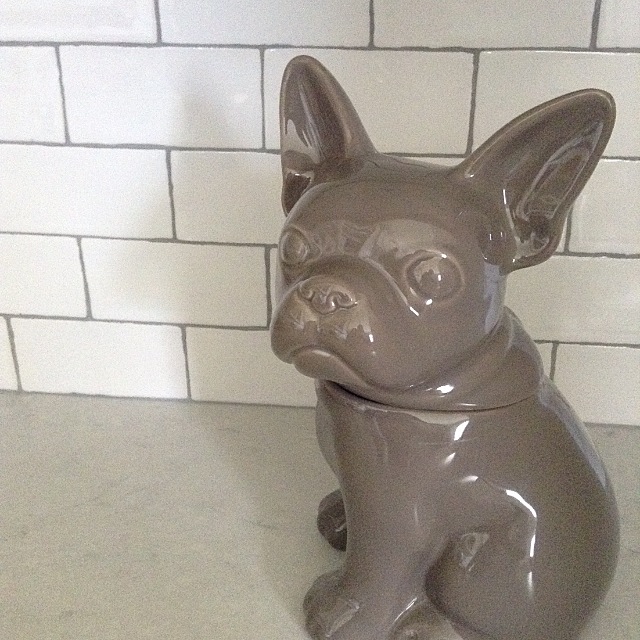
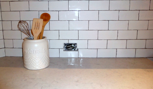
I also did some shopping for accessories to style my kitchen and another kitchen (again not a full reno, more of a makeover like this) which is being photographed on the same day. I found the most adorable cookie jar (seen above) and I smile every time I walk by. (Truth be told I have been thinking a lot lately about getting a dog and my daughter has wanted one for years, so we will see.)
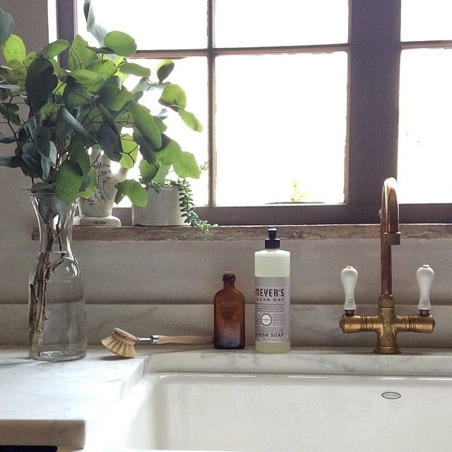
(Love how this kitchen is styled. It really creates a mood, doesn’t it?)
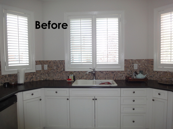
My electrician also came by and he moved the electrical outlets down closer to the counter. You can see how high and awkward they are in this Before photo.
And this is how it looks now, minus the outlet cover yet to be installed – lower and on the horizontal.
So, that’s it! Next week my cabinetmaker is installing the new crown etc., the wallpaper will be hung and the electrical finished including hanging my new pendant. Be sure to check out the other ORC Linking Participants here and the 20 bloggers involved here. Also, follow the #oneroomchallenge hashtag on Instagram – so much inspiration and prettiness.
Oh! On another note, Makeovers with Style, a Style at Home special publication came out this week and this kitchen I designed is featured in it. I will do a separate post on this but just couldn’t contain my excitement over it. Look for it on newsstands – it doesn’t disappoint!
Chat soon!



sherry hart
October 23, 2014I agree….subway tile is classic and timeless and many years down the road you will still be loving it!
ange
October 23, 2014Oh subway tile, it’s like the little black dress, classic, timeless, always looks good. And what a cute cookie jar, dogs are so fun, you should really just jump in and get one! We have two dogs and when they are at the groomers it’s always weird feeling at my house. I never thought about the orientation of outlets and that makes total sense! This week is one of the hardest, I feel like not much gets done but lots of final decisions are made.
kate@willowinteriors
October 23, 2014Love the tile and dark grout! So timeless! Good luck this week!
Christine Dovey
October 23, 2014I love love the natural subway with the dark grout- so beautiful. And I think once the wallpaper goes in, that’s going to pull in the warmer cabinets and cooler counters (that you mentioned on my ORC post) so so well. It’s going to be beautiful!
Amy C
October 23, 2014I am in love with all things subway tile but throw in some dark grout and I am done for! I love the look of this! Great job!!!
dana casey
October 23, 2014great inspirational images and i’m looking forward to seeing the wallpaper up. congratulations on the kitchen feature too. dana
Melissa @ A Prudent Life
October 23, 2014The tiles look AMAZING! I don’t think there are many decor items so perfectly timeless as white subway tiles with gray grout! We have them in our kitchen too
Michelle @ Eamonn & Jack
October 23, 2014I love your backsplash, and I never would have thought of moving the electrical outlets down and sideways- that’s genius. The cookie jar is really cute, but I really wan to know what type of cookies are in it?
Kim@ The Green Room Interiors
October 23, 2014I’m so impressed that you’re going the extra mile and moving those electrical outlets. Makes all the difference. Can’t wait to see that wallpaper go up and congrats on getting your work published!!
Lisa Goulet
October 23, 2014Congrats on the Style at Home issue! That is so exciting! Love the handmade look subway tile, I’m thinking of these for my cottage kitchen restyle. Your kitchen is looking fabulous you must be so pleased with the results.
celine@aquahaus
October 23, 2014Subway tiles are timeless. Absolute perfection forever.
Linda @ Calling it Home
October 23, 2014I really want to know more about your countertops. Love the subway tile, and the fact that you had the electrical outlets moved down. So worth it.
Tiffany
October 23, 2014I have subway tiles in my kitchen as well and I love them. Yours is looking gorgeous.
tara
October 24, 2014love the subway tile….and that adorable pup!
Carrie
October 24, 2014It looks great! And I am so impressed that you are able to get everyone to do what they are supposed to in the timeframe. We ordered counters last month and are still waiting… Loved the kitchen you designed in Style at Home, too.
The Pink Pagoda
October 27, 2014Melissa, the subway tiles are brilliant! Your kitchen is looking just fabulous! Can’t wait to see the wallpaper go up. Good luck this week
Shelia @ House of Highlands
October 28, 2014First – I love the subway tile (I want this for my kitchen) and second – my outlets are also high (why oh why did the previous owners feel the need???) – Hooray to you for making the change!
Shelia
Caitlyn
May 17, 2019Love it! Where is your faucet from?