Hope you enjoyed your snow day today if you had one! Let’s hope the roads are all plowed by tomorrow morning (ours still isn’t.)
After 20 years, Ikea will no longer be offering its popular (70,000 kitchens in Canada!) Akurum cabinetry. Today is the day (Feb 2) that the new Sektion cabinetry is online, will be showing up in Ikea locations across the land and the new online kitchen planner is available.
One of the first kitchens I designed was using Akurum Ikea cabinetry (just remember I designed this a long time ago!) I recommend Ikea kitchens to clients who are on a budget as it is great value and with a little tweaking and ingenuity, you can still have what looks like a custom kitchen. And one of my most popular posts to date was this one I wrote on Ikea kitchens five years ago. (Ignore the small photos and awkward spacing which I can’t seem to be able to fix now!)
The Sektion cabinetry will not be compatible if you have an existing Akurum kitchen and want to reconfigure or add to it. You can read all about that and other FAQ’s on Ikea’s site here. Ikea says “One of the key features of Sektion is “drawers within drawers.” The kitchen can be designed in a way that there is one door for each drawer or a large door that covers several drawers, completely customizing the lines and expression of the kitchen.”But the main intention with the new system is to be able to offer more customization and endless combinations and configurations. You can read more details about Sektion here.
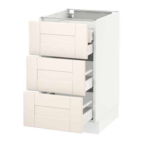 This is what they mean by a drawer within a drawer. Also, this door style looks the closest to a simple, shaker door style in an off-white/cream colour.
I saw firsthand what the possibilities could be with Sektion at the Interior Design Show (IDS 15) a few weeks ago. Ikea partnered with Style at Home and House and Home magazines to create two different, yet stunning kitchens (Ikea also designed an ultra modern kitchen as well.) They were both quite a departure from the very glam kitchen featured last year at IDS but definitely more relatable.
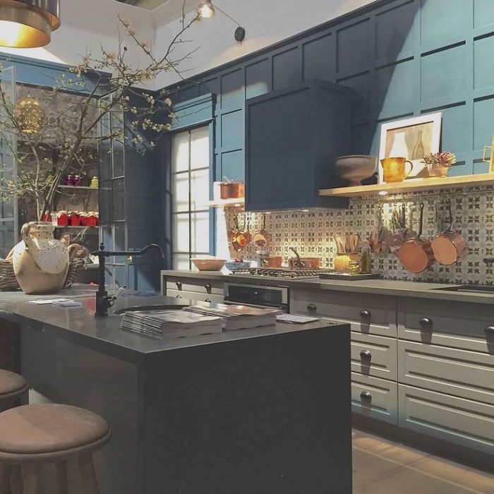
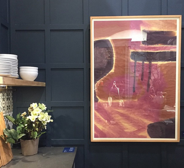
The House & Home designed kitchen featured grey cabinetry (Bodbyn grey) which came to life when paired with panel moulding (painted in Farrow and Ball’s Hague Blue), gorgeous backsplash tile and lighting and a rustic island.
Suzanne Dimma (editor of H&H who designed the kitchen with Sarah Hartill and Joel Bray) described the kitchen in an online video as being inspired by what was happening on the Burberry runways with the layering of patterns. And that it is “all about the mix” and creating something that was “warm and cozy.”
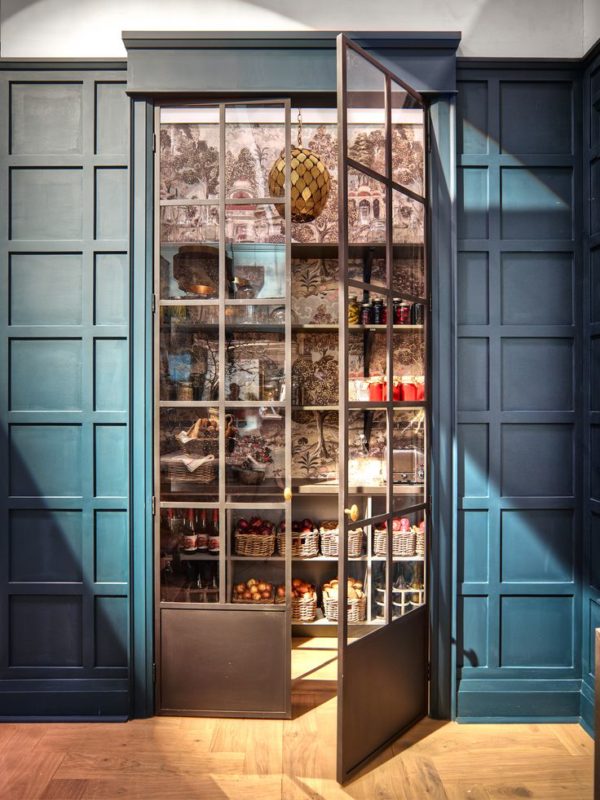
But what did I love most? The pantry at the opposite end:
Pretty brilliant, right? Zoffany wallpaper behind steel and glass doors with a brass pendant and brass door knobs.
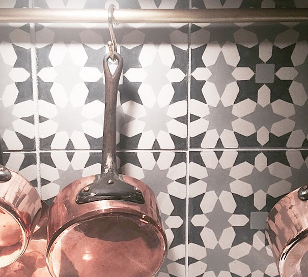
And the backsplash tile from Ann Sacks paired with copper and brass. (I just realized that I saw these tiles when they were introduced at KBIS last year and I just missed a photo op with designer Martyn Lawrence Bullard by about 2 minutes!) :
And I love the wallpaper framed as art. It just adds another dimension to the paneled wall.
You can read their inspiration and see sources here but I’m sure a full spread will be in an upcoming issue of House and Home.
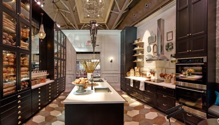
While the H&H kitchen had a folksy charm to it, the Style at Home kitchen was channeling a Parisian bistro. I adore the black cabinetry and would love to work on a kitchen using it. Any takers? 🙂 I believe it’s the Laxarby black-brown.
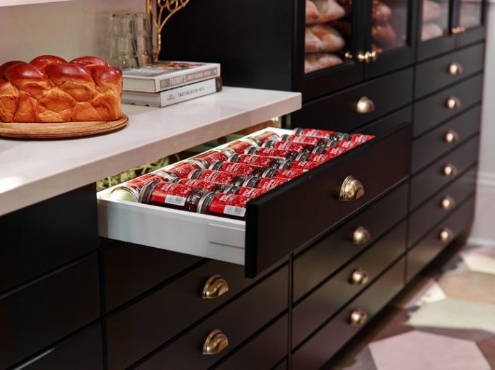
Interior lighting in drawers:
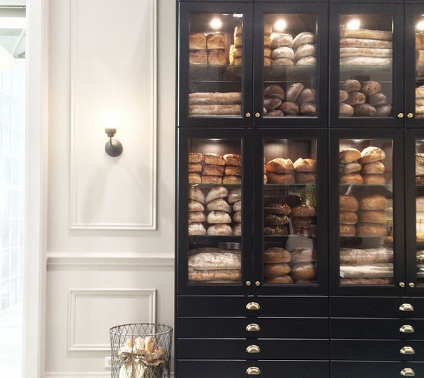
Again, applied panel moulding on the walls really elevates the kitchen:
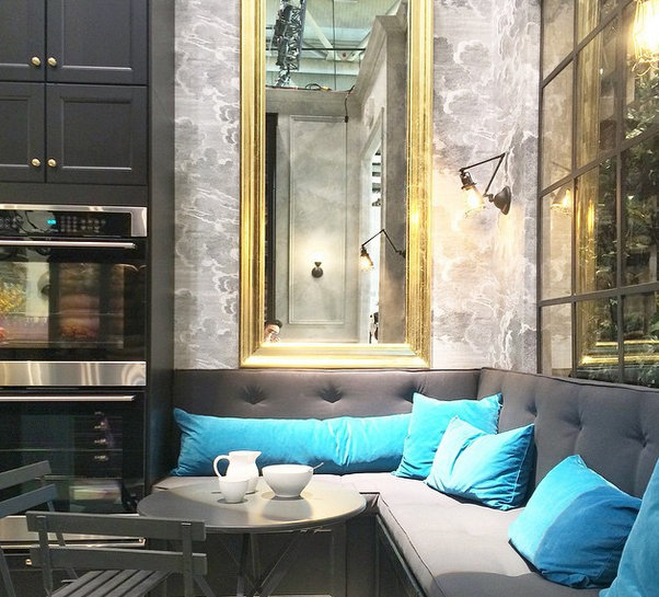
This was my favourite moment in the kitchen (below) and has really nothing to do with the cabinetry. It’s all about how you can create something beautiful in what can be a utilitarian space with some creative thinking. The Style at Home team gold leafed an Ikea mirror and installed wallpaper (Cole & Son) in this little nook (and also on the ceiling) just large enough to sit, read the paper and have a tea.
Photos from my Instagram, Tim’s Instagram (he takes the best photos so go follow him!), Margot’s Instagram and Ikea on Pinterest
If these images haven’t inspired you to create something custom, unique and charming with affordable Ikea cabinetry, I don’t know what will!
Stay warm,





Nancy
February 2, 2015Thank you for some great eye candy – adore the Style at Home kitchen and would love to hear more about the Ikea cabinets – is it best to have Ikea install or hire a carpenter?
Vanessa
February 3, 2015Hi Nancy! Either way works for the install if you have a competent installer/carpenter.
Kelly
February 4, 2015Vanessa I love your blog. You are a great designer and it shows in your thoughtful and informative posts. It’s so great to get useful design perspective from fellow Canadians. Thank you!
Jo Galbraith
February 27, 2015Thanks for this helpful post! Love that little nook – I can picture curling up there with my cup of tea.