Hello again,
Has it really been a week since my last update post? Time flies! This is week three of the One Room Challenge (ORC), where 20 designers/bloggers are transforming a space in real time in six weeks. This is when the panic sets in as things have to be nailed down by now and items definitely have had to be ordered (which in my case, they haven’t!) You can catch up on my two previous posts here:
Week 1: Before photos, inspiration, plans
Week 2: Concept, sources, progress
I am undertaking to transform my neglected principal bedroom from a room with a few good pieces but unfinished to a stylish, restful space. That’s the great thing about the ORC – it really motivates you to make quick decisions to get a room photo ready in a very short period of time. When it comes to my own home, I take forever to make decisions (mostly because of budget.) That’s why this room hasn’t been completed in the ten years we have lived here.
The ORC also pushes you to be creative and come up with something that not only you love but others will too. The ORC gets a lot of visibility. Speaking of that, I didn’t mention in previous posts (just on Instagram and Periscope) that House and Home magazine came to shoot my daughter’s bathroom (from the last ORC in the Spring) for an online video. It is set to go live sometime this month and I will be sure to post a link here. I’m sure it will only be about a minute in length as I was a bit tongue tied and they would have had to do a very good job of editing. 
Here is the concept board again:
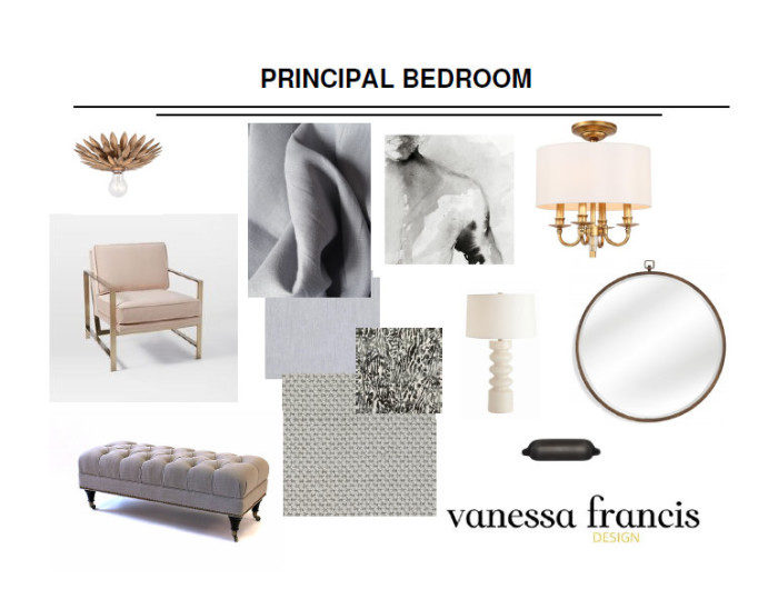
Anyway, back to the reason you are here – to see progress. I really don’t have a lot to share in terms of progress shots of the room because the hardwood is covered with drop sheets and plastic as the ceiling is being painted. The trim (panel moulding, chair rail and crown) from Metrie will be going up on Friday and I cannot wait.
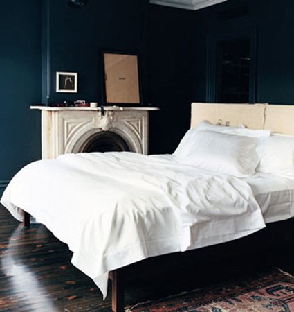
The room will be painted next week and I was/am so torn. Do I go for a dark and moody bedroom in a colour like Farrow and Ball’s Hague Blue (Jenna Lyons’ former home):
Do I go for a light blue such as Borrowed Light by Farrow and Ball? (I’m not sure of the colour in the photo below but this is the look and feel of a light blue like Borrowed Light.) I love the moulding painted this colour and how it meets the curve on the headboard. I am definitely using this as inspiration. My installer came by to mark everything out on the walls and hopefully the end result will look something like this.
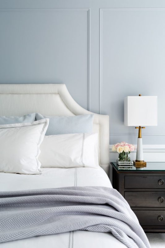
Chango and Co. via Pinterest
Or do I keep the walls a light and airy off white?
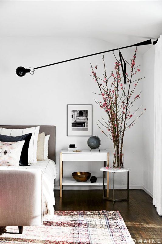
via My Domaine
After much thought and because I have already chosen fabrics, I am going with a light colour, still to be determined, but possibly Farrow and Ball’s Wimborne White. The additional testers should be arriving today and I will get them up on the wall stat. The problem with the colours so far has been that they are all reading a bit green in my room because of the direction my room is facing. The colours themselves are beautiful and I will share a photo next week of all of them on the wall so you can see what I mean. That’s why it is so important to test out paint colours in your own space and light conditions.
Once the room is painted, I can bring all of the new items into the room like the following that I shared on Instagram this past week:
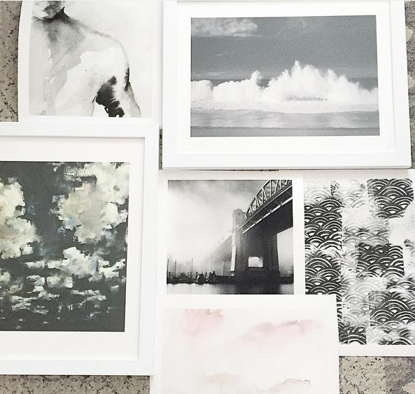
- My limited edition art prints from Minted. So in love with these and can’t wait to see them up on the walls. You can also order the prints in frames. They offer many different options and I chose white for two of the pieces. The rest will be in black frames. These are the prints below: As You Are, Shorebreak Drama, PEEK, Misty Burrard Bridge, WakeLand and Night Clouds.
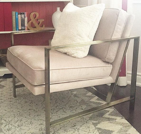
2. My pink and brass chair from West Elm which is sitting in my daughter’s room. Love! (not the best quality photo unfortunately)
Here’s what needs to be done (by myself and trades) in roughly 2.5 weeks until the room is photographed:
- paint closet walls, ceiling and trim
- install closet
- install panel moulding, chair rail and crown
- paint room (ceiling, walls, trim)
- electrical: hang 3 ceiling fixtures and possibly move an outlet
- order closet door hardware
- pick up headboard (new shape and fabric)
- pick up ottoman
- pick up drapes, cushions and rods
- install rods and hang drapes
- hang art, mat some frames
- source bedding, accessories
- style it pretty!
Nothing much, right? Next week I will have some progress shots for you including the beautiful trim by Metrie and the closet installed by California Closets. Be sure to follow me on Instagram where I share sneak peeks as well.
Have you been following along with my talented colleagues? I love seeing their design plans come to life.
Apartment 34 | Arianna Belle | Because It’s Awesome | Coco+Kelley | Design Darling |
Design Indulgence |Design Manifest | Christine Dovey | The English Room | Vanessa Francis | Hi Sugarplum | Honey We’re Home | Jojotastic | The Pink Clutch | The Pink Pagoda | Simplified Bee | Style Your Senses | A Thoughtful Place | Kimberly Whitman | The Zhush | TM by CIH
You can also follow along with the 174 linking participants here. I think that is a record number. The ORC just keeps growing and growing. Kudos Linda!
Thanks for following along,





sherry hart
October 21, 2015Love the paint direction……you know I am a sucker for a light room! Can’t believe we are in week three already…..feeling kind of panicky:)
christine dovey
October 21, 2015I’m glad you chose light…your room just suits it with the fabrics etc. Looking forward to hearing what you think about the Wimborne and I also love Borrowed Light. Oh and that chair…West Elm knocked it out of the park with that one. Excited to check back next week!
Mallory
October 21, 2015ahhh so excited to see the color! Our palettes are so similar and I adore the direction that you are taking yours…cannot wait to see it all!
Iris Nacole
October 21, 2015I’d be torn about the paint idea as well, but light seems to be the way to go! I went really light with my space too. It’s so refreshing! Good luck this week!
courtney {a thoughtful place}
October 21, 2015OH I love that you are going light. Goes so beautifully with everything you are choosing. And what a great chair. Wheels are turning for another room in my house. Excited to see this, Vanessa!
Cristin // Simplified Bee
October 21, 2015the chair! new closet?! double swoon.
xoxo
cristin
Linda - Calling it Home
October 21, 2015Big kisses! Thank you. House & Home has been wonderful to the ORC. The Canadian design bloggers are a tight, supportive group. I will be jealous of the closets, for sure. Looking good.
Vanessa
October 26, 2015No, thank you! For lighting a fire under me to get 3 rooms done in my house in the past year. I am very grateful to House & Home for loving the bathroom enough to shoot a video – and of course I had to give the ORC a shout out. I am looking forward to filling the closet with clothes that I love. Thanks! xo
Ivy Lane
October 22, 2015i am happy you chose to go light! the art works will pop along with your fab pink chair!
Karolina
October 24, 2015I would also incline more to light colour. I love F&B Borrowed and the trims. Looks so chic!! I was also considering it for my kitchen makeover. Can’t wait to see what you decided on in the end. Karolina
Kara
October 24, 2015Do you have any feedback about the West Elm chair? I’ve been eyeing a pair of those, so I’d love to hear your thoughts on quality, comfort, etc.! Thanks!
Vanessa
October 26, 2015Hi Kara,
The chair looks exactly as it does online – pretty rose colour velvet fabric and very soft. Because of the brass arms, it’s not a chair that you will want to curl up on and read a book for a long duration. It’s great for when guests are over as it is very comfortable. I really bought it because I love the modern look of it! It’s in my bedroom so will be sat on very occasionally. And you can’t beat the price. I bought it when it was on sale too. Hope that helps!
Vanessa
tobe | because it's awesome
October 26, 2015Glad I’m not the only one whose list is still a mile long. ha! You’re so right – testing colors takes lots of time and consideration…and so important to test in your own space! I think all of the directions you’ve considered are gorgeous — and the art fits any of them! That chair is SPEC-TAC-U-LAR. Can’t wait to see all of this come together!
Mary @ I Like it Lovely
October 26, 2015Love that you are going light and that chair is awesome as well as the art. Can’t wait to see this come together.