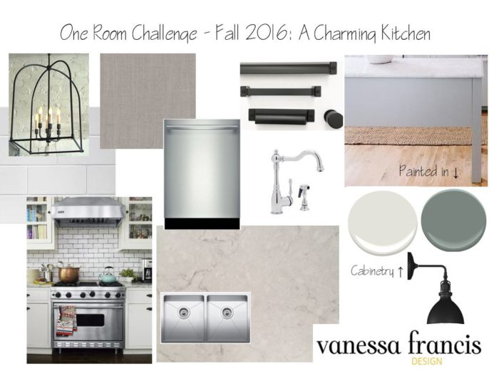
Here we are at week 2 of the One Room Challenge which means that reveal day is in just four weeks – yikes! Last week, I shared inspiration and the before photos of the kitchen in the home I moved into four weeks ago. Today, I’m sharing my design plans.

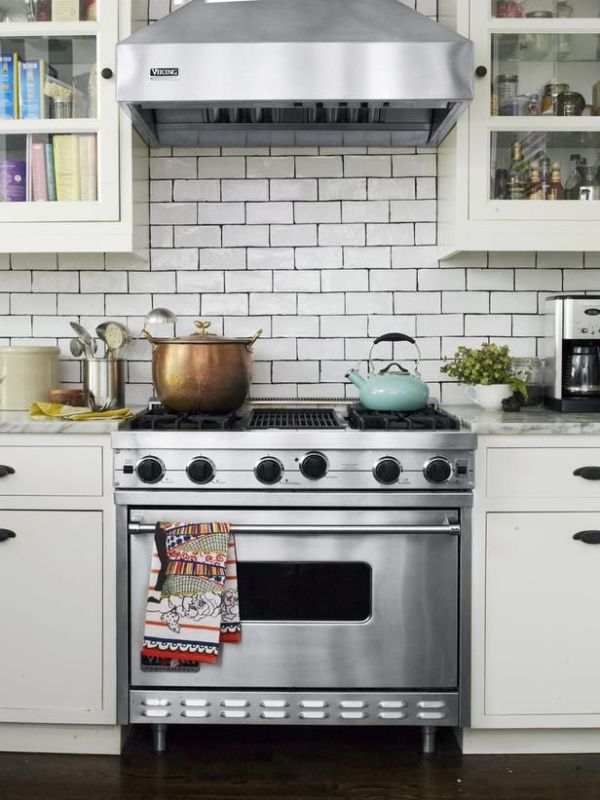
Design by Genevieve Gorder
I actually shared the above photo as inspiration two years ago when I updated the kitchen in my former home for the first One Room Challenge I participated in. What I love about it and keep coming back to is its charm and personality – it’s not trying too hard. There is no crazy tile that you will tire of, no embellishments, no pattern. I LOVE the way it’s styled with the copper pot and splashes of colour in an all neutral space. And I love that things are placed imperfectly in the cabinets. I want to bring some of that charm and easiness into my own kitchen.
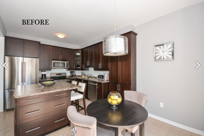
My kitchen takes up a lot of real estate in my small home at 18′ x 10’8″ and when I first saw it, I immediately envisioned a long island with no table in the kitchen. (I have a small table in my living/dining.) Here is the before again taken from the real estate listing so you can see what I mean.

Besides not being my aesthetic at all, it wasn’t functioning as best as it could. Here are my plans:
- take advantage of the long wall by installing cabinetry on the entire wall. I ended up using the pantry that was there and my cabinetmaker built an identical one to be placed beside it. I think we used 3 cabinets from the old layout and the rest were built new. I tried to save $ where I could.
- rather than that very awkward square island and a small table, install an 8′ island (30″ wide) to span the length of the kitchen. So as not to overwhelm the space, build it with legs so it is lighter in appearance. Paint it Benjamin Moore Night Train which is described as a “velvety gray blue” but to me it looks more green than blue – so pretty. It will add just the right amount of colour to the space.
- paint all the cabinetry in Benjamin Moore Silver Satin, an off white. I didn’t want a stark white but something a little warmer and grey. In hindsight, I actually think I could have gone a bit darker. Oh well.
- change the laminate counter to the most beautiful quartz called Snowy Ibiza from Silestone. I think I’m one of the first people in Canada to install it. I will share more on the counter next week. I couldn’t love it any more. It mimics marble and has a warm greige tone.
- install my favourite sink from Blanco and this gorgeous faucet (also Blanco) that apparently is only available in the US but if you google it, it’s available at retailers that ship to Canada.
- change the hardware to a combination of knobs, cup pulls and pulls in a matte black finish from Top Knobs.
- install two large handmade (in TO) lantern type fixtures over the island. Fingers crossed they will be ready in time.
- change all the appliances. I purchased the same Bosch dishwasher I had just purchased in my former home but had to leave behind. It needs to be super quiet because the family room is connected to the kitchen and this one doesn’t make a sound.
- install drapes on the patio door in a gorgeous linen blend fabric (one of my faves that I had in my former home and recommend to clients all the time) from JF Fabrics.
- hide the awkward bulkhead with a riser and this crown from Metrie which will reach the ceiling.
- change out the basic builder baseboards and casings to this one (tall + simple) and this one (not wide but substantial) from Metrie.
- install bookshelves over the sink and glass cabinets on either side for an airy feel.
- install a simple, can-never-go-wrong-with, subway tile in an off white colour. Again, I don’t want it to read too bright.
- add potlights and undercabinet lighting which will provide adequate lighting, along with the pendants.
- still have no idea what I’m doing about counter stools. I may spray paint the black ones I have because I love them but they are too dark against the island.
- And no, I am not installing any wallpaper as there is no space for it. I will hang art though on the one wall facing the long wall.

I will share photos of the products in situ plus more details over the coming weeks. I love it already! The counter and sink were installed last week and the faucet and dishwasher just yesterday. We had been washing dishes in our upstairs laundry room for a month. But it will all be worth it when it’s all done. The end is in sight!
Go check out what the other guest participants are up to here and and the 20 designers here. My friend Tim is also linking up a kitchen and it’s going to look similar to mine with white cabinetry, subway tile and statement lanterns – classic for the win. And don’t forget to follow me on Instagram, as I will be sharing updates there as well.
Have a lovely week!


Tim@DesignMaze
October 13, 2016beautiful kitchen and of course I wouldn’t expect anything less from you V! Can’t wait to check out that countertop in person and I love my Blanco sink as well! So jealous of your bulkhead solution … only wish mine can be extended as well with a simple paint and moulding trick.
I am going for white subway as well + a built-in for the empty wall … great mind don’t you think? Now fingers crossed it will be ready in time for installation as my subway tile, wall sconce, and floating shelves are all depending on it!
Wish me luck!
Iris Nacole
October 13, 2016It’s going to be gorgeous Vanessa! I’m excited to see you work your magic, sweet lady!
Erin Burke
October 13, 2016I’m loving this, Vanessa! It’s going to be gorgeous.
christine dovey
October 13, 2016Looking beautiful Vanessa! I love the idea of the giant island!!!
Barbara
October 13, 2016Love the direction you are going!
jessica Davis
October 13, 2016Love your design board and what you are thinking of. Isn’t it funny how your before kitchen would have been so hot like 10 years ago? I remember wanting those long chrome pulls! And you are so right re trendy tile. I love the patterned cement tile but really worry I would tire of it over time. Let me know if you need any hardware! Our Reveal in Antique copper would work really well with the oil rubbed bronze finish!
Bethany
October 14, 2016Love your classic timeless style and the fact that you replicated a similar design in your previous home and still love the same esthetic. Cant wait to see the project come together!!!!
Bethany
October 14, 2016I love your plans! That island will be perfect! Cant wait to see it all come together!
Melissa @ Polished Habitat
October 16, 2016Eeek, how are there only four weeks left (3.5 now I guess!)? As usual, I love all the plans for your room. It’s going to feel so much more like YOU in a few weeks.
Nancy, Marcus Design
October 19, 2016I just love your selections V, the paint and that lantern, YUM. You are a ORC rockstar, I am so proud I know you!!! Can’t wait to see your next post. x
Sarah Sofia Knepp
October 20, 2016Vanessa, I’m loving your inspiration board and who doesn’t love Genevieve Gorder?! I loved your kitchen from the previous ORC, and know you’ll knock it out of the park with this one my friend! XOXO, Sarah
Kristen Chapiro
December 16, 2016I love your finished product! Could you please explain a bit further on your handmade lights? They are gorgeous!