Hi there,
Welcome to week 4 of the One Room Challenge. If you landed here and don’t know what that’s all about, you can catch up on my previous posts here:
We have had a few setbacks this week but in the big scheme of life, it really doesn’t matter – it’s just renovating/decorating and these things happen. But on to what has happened and where we are.
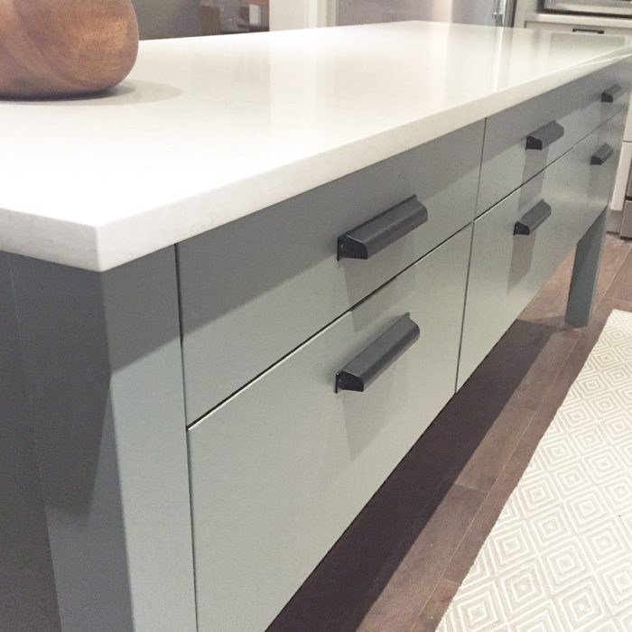
The island is exactly what I had envisioned when I first saw the house – a long (but narrow) island in front of a wall of cabinetry. Because it is a narrow space, placing the island on legs gives it an airier feel. It really is a custom piece of furniture that you might see in an English country kitchen and has a ton of storage. I love it and the gorgeous Silestone counter. It’s 8′ of functionality and prettiness all combined into one. My daughter says it looks like it should be on a cooking show set so whenever I’m cooking I humour her by pretending I’m a celebrity chef.
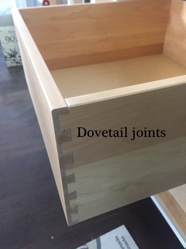
One way to discern whether cabinetry is well made are dovetail joints:
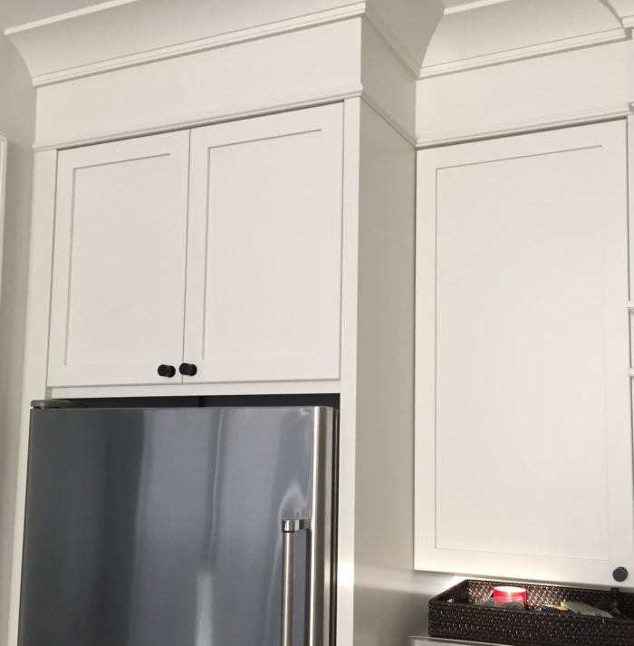
And the beautiful crown moulding from Metrie was installed. My cabinetmaker built a frieze so that the crown would reach the ceiling. Nothing worse than crown that is a few inches shy of the ceiling like I had in my former kitchen. And I love the off white cabinetry colour – Benjamin Moore Silver Satin.
My to do list is pretty much the same as last week:
- install hood fan (there was a little snag with this and the duct work so the decorative hood fan has to be reworked)
- install backsplash (down to the wire – happening next week)
- install pendants (another snag – hoping I will have them for the photo shoot) and wall sconce (installed this Friday)
- install drapery (this Friday with Q Design)
- paint counter stools – thank you to my friends at Paint it Like New who are taking this off my hands.
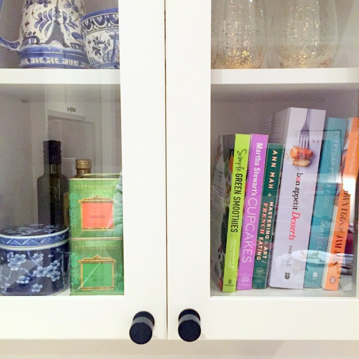
- style it pretty (my most favourite part.) I couldn’t wait to play around with the glass door cabinets and display some pretty things. Most items I already had but some are purchases from the revamped Wiliams Sonoma store in Yorkdale – love!

Go check out what the other guest participants are up to here and the 20 designers here. And don’t forget to follow me on Instagram where I share more sneak peeks.
Have a happy week!


Tim@DesignMaze
October 27, 2016LOVE that crown moulding and the silver satin! Wish I could do the same at my client’s kitchen but her uppers set in too far and it would look funny to have them “extended” to the ceiling. That island is gorgeous and can’t wait to see the other side of it as well for seating and entertaining.
Can’t wait to see what you will cross off the list in Week 5!
Shela
October 27, 2016Looking great Vanessa,
Amy @ Love On Sunday
October 27, 2016Hi Vanessa! I love the crown moulding and the cabinet colour. I also love how both you and Tim are working on a kitchen for this challenge….I’m dreaming of making over my own. It needs serious help so thank you for the inspiration!
Cassie Bustamante
October 27, 2016that island is DREAMY! love it so much, vanessa!
Ashley
December 17, 2017I love the island. Can you share any of the design details? Dimensions, materials, etc. Thanks!