Hello,
(“Spring” in the title is really a misnomer as most of Ontario is being hit hard this weekend with an ice storm – in mid April! Drive safe everyone. )
So I’m a little (ok, a lot) late with my weekly One Room Challenge update. The main reason is because I jumped in this round really late, like the day before it started. Yikes! I really struggled with what to do. I’m tackling my daughter’s bathroom and you can see the Before’s in my Week 1 post here.
Remember last week when I said I wasn’t going to replace any of the tile or the tub? Well, I had a change of heart. I always tell clients why spend money on a beautiful new kitchen, for example, when you are going to keep the basic builder (usually ugly) tile. So, I needed to heed my own advice and spend money to do it right. So, I am replacing the floor and shower tile and the tub as well.
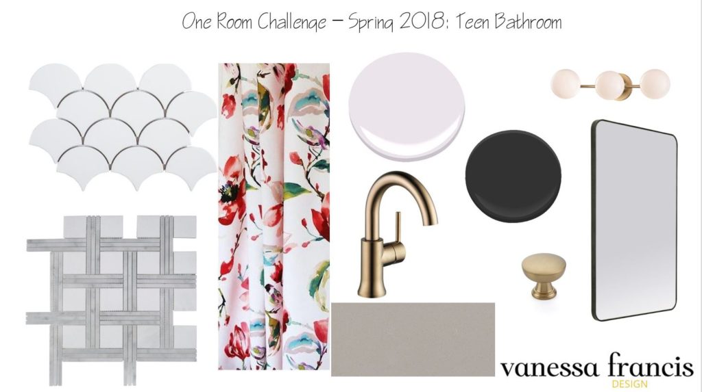
When designing a space you don’t want too many competing patterns so I always like to think about where should the pattern go. In this case, I am using this beautiful marble tile from Jeffrey Court on the floor (the basket weave shown below.) It’s a little bit different and very luxe. The white fish scale will go on the tub surround – again, a little different than subway tile, which don’t get me wrong I absolutely love and it was my initial thought. So, those are two beautiful patterns happening in the room already.
Now, the big question – statement wallpaper or statement shower curtain? That has been the most difficult decision because as you know I love wallpaper but I have a lot already in the house and my client (my daughter) didn’t really care either way. I have come up with two design plans that are pretty similar except one has a custom shower curtain and the other has wallpaper.
Option 1: The one thing my daughter was sure of was she wanted a faint lavender on the walls so I chose the fabric below which has shades of lavender in it. I thought of doing shiplap on the vanity wall (rather than wallpaper) – but is that too over done and I wouldn’t want it on all walls just the back wall so that may look a little odd. Hopefully, the wall colour with the mirror, lighting, faucet and black gloss vanity will provide enough interest.
Option 2: I have loved this wallpaper for ages and it was recently released in this blush pink colour so I think it would look amazing on the vanity wall. My daughter wanted a busy palm tree pattern but I think she will love that this is a little quieter and she won’t tire of it.
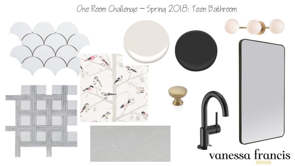
Both the counter images are from Caesarstone and I am undecided which to use so you will have to stay tuned for that as well as the other design choices.
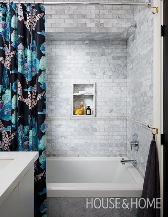
Here are some inspiration photos that I absolutely love – with either statement wallpaper or statement shower curtain:
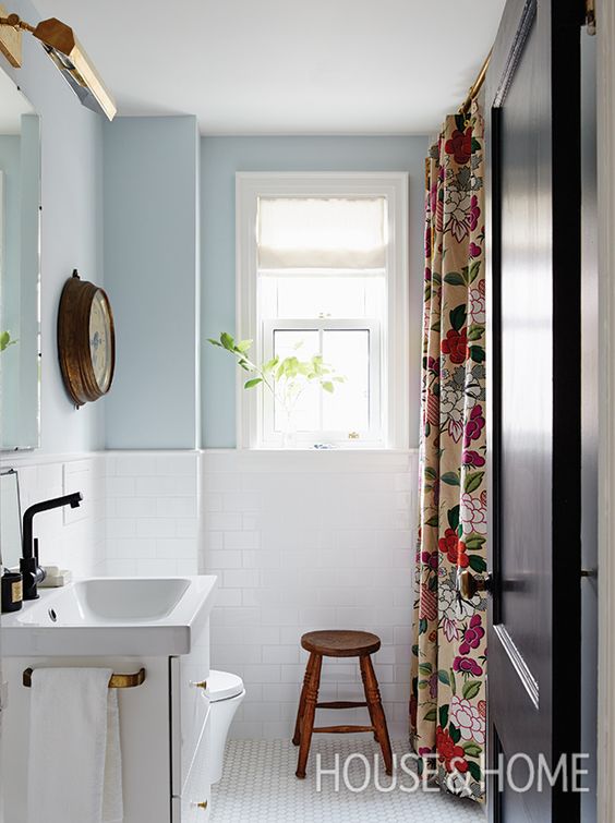
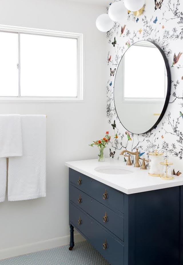
I had to include my daughter’s bathroom from an ORC three years ago as it is another good example of how one wall of wallpaper can have a huge impact.
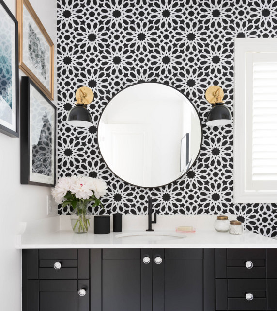
So which direction do you think I should go? I need to make a decision – like yesterday.
You can read the posts of the 20 featured bloggers here and the rest of the guest participants here. And as always, thank you for following along and leaving a comment.

Check out my former One Room Challenge Reveals here:
Prettying Up a Builder Kitchen (former home) – Fall 2014
Teen Daughter’s Bathroom (former home) – Spring 2015
My Parisian Bedroom (former home) – Fall 2015
Teen Daughter’s Bedroom (former home) – Spring 2016
My Charming Kitchen – Fall 2016
My Functional and Pretty Office – Spring 2017
A Multi Purpose Basement – Fall 2017
Feel free to connect here:
Instagram | Pinterest | Facebook | Twitter
Happy decorating,
 {Please feel free to email me at decorhappy@gmail.com if you are interested in a design consultation. I am not taking on any projects at the moment – two to three hour consultations only. So if you need a fresh pair of eyes and ideas for your space, or advice on a kitchen or bath reno, please reach out.}


Michelle @ Eamonn & Jack
April 15, 2018I love the first one – I think it’s the deeper colours in the shower curtain?? It’s so striking!
Vanessa
April 15, 2018Thanks so much Michelle! I love that fabric so we will see.
Cathy
April 15, 2018I also love the first one. That fabric is beautiful!
Vanessa
April 15, 2018Thanks for weighing in Cathy!
Joan S
April 15, 2018I love option 1. Plus your daughter really wanted lavender, so bonus!
Vanessa
April 15, 2018Yes, she really wants lavender of all colours. LOL Thanks!
Carley
April 15, 2018Option 1! I’ve seen the bird wallpaper a lot and I love the mix you have in option 1 – sophisticated!
Vanessa
April 15, 2018Yes, I know that bird wallpaper is popular but haven’t seen it used much in the blush colour yet. Thanks for your input!
Mary
April 15, 2018I like Option 2. The wallpaper adds a soft, dainty, feminine feeling.
Vanessa
April 16, 2018Thanks Mary. Maybe we can do wallpaper in your guest bath?
Mary
April 16, 2018Yes! ?
Linda Moore
April 16, 2018I vote option 1. Brings in the right color now and can easily change it in a few years if you want a different look.