Hello there,
Welcome to Week 2 of the One Room Challenge where I am transforming my sister’s ugly duckling kitchen into a beautiful swan in just five short weeks. Did I mention that it is a total gut reno – everything is going/gone and that I am away for two of the five weeks of the reno? And that I have a full roster of other (patient) clients. I’m not complaining, life is good. If you follow me on Instagram, you would have seen that I was away in San Francisco and Napa last week on a Designer Retreat with the lovely folks from Zephyr. More on that front in an upcoming post but also check out the range hood from them below. All this to say that I am posting this at the 11th hour. But better late than never, right?
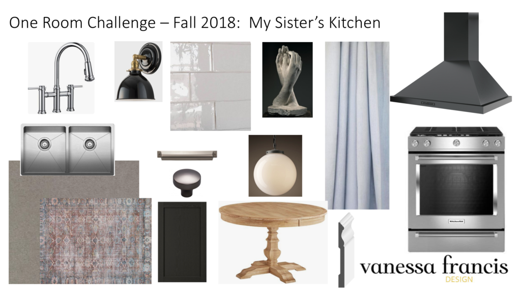
Last week, I shared the Before’s and inspiration which you can see here. Today I’m sharing the design plan that we came up with.

1. The beautiful faucet is the new Empressa bridge faucet from Blanco Canada. I love the modern take on a bridge faucet. The sink is my tried and true one that I love – I have it in my home as well. It is the Blanco Quatrus R15 U2. My sister is like me and much prefers two deep sink bowls rather than one large one.
2. The hardware is in the new Ash Grey finish from Top Knobs. I was going to do polished nickel but I kind of like the moodiness of the dark hardware on the black cabinetry. The base cabinets and pantry are black and the uppers will be painted an off white by Paint It Like New. We are using Ikea cabinetry as it is affordable and we are being budget conscious.
3. The range hood is the Ombra wall hood in black stainless steel from Zephyr. When I saw this on their site, I knew it would be perfect in Arlene’s kitchen with the black cabinetry. And then I saw it in person last week at the Zephyr showroom in San Francisco and the finish is quite stunning. I love how it comes in a range of CFM’s and all the contractor has to do is set it to the correct one for your space when installing.
4. The gas range is similar to the one I have from Kitchen Aid.
5. I always tend to defer to draperies in a solid neutral like the ones I have in my kitchen but Arlene and I talked about injecting a little colour into the space so we are using this faint blue linen fabric from Tonic Living. (Tonic is my go to supplier for affordable yet beautiful drapery.)
6. And yes part of the winning formula in a classic kitchen is white subway tile. This one has a handmade feel unlike the simple one in my kitchen.
7. For art, we are blowing up one of the photos I took at the Rodin art museum in Paris this summer – affordable and meaningful art. Arlene’s son Scottie came with us on that trip.
8. The baseboards and door casing will be from one of my favourite long term partners, Metrie.
And there you have it. Let me know your thoughts in the comments or if you have any questions.
I will share where we are with the renovation next week. A lot has been accomplished to date but we still have a long way to go. Fingers crossed everything will get done in time for the photographer who will be shooting it in just three short weeks!
Be sure to check out the featured designers here and the guest participants here.

Feel free to connect here:
Instagram | Pinterest | Facebook | Twitter
Happy designing and decorating,


tim@designmaze
October 15, 2018your kitchens are always amazing. .. one lucky sister you have there! love that you are using your own photo as art. I will have to look into that one day perhaps. glad to hear you had a great trip to SF, can’t wait to hear all about it when we meet up in person!
minimom
November 1, 2018what color white did you have the uppers painted?
Kacey
November 3, 2018I love the moodiness and drama I get from JUST the moodboard! I can’t imagine what the real thing will look like! BEST OF LUCK! I know it will be amazing