Hello there,
Welcome to Week 3 of the One Room Challenge where designers and bloggers transform a space in five weeks. My sister’s 23 year old untouched builder kitchen is the space we are completely renovating. You can see the Befores and the design concept in these two previous posts:
A lot has happened in the past few weeks and I am so happy to see how it has come together. My sister lives over an hour east of me but she has been providing me with daily (hourly) updates and getting my design input via Facetime and text. Oh the texts! LOL But she says she doesn’t want to make any quick decisions that come up during the process without seeking design advice from me as she realizes how “picky” I am. I like to think of it as ensuring that the outcome is aligned with the vision and yes, I have particular ideas about how things should be done and look from a design perspective.
This is how the kitchen looked with the original floor tile, paint colour and window coverings but with everything else removed.
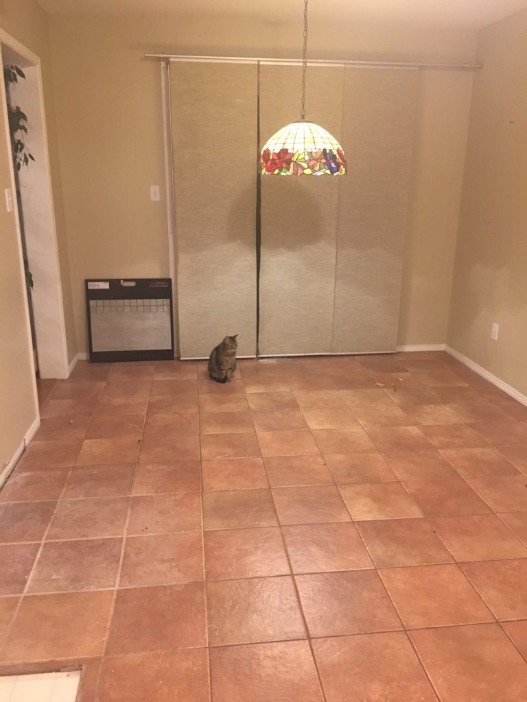
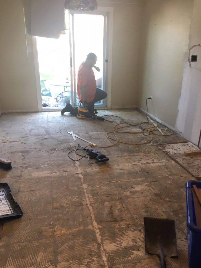
I’m so glad they decided to replace the terra cotta tile. At first, it wasn’t in the budget but then out of necessity, the tiles were removed and new large tiles installed.
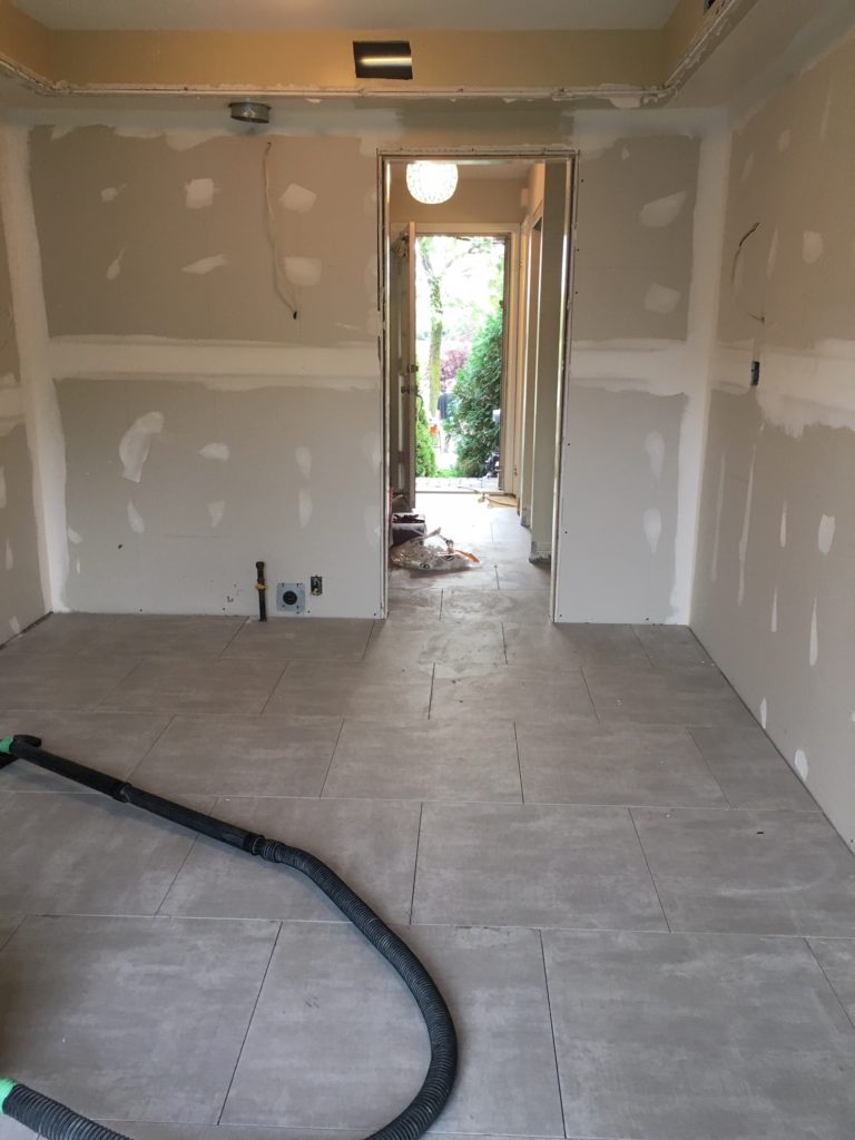
My sister chose this budget-friendly, large format 24″ x 24″ tile and I think it makes the small space look larger. It is neutral so won’t be overpowering like the terra cotta ones:
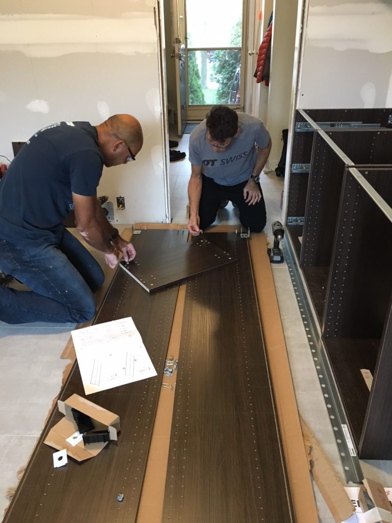
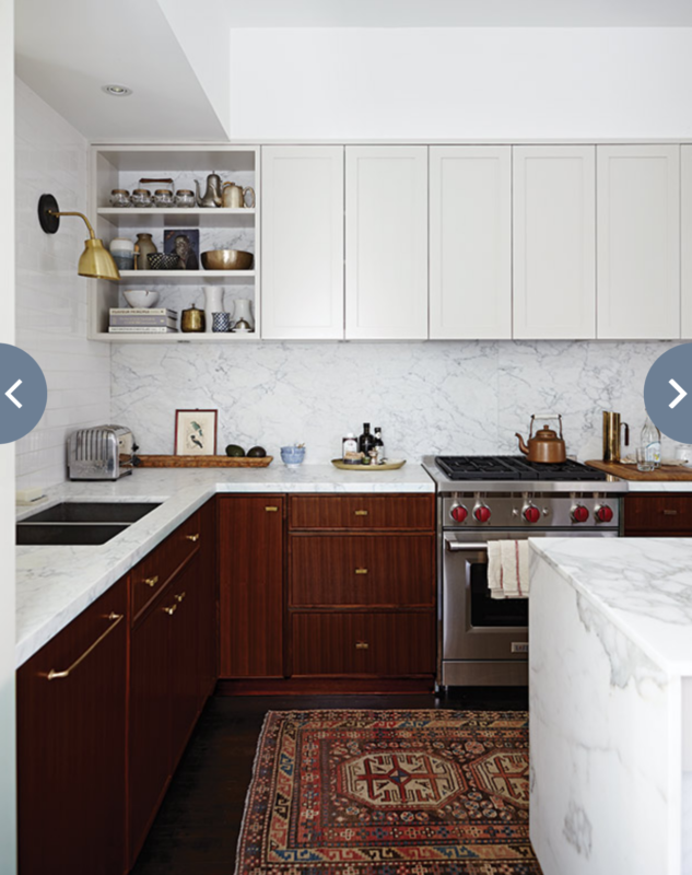
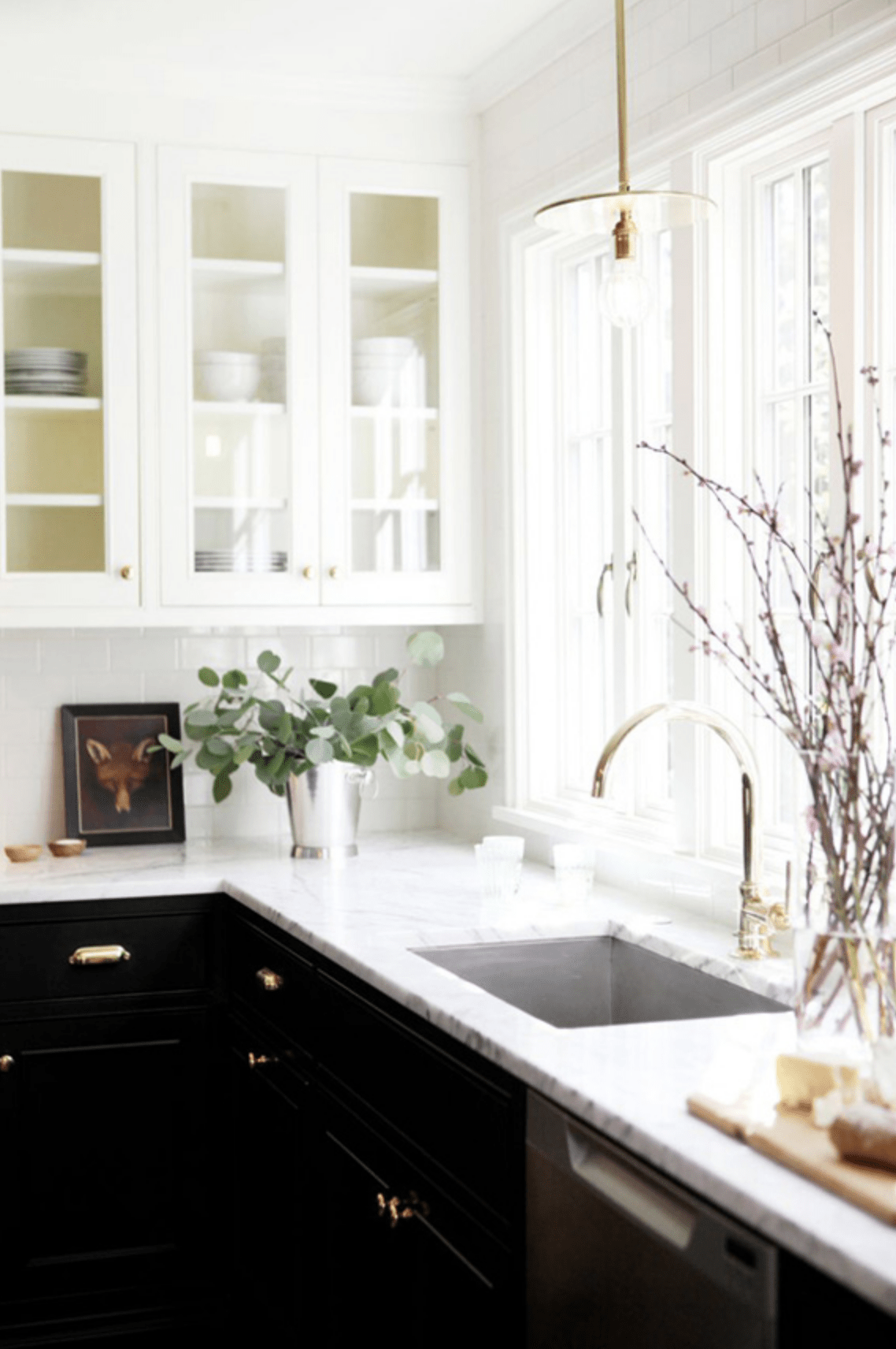
Then began the job of assembling and installing the Ikea cabinets. We went with a new shaker style black door front. (This photo is showing the cabinet interiors which are brown.) The base cabinetry and pantry will be black and then we had the uppers painted Sherwin Williams Toque White (a beautiful off white and also a very Canadian name. LOL) by Paint It Like New. My brother in law painted the upper gables and fridge gables by hand. I will share more of that next week. I have always loved the look of two tone kitchens specifically when they are black and white. The first image above has been a favourite for a few years and is the look and feel we are trying to achieve. Isn’t it stunning?
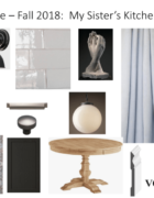
This budget kitchen is about taking something off the shelf and customizing it to make it look completely different and well, custom. Here’s a little sneak peak of where things are at the current moment.
The Before: 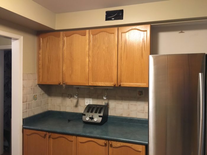
These cabinet doors were black and with the magic of paint they are a beautiful white.
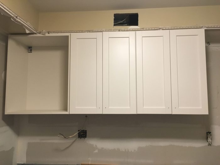
I shared the below image previously of Suzanne Dimma’s former kitchen (via House and Home) as inspiration. Rather than having an uninteresting wall of closed cabinetry, the cabinet on the left will be open so we can display pretty things. PILN did an amazing job of covering the bazillion shelf holes in the Ikea cabinet – just leaving the ones we are using for the two shelves. We are also painting the bulkhead the same colour as the ceiling so it disappears. Typically you would paint a bulkhead or riser and crown the same colour as the cabinetry but I have opted to paint it the same colour as the ceiling as in Suzanne’s kitchen. As I mentioned in a previous post, the bulkhead couldn’t be removed in its entirety from all three walls so we have to keep it. We are building it out so it lines up with the cabinetry. Ikea uppers are deeper by a couple of inches than traditional uppers.
Stay tuned next week for more progress.
Be sure to check out the featured designers here and the guest participants here. Thanks for following along. If you have any questions, please feel free to ask.

Check out my former One Room Challenge Reveals here:
Prettying Up a Builder Kitchen (former home) – Fall 2014
Teen Daughter’s Bathroom (former home) – Spring 2015
My Parisian Bedroom (former home) – Fall 2015
Teen Daughter’s Bedroom (former home) – Spring 2016
My Charming Kitchen – Fall 2016
My Functional and Pretty Office – Spring 2017
A Multi Purpose Basement – Fall 2017
A Teen Girl’s Bathroom – Spring 2018
Feel free to connect here:
Instagram | Pinterest | Facebook | Twitter
Happy designing and decorating,



Rhonda Notschaele
October 22, 2018This is going to look great. Love the black and white combo. Just wondering if it was cheaper to order all black fronts and paint the uppers white rather than ordering 2 different colours. I just thought repainting white Ikea doors with your white paint may have been easier to do.