Hello there,
And that’s a wrap! My ninth One Room Challenge is complete. I am so excited to share the reveal of my sister’s kitchen with you. It was a labour of love and I am so happy that Arlene is so happy with the end result. If she didn’t live an hour and fifteen minutes away, I would be over there every day for dinner admiring her kitchen. She is the most talented of chefs as well.
If you are new here, I’m an Interior Decorator located in Milton, ON, just 45 minutes northwest of Toronto. I absolutely love what I do and am so grateful that I get to do this on the daily. Also, to catch up on previous posts regarding this renovation, go here:
Week 1 | Week 2 | Week 3 | Week 4 | Week 5
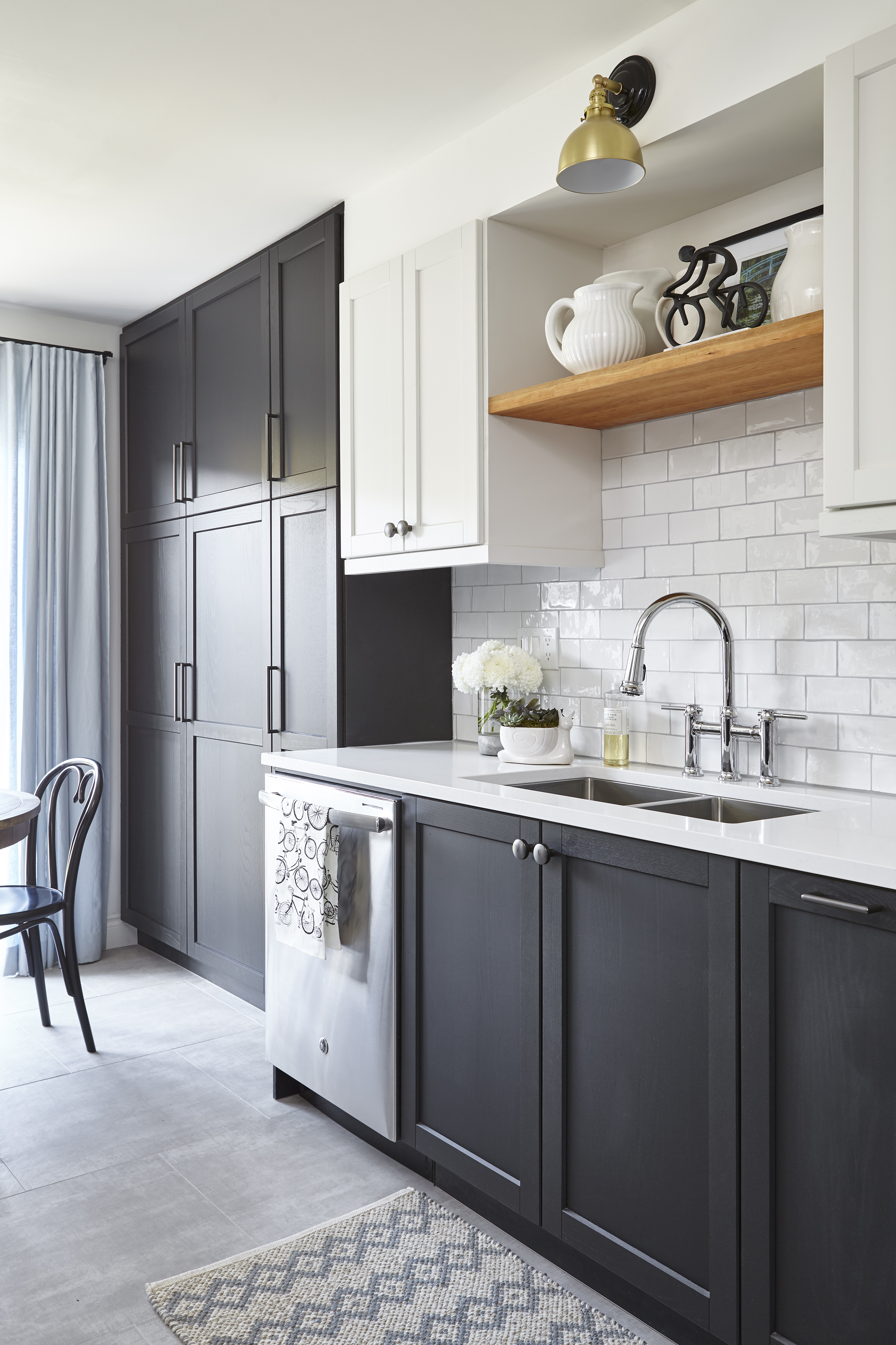
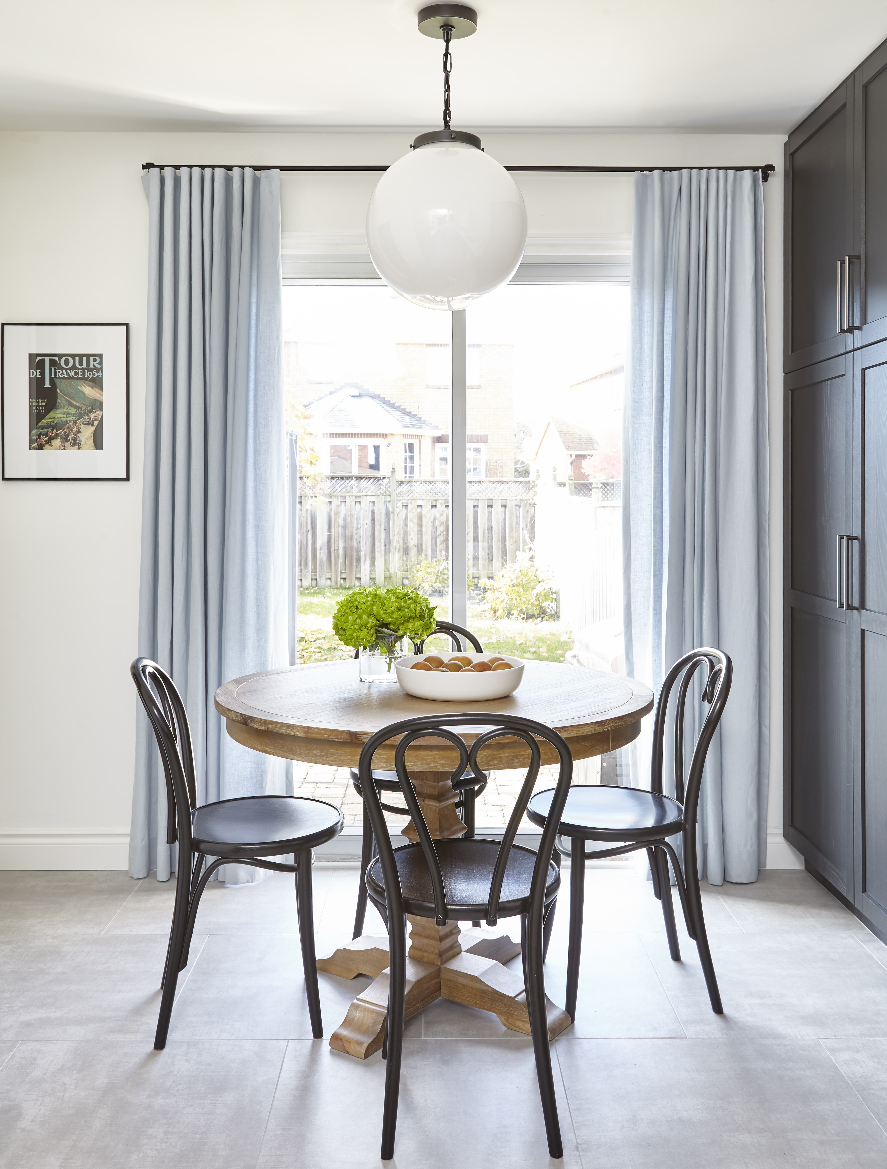
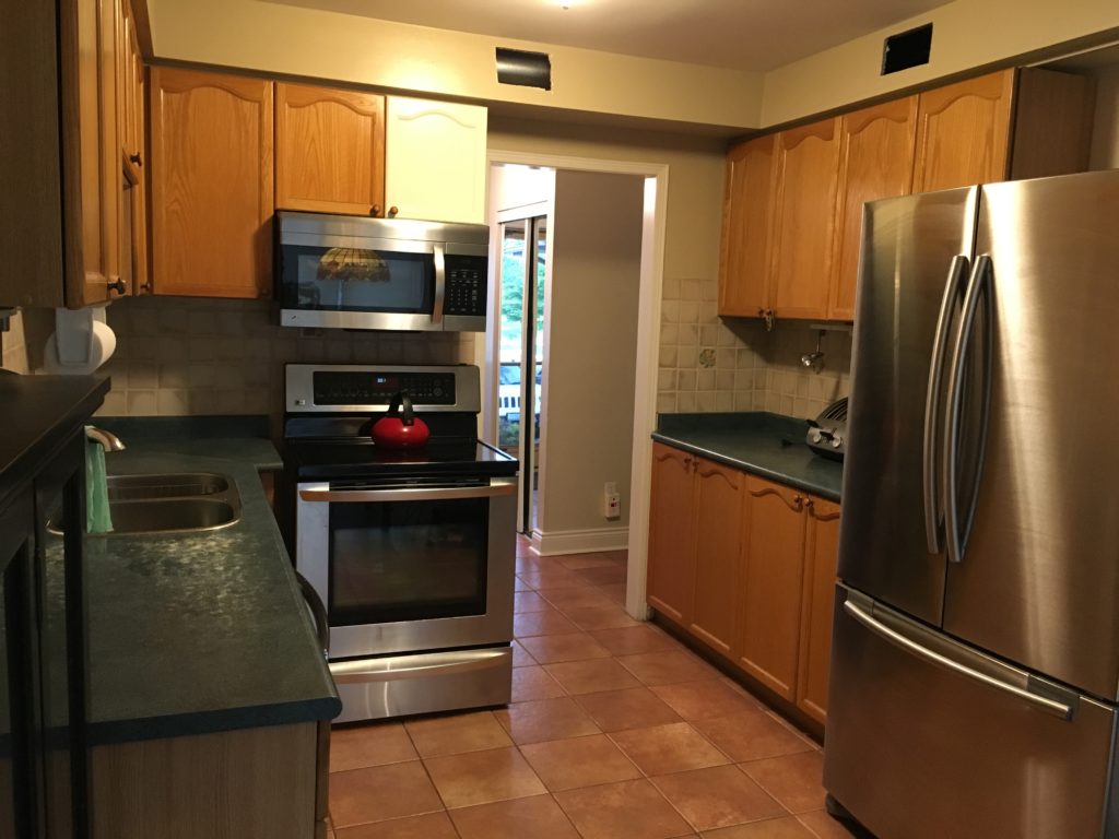
Let’s see the Before so you can see how far we have come in only a few short weeks. We did end up replacing the terra cotta floor tiles and I’m so glad we did. My sister sourced a very budget friendly large format tile in a neutral colour with minimal pattern.
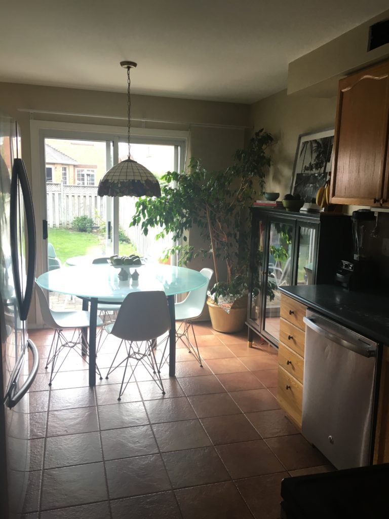
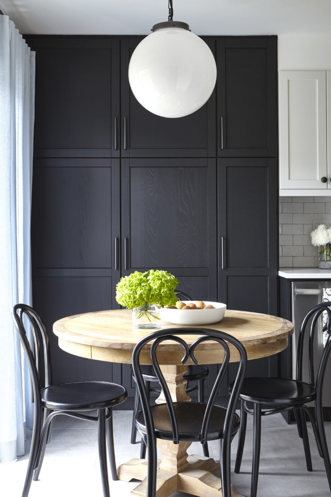
The large plant which is 25 years old was taking up too much precious storage space. A floor to ceiling pantry is a much better use of space, don’t you think? Having all of your food in one location rather than multiple cabinets is one of the goals when designing kitchens.
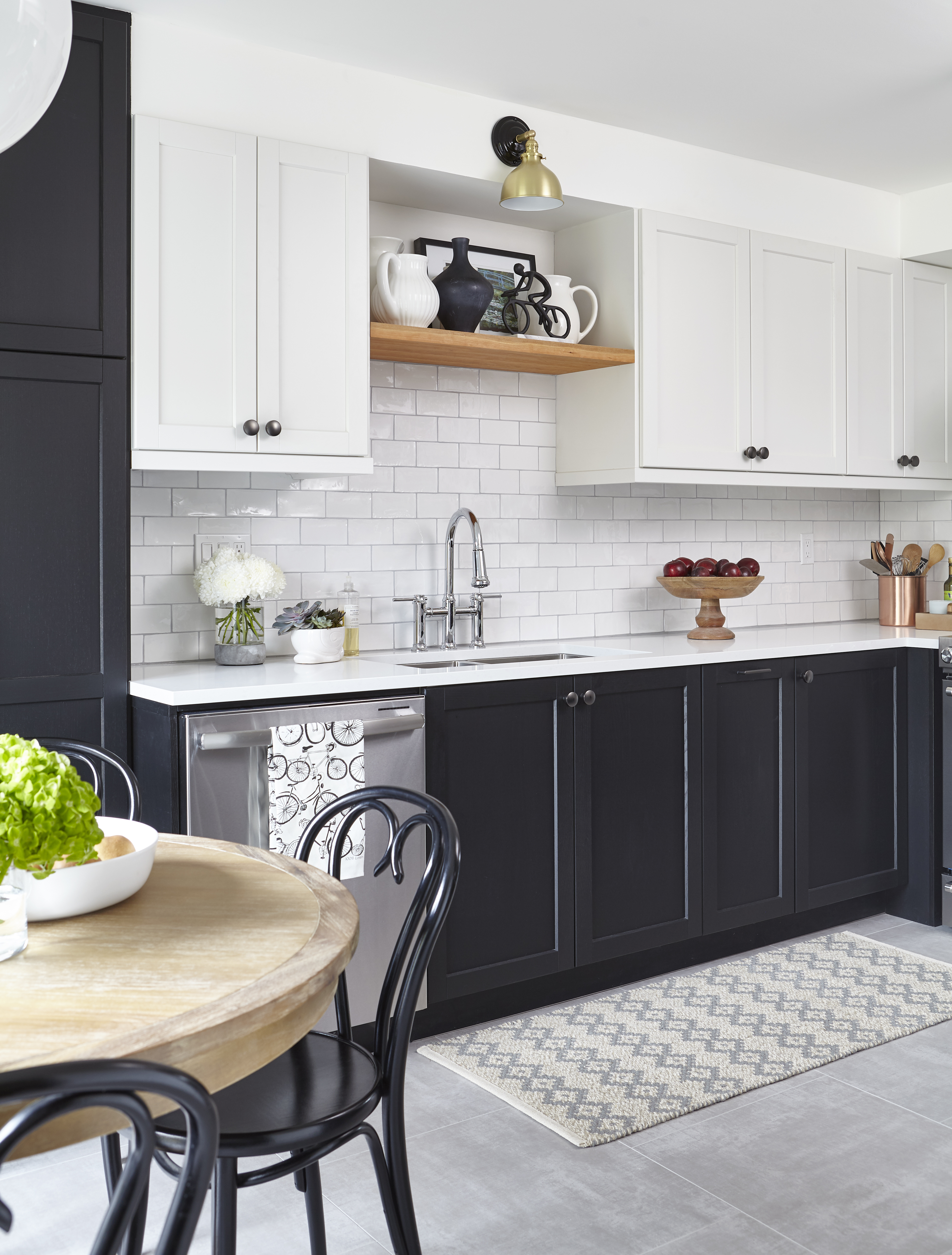
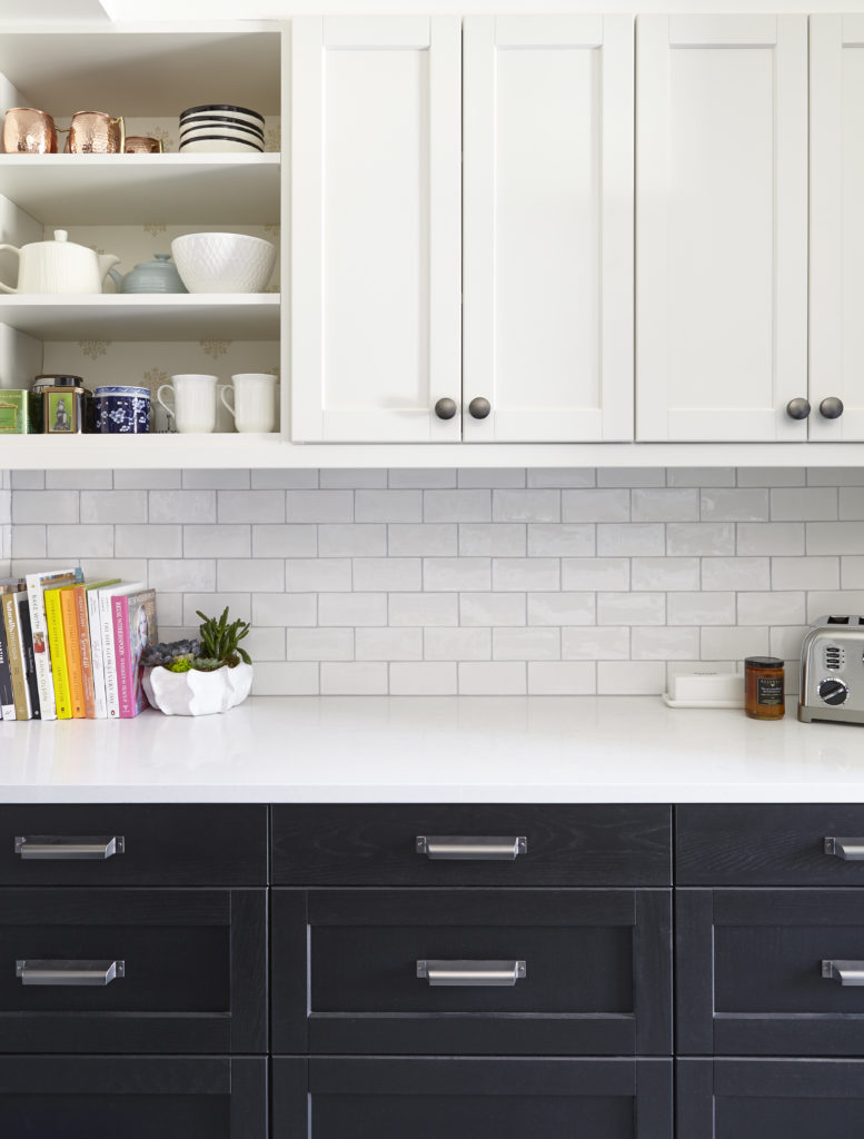
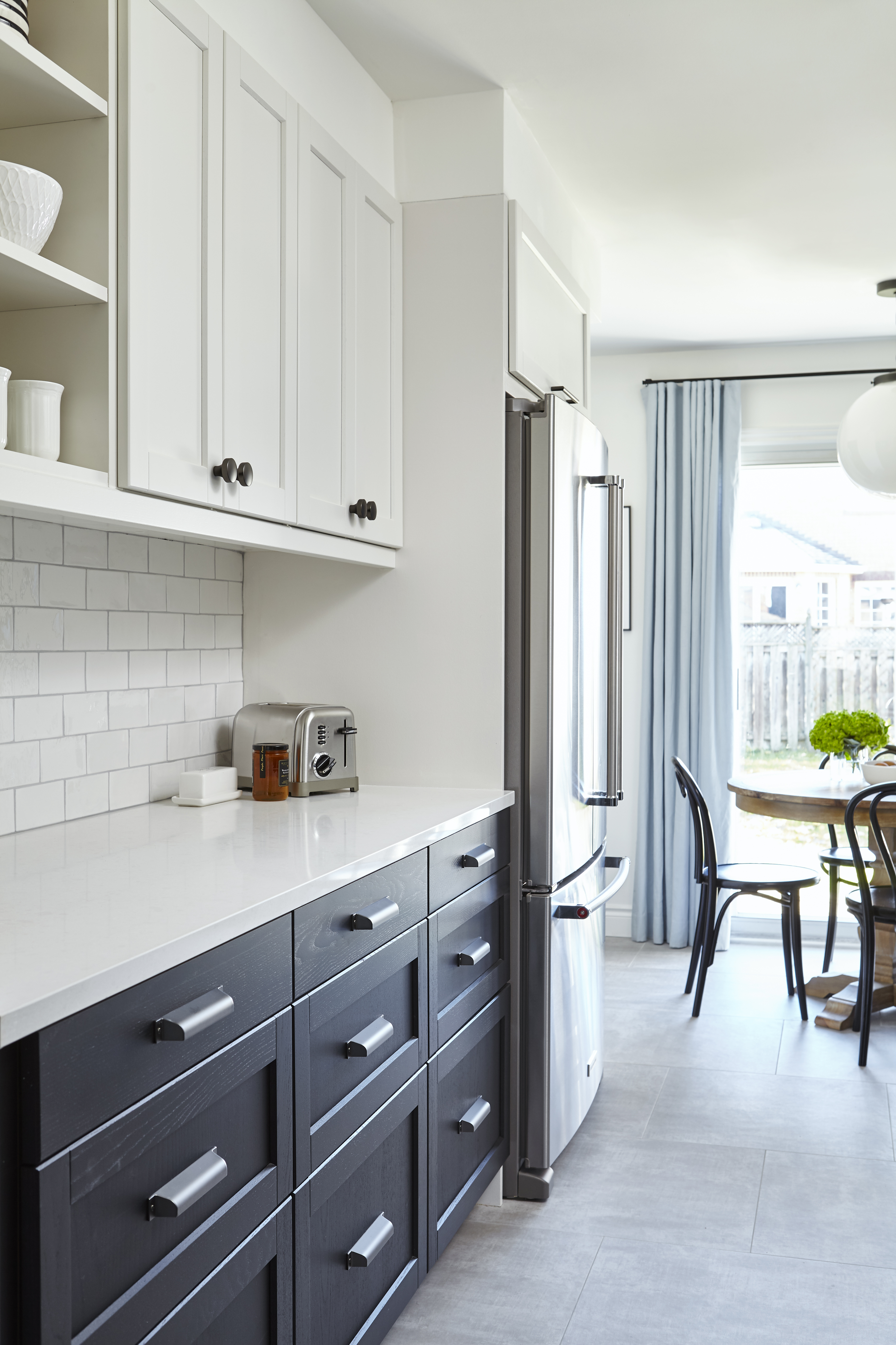
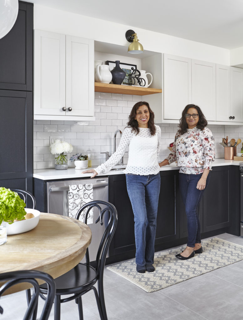
The cabinetry is from Ikea but you would never know as we had the uppers spray painted SW Toque White (so Canadian, eh?) – a warm greyish white. We didn’t want anything too stark. So, we took the black cabinet upper doors to Paint it Like New and they did a marvelous job as usual spray painting them. The black finish on the doors (both base cabinets and pantry) is how the Ikea doors come.
We could not get rid of the bulkhead in favour of taller upper doors unfortunately so we painted the bulkhead the same colour (BM Simply White) as the ceiling so that it would disappear.
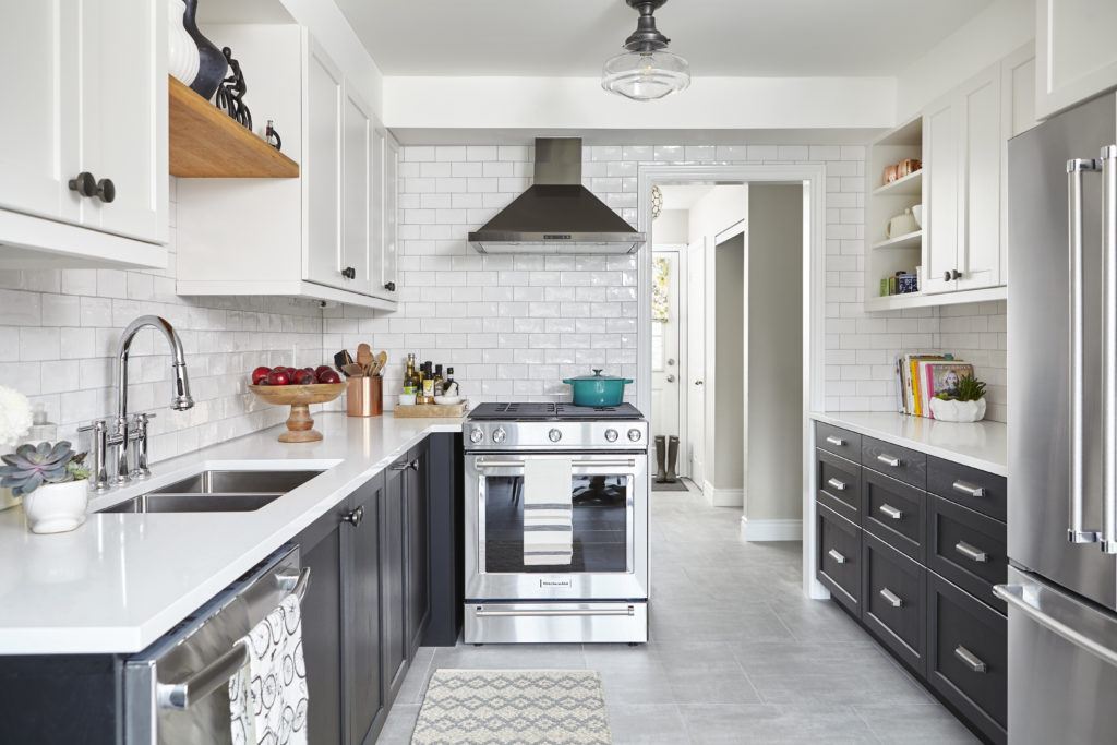
If you compare both photos, you will notice that we moved the sink and dishwasher a few feet to the left, thereby extending the counter and creating more prep space and more room around the range.

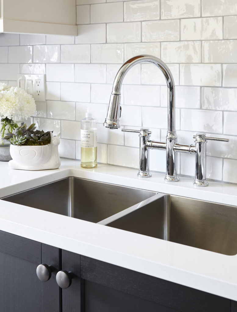
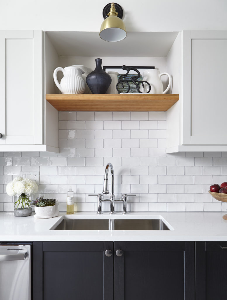
A close up of the beautiful Blanco faucet and sink. This is one of their new faucets and I just love the modern take on a traditional bridge faucet.
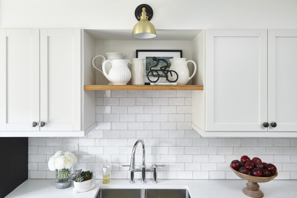
A wall of closed cabinetry in a kitchen can look uninteresting so I always find ways to add in some display. (In my own kitchen, I did the same thing as we did here but also added glass front cabinets.) I always think a little natural wood in a kitchen adds warmth and interest. So we opted for the single cherry wood shelf above the sink. I bought the Monet print when we visited Monet’s house in Giverny this past summer. Even though it looks perfect here, I just may steal it back. ?
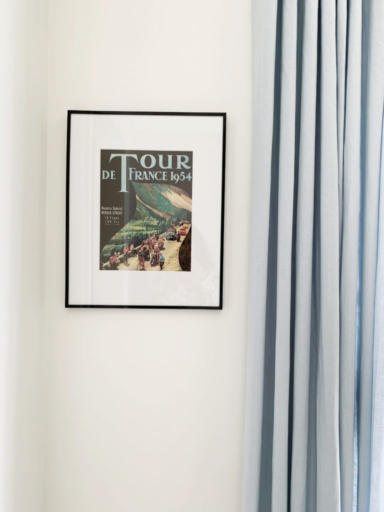
My sister and her husband have owned a bike store, Bicycles Plus, in Whitby for around 30 years and as a result they are both avid cyclists. They have even cycled several stages of the Tour de France over the years. There are a few references to their love of cycling in the kitchen: The vintage Tour de France poster that my nephew bought in Paris on our trip this summer; the tea towel that I picked up in Vancouver last week from Rain Goose Textiles and handmade in North Vancouver (my former home); and the black cycling statue on the marble stand from HomeSense , where the majority of accessories in the kitchen are from.
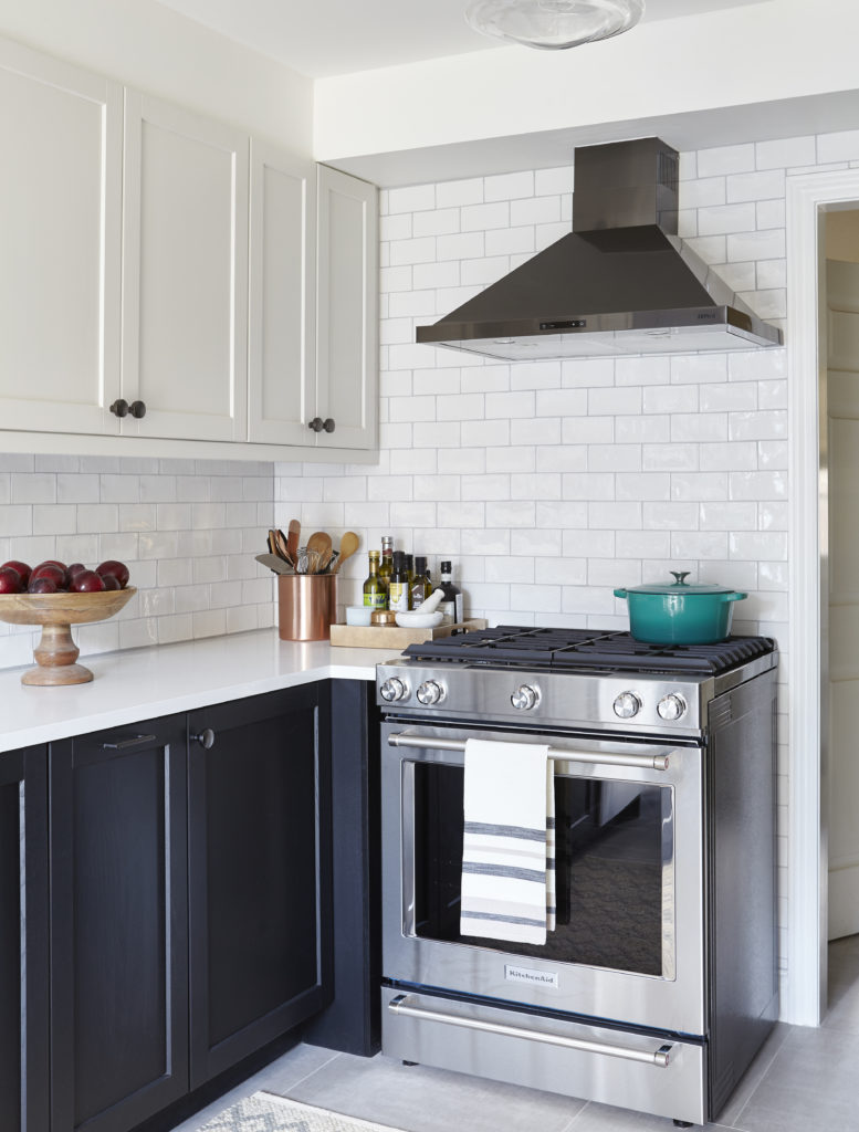
The Ombra range hood from Zephyr adds so much to the kitchen and the black stainless steel finish is perfect. I now think every kitchen needs a black stainless hood for impact. Yes, we did have to retrofit it because of the pesky bulkhead. It pairs so well with the hardware in the ash grey finish from Top Knobs.
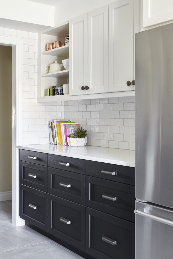
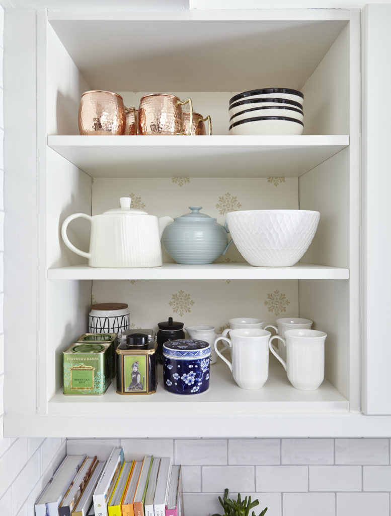
I try to incorporate as many drawers into a kitchen design as possible so on this wall we have 9 drawers. I love the cup pulls from Top Knobs and how the finish recedes into the black base cabinetry. Again, this wall would be lacking if we didn’t add this open cabinet at the end. My sister was a bit skeptical but when I showed her an inspiration image (Suzanne Dimma’s former kitchen which I linked to in a previous post) she was sold. In design, displaying objets is always a good idea. Notice how we ran the tile around the door for a seamless look.
I already had this Farrow and Ball wallpaper and it’s a pattern that I have always loved and luckily my sister did as well. It just looks perfect here.
At first we thought the light fixture was a tad too large but my feeling about lighting is to err on the side of the lighting being too large rather than not large enough. We both think it is the perfect size and the size down would have been too small.
Fiori Oakville is my go to florist and all the flowers and greenery were provided by them. They add so much life to any space.
At the outset of designing this kitchen, I thought that blue linen drapes on the patio door would be the perfect hit of colour and would work nicely with the black and white colour scheme. The drapes are from my go to online resource, Tonic Living.
Another Before photo so you can appreciate the After even more. Goodbye dated cabinet doors, green laminate counters and fruit backsplash.
This is an overview of the kitchen. Here you can see the trim from Metrie which mirrors the trim in the rest of their home. Simple and classic. We also changed the very large, protruding refrigerator in favour of a more sleek, counter depth one. The new kitchen feels so fresh and bright and spacious. The former kitchen was just sad and now you can’t help but feel happy in the new kitchen.
All photos by Valerie Wilcox except the close up of drapes and art
So what do you think? Quite the transformation. My sister and her husband are so happy. Both her kids are away at university so they will have to wait to see it. Here are her thoughts that she sent me: “I have been wanting a kitchen like this for many years so when Vanessa said she would like to complete my kitchen for the fall ORC I knew it would get done and get done beautifully. I am over the moon with the end result of the renovation. I always wanted a white kitchen but when Van suggested a black and white one I thought that’s a bit different so I said yes and we are now loving the two tone cabinets. It has so much character and I now think a totally white kitchen would have been very boring. Love the deep sinks and the faucet. Love the big floor tiles and how it makes the kitchen appear larger. Love the reflective quality of the subway tiles. Love the new appliances and the hood and all the new lighting. Love the little bit of open shelving. Love the extra counter space and extra cabinets, especially the tall pantries. I now have a place for everything. The many weeks without a kitchen was well worth it. It was finished on time as the contractors made sure they met the deadline. Going to really enjoy cooking and baking in my new kitchen.”
Sources:
Zephyr: Black stainless steel range hood
Blanco: Sink and faucet
Top Knobs: knobs, pulls, cup pulls
Metrie: casing and baseboards
Kitchen Aid: Refrigerator and range
HomeSense: Cuisinart pot on range, area rug, striped tea towel, white bowl on table, copper utensil holder, black cycling statue, white pitchers, copper mules, white mugs, white teapot, white bowl on shelf, some of the cookbooks
Paint it Like New: spray painting of uppers, light valences
Fiori Oakville: Flowers and succulents
Tonic Living: Drapery
Thank you to the brands that partnered with me on this project. My sister and I truly appreciate you! Thanks to Linda from Calling it Home who is the visionary behind the ORC and works behind the scenes so that all of you can be inspired by the transformed spaces. Thank you to my baby sister who trusted me with this project and let me have free reign with the design. She now knows all the millions of details that go into a renovation project and said she couldn’t have done this without me/a designer. And thank you for following along. If you have any questions, please feel free to ask. And I know many people don’t read blogs any more or leave comments but I would so appreciate it if you left your thoughts and if you participated in the ORC as well, I would love to see your reveal.
Be sure to check out the featured designers here and the guest participants here. I have seen a few reveals so far and they are pretty amazing so be sure to follow the #oneroomchallenge and #bhgorc hashtags on Instagram. Very inspiring!

Check out my former One Room Challenge Reveals here:
Prettying Up a Builder Kitchen (former home) – Fall 2014
Teen Daughter’s Bathroom (former home) – Spring 2015
My Parisian Bedroom (former home) – Fall 2015
Teen Daughter’s Bedroom (former home) – Spring 2016
My Charming Kitchen – Fall 2016
My Functional and Pretty Office – Spring 2017
A Multi Purpose Basement – Fall 2017
A Teen Girl’s Bathroom – Spring 2018
Feel free to connect here:
Instagram | Pinterest | Facebook | Twitter
Happy designing and decorating,


cassie bustamante
November 8, 2018it looks amazing, vanessa! i love the eating nook- that huge light fixture!!!
Vanessa
November 8, 2018Thank you so much Cassie! Yes, we were worried about the size of the pendant but I think it’s perfect.
Lesa
January 29, 2019It looks amazing! Did I miss the name/material of the countertops? Thanks!
Jordana @WhiteCabana
November 8, 2018You are definitely a master designer of kitchens, Vanessa! This one turned out beautifully! It’s inviting and modern, and you’ve thoughtfully included special elements that are just right for the family.
Vanessa
November 8, 2018Thank you Jordana. I always appreciate your thoughtful comments. xo
Nicole @ The Inspired Hive
November 8, 2018This is stunning! I love the pattern on the back of the shelves. The table and chairs remind me of my kitchen!
Vanessa
November 8, 2018Thank you so much. I must check out your kitchen now. ?
Carley
November 8, 2018Beautiful! I love the backsplash, the two tone cabinetry and that light! Congrats!
Vanessa
November 8, 2018Thank you so much Carley! Going to check yours out shortly. xo
Joan
November 8, 2018Beautiful space! Can you share details on the backsplash….it is wonderful!
Vanessa
November 8, 2018Hi Joan. Thank you. Yes it is the Masi tile from Centura Tile. ?
Mary
April 4, 2019Please let me know where you found the table and light! My kids just broke pur table and I lobe the one you used- Wishing You Well!
Mary
Tee at Beauteeful Living
November 8, 2018What a clean and beautiful kitchen makeover, Vanessa! Congrats on a job well done. I especially love the color scheme in this space.
Vanessa
November 8, 2018Thank you so much Tee! xo
Libbie@alifeunfolding
November 8, 2018Vanessa,
This turned out so beautiful! What a wonderful gift to give your sister make sure she makes a lovely meal for you to celebrate! Love the dining nook.
Vanessa
November 8, 2018Thank you. Yes, I’m sure she will have me over although she lives a little far from me unfortunately. ?
Debra
November 8, 2018What a great transformation Vanessa! I love the contrasting of the black and white.
Vanessa
November 8, 2018Thank you Debra. xo
Carrie Sampson
November 8, 2018This is so stunning, Vanessa! Well done!! It makes me eager to re-do my kitchen now.
Vanessa
November 8, 2018Thank you Carrie. A kitchen renovation can be life changing. I have experienced it myself. ?
Linz
November 8, 2018Wow! Great job making a small kitchen feel larger and function better without removing all the walls! It is gorgeous!! I love how removing the upper cabinets and microwave eliminate the claustrophobic feeling that used to be in this kitchen. The pantry wall is genius as well! So perfect??
Vanessa
November 8, 2018Thank you so much. Yes, claustrophobic is a good word to describe the old kitchen.❤️
karen
November 8, 2018Another standing ovation from Arizona. Beautiful as can be.
Vanessa
November 8, 2018Hello Arizona and thank you for stopping by and for the standing O.
Colleen
November 8, 2018This is giving me ideas for our (distant future) kitchen renovation, especially the open cabinet. Your basement reno is still my inspiration for when we get around to that in our house too. I love your style!
Vanessa
November 8, 2018And I love your kind words. Thank you. Happy to inspire. ?
Susie Brown
November 8, 2018STUNNING work girl!! Love it! Gorgeous gorgeous gorgeous.
Vanessa
November 12, 2018Thank you so much Susie!
tim@designmaze
November 8, 2018another beautiful kitchen renovation V! lucky sister to have you reimagined her dated kitchen into a sophisticated yet inviting hub for the family. the combination of open and closed storage is right on, especially with the full height pantry tucked to the back of the room. Great scale for the lighting fixture and so smart by painting to top wall same color as the upper cabinet to blend the two together.
Yes you need to be their house guest everyday to enjoy this beautiful kitchen!
Vanessa
November 12, 2018Thank you so much Tim! Appreciate your lovely comment. And so happy we finished another ORC together. Your client’s office is so glam!
Melissa @ Polished Habitat
November 8, 2018It looks 9 million times bigger and the dark lowers add so much grounding and interest! Another ORC win my friend! And I had to laugh when I got to the Reese Witherspoon book because you can spot it in my reveal photos too.
Vanessa
November 12, 2018Yes, I’m surprised at how much bigger it looks and feels. Great minds Melissa. Gotta love Reese, right? Thanks for stopping by. xo
Jana
November 8, 2018Vanessa it’s sensational, your sister must be thrilled! Congrats on another stunning transformation!
Vanessa
November 12, 2018Thank you so much Jana! xo
Jess
November 8, 2018WOW! What a wonderful sister you are! I can’t even tell that they’re iphone photos! Congratulations on this beautiful accomplishment!
Vanessa
November 12, 2018Why thank you. She’s pretty wonderful herself. Yes, I have the iphone X and it takes amazing photos. I swapped them out so these are all the professional photos now. ?
Emy
November 8, 2018It’s gorgeous! I love how much storage you added to the room!
Vanessa
November 12, 2018Thank you so much! ❤️
HOME DEKO
November 8, 2018This kitchen looks awesome ! it’s modern but still has traditional feel to it. Love the mix of colors and wood. Btw I used the same light fixture for my one room challenge! : )
Vanessa
November 12, 2018Thanks so much! Great minds re the light fixture. It looks perfect in your bedroom. xo
wendy clark
November 8, 2018As with all of your work this kitchen looks fabulous. What a transformation. Would you be willing to share the source of the backsplash tile and the grout color used?
Thanks.
Vanessa
November 12, 2018Thank you so much. The backsplash is the Masia tile from Centura tile and we used a light grey grout – sorry don’t remember the brand or colour.
Create/Enjoy
November 9, 2018Oh my gosh!!! It’s sooo beautiful! What a wonderful change! Love the lighting, the special tile, the simple colors.. great job!
Vanessa
November 12, 2018Thank you Suzannah! Love your bedroom transformation. xo
Nicole
November 9, 2018What a lucky sister! Stunning transformation and I know this was no easy feat! Especially loving that you ran the backsplash around that entire wall! Genius. And that you found a company that sprays cabinets so well. I need to see if they have a location here in Florida. Great job lady!
Vanessa
November 12, 2018Nicole! Thank you for stopping by sweet friend and for your lovely comment. Yes, Paint it Like New did an amazing job changing the black cabinets to white. Thanks again. xo
Sheri Bruneau
November 9, 2018What an amazing transformation! Your sister must be so happy!
Vanessa
November 12, 2018Thank you Sheri. She is. Love your bathroom transformation. xo
Nicki Parrish
November 9, 2018It is beautiful, and what a wonderful gift to give your sister! It’s amazing!
Vanessa
November 12, 2018Thank you NIcki! She owes me big time. LOL But happy to do this for her. xo
Erin
November 9, 2018I have been wanting to paint our uppers white and lowers a dark color. This is stunning and is my new inspiration photo!
Vanessa
November 12, 2018Happy to inspire Erin. xo
Nan, Odessa, DE
November 9, 2018Great!
Please give details on tall cabinet by table.
Thanks
Vanessa
November 12, 2018Thanks. The tall black cabinet is from IKEA. ?
Bridgetown Bungalow
November 10, 2018Job well done! Your sister must be very pleased and kudos for incorporating her personality with the cute bicycle decor.
Vanessa
November 12, 2018Thanks so much. Yes, had to include a nod to cycling as it is a big part of their lives. xo
Brenda
November 10, 2018Wow. The floor tile is just right and what a difference the cabinet depth refrigerator made. This kitchen looks so beautiful and functional. Love following your ORC.
Vanessa
November 12, 2018Thank you so much Brenda! ?
Arli
November 11, 2018Really gorgeous transformation. I would like a kitchen like this!
Vanessa
November 12, 2018Thanks so much! ❤️
Andrea
November 12, 2018What a beautiful remodel!
We have the same dining nook table and I’ve been looking for new chairs. Would love to know the details on those chairs!
Again, great job!
Lindi
November 12, 2018Vanessa! Your designs always blow me away and this is no exception! This is exactly what I want to do in my kitchen one day, with dark lowers and light uppers. Love your design!
Tracy
November 12, 2018It’s all beautiful. Congratulations! Can you pls share the source for the light fixture over the table? Thank you!
Marlene Meyer
November 24, 2018It’s amazing what a designer can do to transform a space! Just stunning!
Several of your posts have really helped me on my renovation journey. I think I’m sold on Lagoon Silestone in Suede because of your own kitchen. Please let me know if you still love it. All the Best!
Diane
December 31, 2018Beautiful, love that kitchen!! I’m going to see if your available to my house!
Susie | Chelsea Project
January 27, 2019So sad I missed this amazing reveal last fall, but thrilled to enjoy it today! It’s just so fabulous! Will you be my adopted sister?? I promise to give you full reign in my kitchen as well. LOL… super congrats on this great makeover! Susie from The Chelsea Project
Erica
February 7, 2019Would you mind sharing where the pantry cabinets are from and also the paint color used on them? I thought I heard IKEA and came here from the H&H video but don’t see that information listed anywhere. Love the makeover!
Saviesa Home
June 6, 2019What a beautiful and clean kitchen makeover, Vanessa! It was really a great transformation. I love the contrasting of the black and white.
Maggie
July 24, 2020I’d love to know the brand of floor tile. Can you share more here? Thanks