
Hello,
{Thanks for stopping by! If you are new here, I am an Interior Decorator located in Milton, ON and I love nothing more than transforming ugly duckling spaces into swans.}
I am renovating my tiny, basic laundry room for my tenth One Room Challenge. For those who have asked over the years, the ORC is not a competition and every one is a winner. What you win is a beautifully renovated and/or decorated space at the end. And for someone like me, who can’t make decisions on my own home (typical designer’s lament) the ORC has been a godsend. As a result, I have a beautiful kitchen I love to cook in, a home office I love working in, a basement I love hanging out in – well you get the picture. At the end of this, I will hopefully have a laundry room I will love to do laundry in! If you missed my previous two posts where I shared my inspiration photos, before photos and design plan, go here:
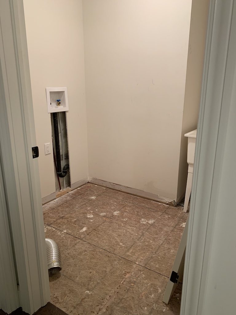
So all that happened this past week was the floor tiles, baseboards etc. were ripped out and the wall opened up. Because we are installing a backsplash above the counter, we need to lower the taps for the washer. By code, the taps have to be accessible, so my contractor will be cutting a hole in the counter so that I can access the taps if need be. We are at a standstill because the plumber can’t come until Saturday.
Also, some of the products I will be using have arrived. Make sure you follow me on Instagram as I share progress and product info in my stories.
Since I don’t have much to share with you in terms of progress this week, I thought I would chat a little about the design plan and how I came up with this scheme which I also shared last week.

1) One of the first design elements I think about when designing a space is the wall treatment. What can I do to up the ante of plain drywall? Wallpaper, trim or a fabulous wall colour usually come to mind. I really wanted to use wallpaper in my laundry room as it does so much to elevate a small space like this. Sue’s laundry room that she did for a previous One Room Challenge is a good example. So pretty! The room would be very bland and uninteresting without the gorgeous paper, right?
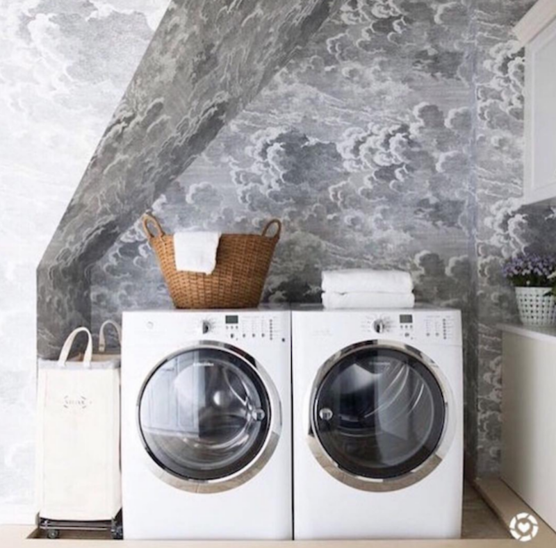
In my case, as I mentioned last week, wallpaper in the laundry room would compete with the beautiful wallpaper I have in the hallway just outside. So, then I thought of wall mouldings or an applied wall treatment and have always loved the look of shiplap but have never installed it in any of my homes. When I was at KBIS and IBS (Kitchen & Bath Show/International Builders Show) in Orlando in 2017, Metrie introduced their Option {M} Modern Farmhouse Shiplap and their Complete Pre Painted Shiplap which is ready to install – no priming or painting and in a beautiful white. A very easy weekend project to transform any room. I love the look of white shiplap but I thought for a little bit of drama, I would paint it a colour (yet to be decided by the way.) That is why I’m using the Option M shiplap. It comes in two widths in Ontario – 7″ and 11″ and I’m using the 7″ one installed vertically. This will help to make the ceiling height seem taller. It will look similar to the inspiration image below – so much character! PS Shiplap on a ceiling is a great way to cover over an ugly, popcorn ceiling without any mess. ?

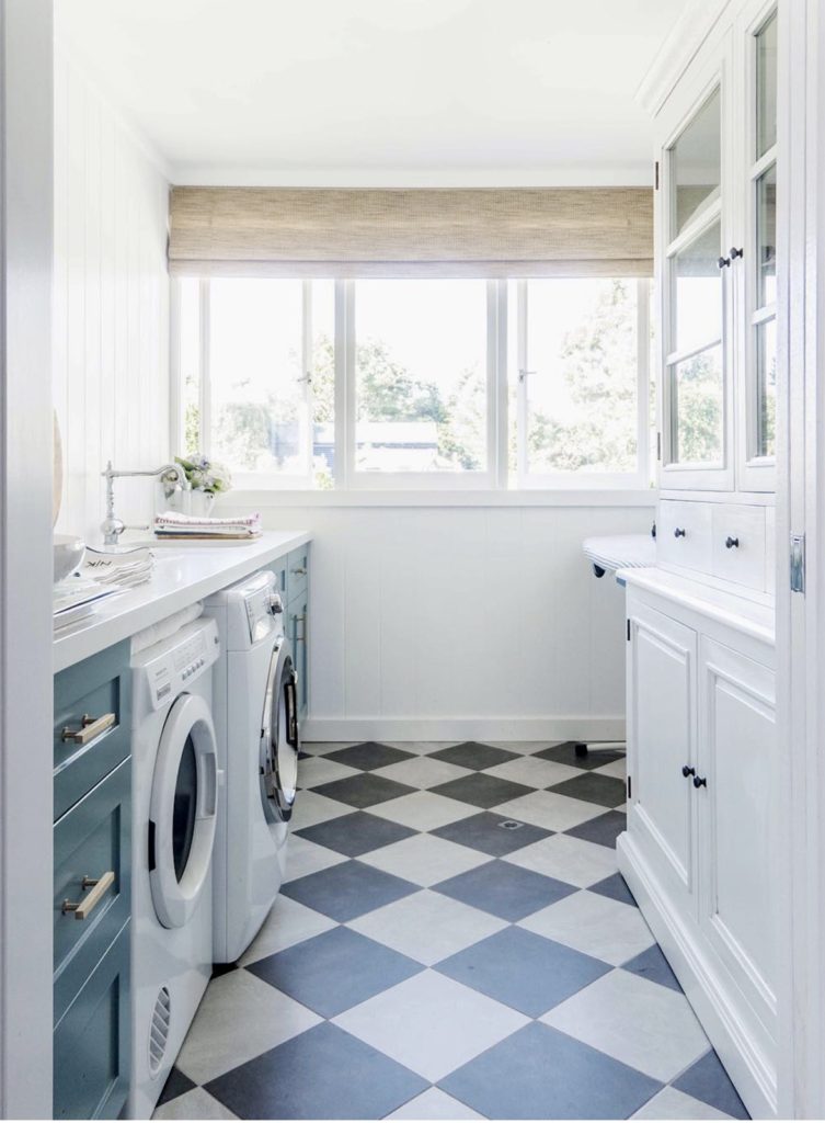
2) Another element to consider is the flooring and my original intention was to do a black and white floor similar to what Nicki did in her former laundry room below. But I had a difficult time finding smaller 12×12 floor tiles in black and an off white. Seems this size isn’t made that much any more as larger 16×16 or 12×24 floor tiles are more up to date and on trend. But look at how beautiful this look is!
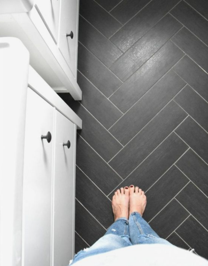
So, then I went to the second idea I had which was herringbone floors and ordered 3×12 black porcelain tiles which mimic marble. That should be going in this week so stay tuned! The penny round backsplash tile will also be black. This is an inspiration photo from Gemma’s bathroom renovation but mine will look a bit more speckly.
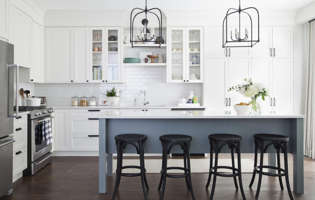
3) And then I think about the colour scheme. Because of my laundry room being windowless, I want to keep certain elements white. The Ikea cabinetry, the washer/dryer and the paint above the shiplap will be white. So now we have a neutral black and white backdrop to add colour to. You can never go wrong with a black and white backdrop and a hint of colour as shown in my kitchen below. PS I’m all about muted, greyed down colours as they are move livable and a perfect example is my island colour which is Benjamin Moore Night Train.
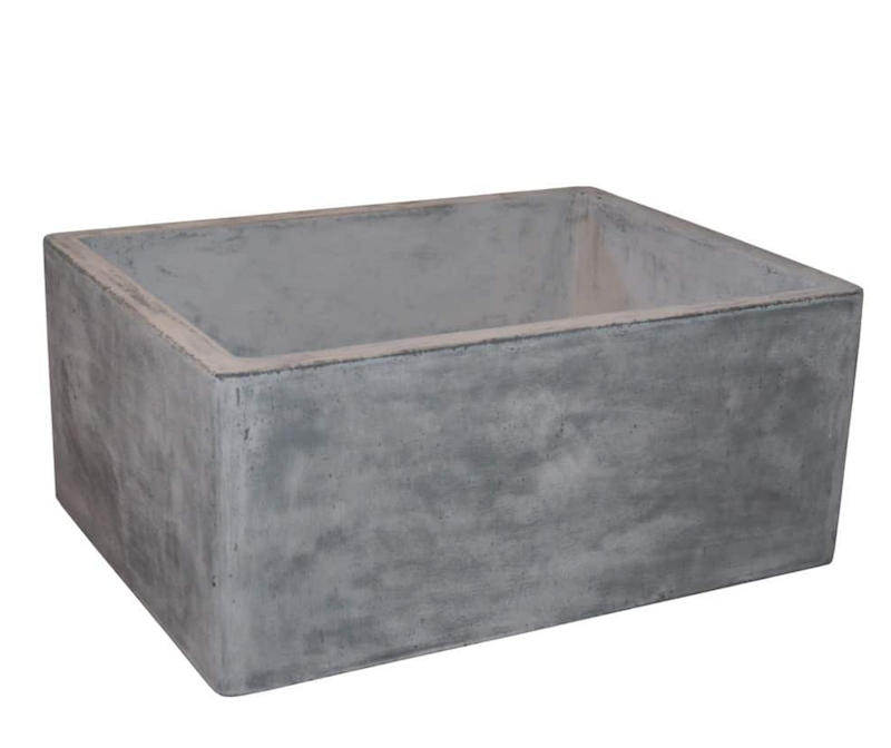
4) I always like to mix things up as well – a little bit modern, a little bit traditional, a little farmhouse thrown in for good measure. That’s why the rustic, concrete Native Trails sink I am using will be perfect with the modern, brass faucet from Wayfair Canada.

I can’t wait to see this come to life over the next two weeks. Yes two weeks – that’s when my photographer is booked. Wish me/my contractor luck!
Want to see more visions come to life? Check out the One Room Challenge blog. And follow these hashtags on social media to see 100’s of other transformations: #oneroomchallenge and #bhgorc
Thank you for following along!

Connect with me here:
Instagram | Pinterest | Facebook | Twitter
Much love,




What do you think?