Hey friends,
{Welcome to my little corner of the internet. If you are new here, I’m an Interior Decorator living in Milton, ON and I love to create beautiful, livable spaces. I believe that everyone should have a home that makes them happy.}
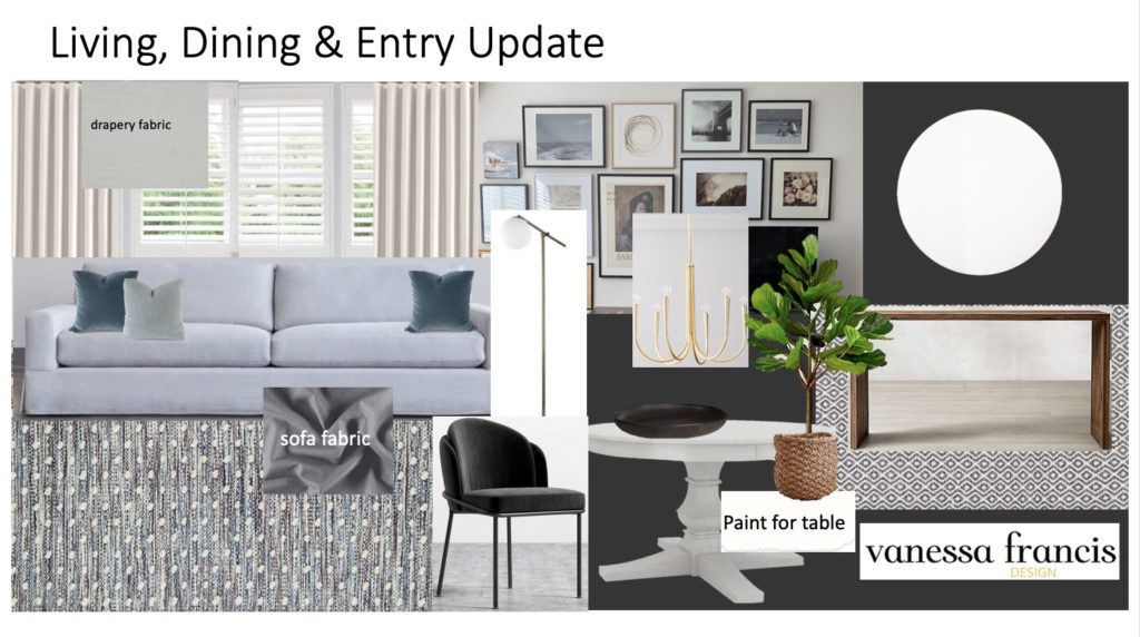
It’s time for another One Room Challenge Reveal! My eleventh one. I moved into this smaller home three years ago (after a life changing event) and have renovated six spaces – almost every inch of this home. But this ORC was a decorating project involving no construction, unlike the basement, kitchen and bath renovations I have completed for previous ORC’s. This involved just a few trades (painter, electrical), a sewing workroom, suppliers and some DIY. So, no matter what the project scope, there are always a number of elements to juggle and plan around so that everything comes together beautifully…within the timeline.
What is the One Room Challenge? It’s a bi-annual online event where design bloggers and designers renovate and/or decorate a space in five weeks. There are featured designers but anyone with a blog or Instagram can link up each week. If you missed some of my earlier blog posts, you can catch up here:
Week 1 | Week 2 & 3 | Week 4 | Week 5 | Reveal
How do you start the design process? When I’m working with clients, I come up with a design concept after multiple discussions about their aesthetic, lifestyle and needs. When I’m the client, this stage is so difficult because although I know what I like and don’t like, it’s sometimes so difficult to make decisions which can slow down the process. Not the best when you are on a tight timeline.
Anyway, after much deliberation (with myself), this is the concept I came up with. This is based on: my lifestyle and wanting a comfortable, unpretentious, inviting, pet friendly space; my aesthetic which is always evolving but I would describe as modern traditional, relaxed, pared down but still elegant, unfussy, neutral overall with a hint of colour; and needs such as a welcoming, functional entry, dining for 4-6 people and a comfortable seating area for relaxing, reading, tv viewing and entertaining.
And here is my vision come to life. You can go back to my first post to see the uninspiring Before photos. I had the entry console custom made and I just love its simplicity. The indoor/outdoor rug is perfect for an entry and is from Dash and Albert (Annie Selke.) The greenery is from Fiori Oakville. (All links are at the end of the post.)
I’m really liking the black wall – Benjamin Moore Onyx. It was an inexpensive update and if I tire of it, I can always change it. I have always loved the black/brass mix.
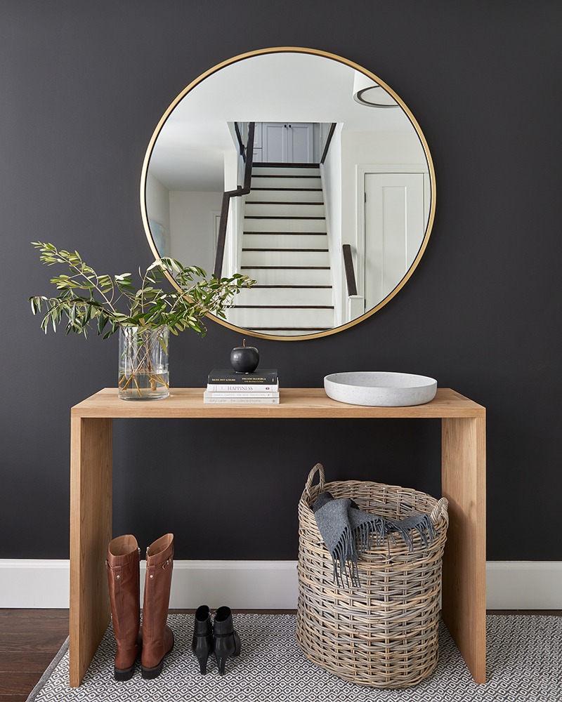
You can see why I opted to have a console rather than a bench in the entry. It makes for a great styling moment and can change with the seasons. Plus, there are dining chairs (and stairs) close by if someone needs to sit down to put on their shoes.

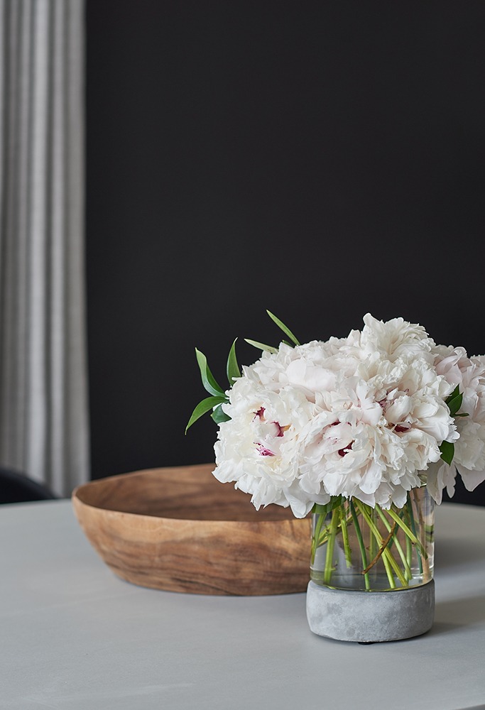
In the image below, you can see how small my first floor is. The entry flows right into the dining area. This is the table that I painted with Fusion Mineral paint. I just love the colour from the Lisa Marie Holmes collection called Goddess Ashwagandha. I’m all about reusing and repurposing furniture rather than always buying new. This table was just calling out for a makeover and I think it looks pretty amazing.

Peonies are my fave. That is all. And the drapes beautifully made by Custom Home Decor (trade only resource so contact me if you are in need of draperies) in a JF Fabric add so much to the space. This fabric looks like linen but is in an easy to care for polyester blend, Love.
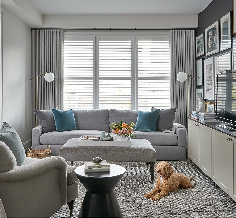
And this is my living room. I have had the chair from Whittington’s for maybe 12 years and I didn’t want to part with it because it is so comfortable. The only thing is that I couldn’t fit two chairs in the space but that’s OK because most of the time it is just the two of us. Plus we have a finished basement with a large sectional when a large crowd is over.
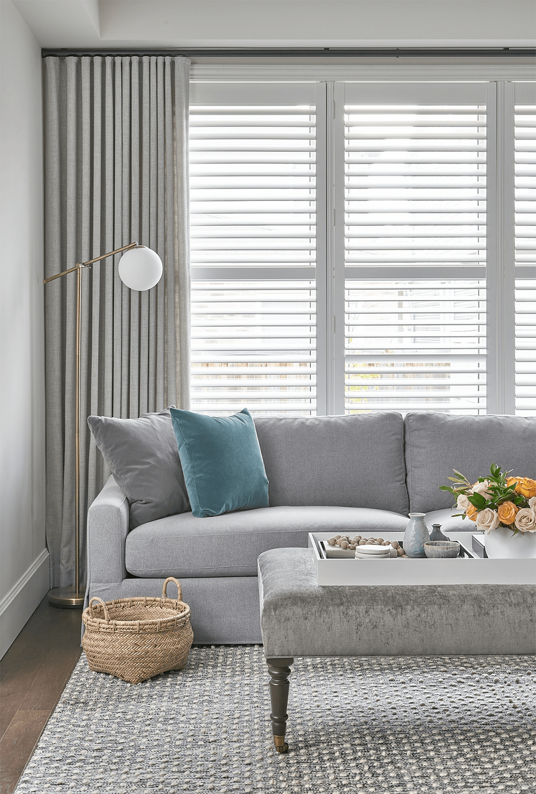
I wanted everything to be tone on tone, solid fabrics because the art is vibrant enough. But there is a mix of textures – velvet, linen and the rug has sort of a boucle look and feel. It’s indoor/outdoor but so soft on the feet. I already had the ottoman in that fabric and it works well in the space.
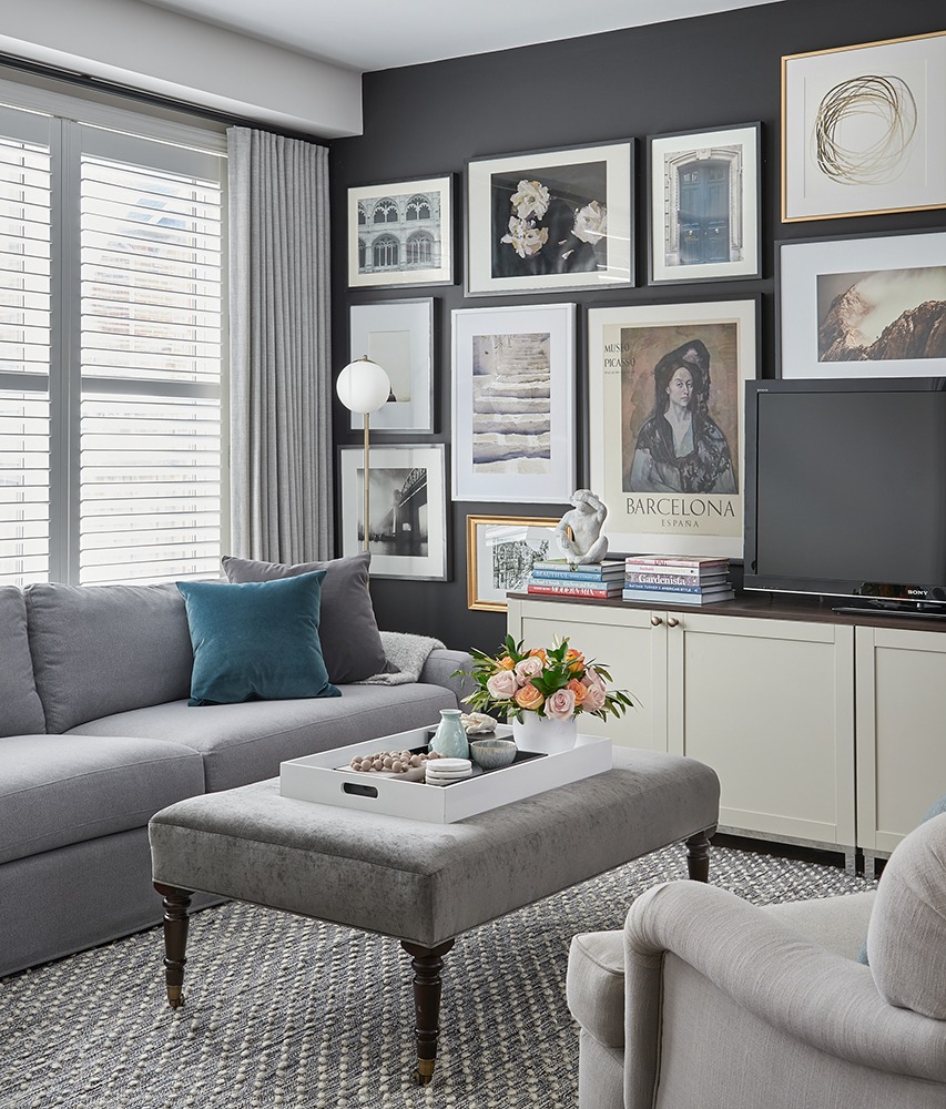
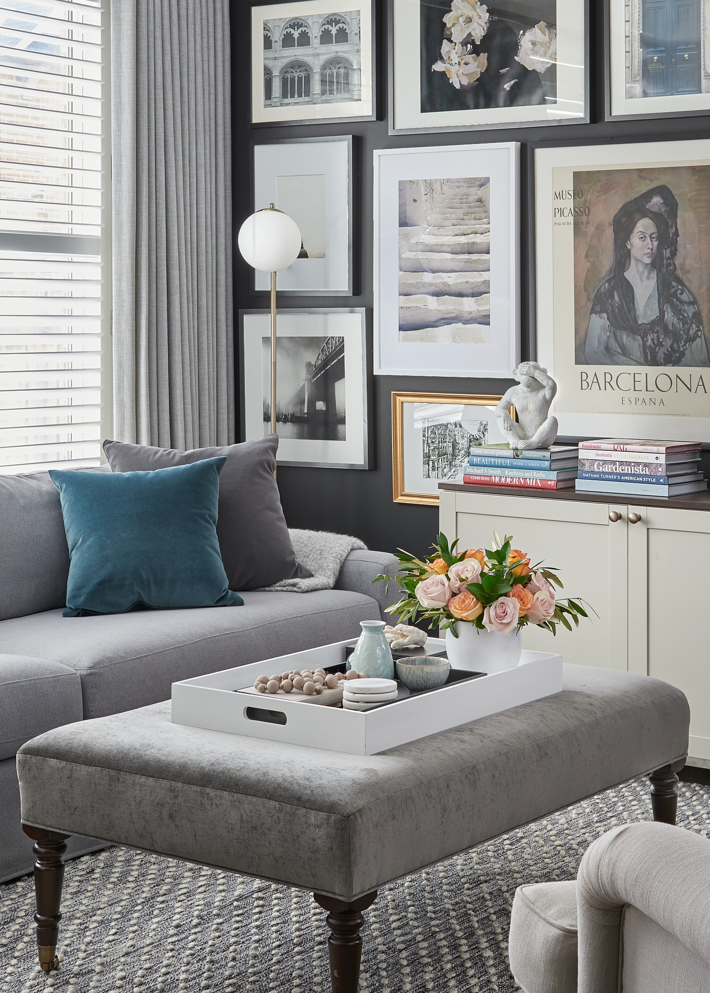
I think this is my favourite image from the shoot (below.) It has everything I love – art, books, flowers, comfortable seating, soft (yet practical) rug underfoot and a place to put your feet up. Oh, and something whimsical like the “see no evil” monkey – I just love him!

The beautiful 102″ custom sofa from Whittington’s is so comfortable. I had it upholstered in a performance fabric from JF Fabrics – a must when you have dogs who are prone to sit on the furniture with muddy paws etc. I’m trying to train my pup Ellie not to sit on the sofa but it’s not going so well. Do you want to know a secret? The floor lamps are from…Walmart! Can you believe it? I’m a big believer in getting the look for less and mixing high and low
I LOVE the art wall. It’s slightly different from what I had before. I added the photo of the teal door (I took that in Paris last summer) and a few other prints.
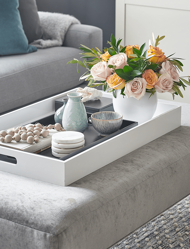
Styling the spaces was my most favourite thing to do. And beautiful roses for the win!
Of course Ellie had to get in at least one photo. She is way more photogenic than me! The spot beside the photo is where her dog bed goes.
I’m pretty happy with how it turned out. Let me know what you think in the comments. The photography is by the very talented and lovely Stephani Buchman Photography.
Sources:
Sofa and chair: Whittington & Co.
Fabric on sofa, chair and drapes: JF Fabrics
Entry and living room rugs: Dash &Albert for Annie Selke
Art: Minted, Etsy, my own photographs and poster
Sewing of drapes: Custom Home Decor
Teal and aqua velvet cushions: Tonic Living
Greenery and floral arrangements: Fiori Oakville
Fusion Mineral Paint, supplies and consulting: Decorative Dreams
Trim: Metrie
Accessories: HomeSense, Elte MKT, Crate and Barrel
I can’t wait to see everyone’s reveals! You can see the featured designers here and the guest participants here. And follow these hashtags on social media to see 100’s of other inspiring transformations: #oneroomchallenge and #bhgorc . Also, a big thank you Linda for creating this concept and hosting!
Thank you so much for following along and encouraging, engaging and being supportive here and on Instagram. I really appreciate it!

Take a look back at my other ten ORC reveals:
1) Modern Farmhouse Laundry Room Renovation
2) My Sister’s Kitchen Renovation
5) My Functional and Pretty Home Office
7) My Daughter’s Bedroom (former home)
8) My Parisian Inspired Principal Bedroom (former home)
9) My Daughter’s Bathroom (former home)
10) Prettying Up a Builder Kitchen (former home)
If you are in need of design advice, please contact me at decorhappy@gmail.com. I would love to help you create something beautiful!
Connect with me here:
Instagram | Pinterest | Facebook | Twitter
Cheers to a happy home,




Angela Nickerson
November 7, 2019Lovely! So sophisticated! Cheers to a great challenge!
Cassie Bustamante
November 7, 2019SO beautiful! I love love love the black walls and that entry especially!
Shelly
November 7, 2019Vanessa, your living room is just beautiful. You created such a warm and cozy space filled with lots of personality and style. Great job.
Karen
November 7, 2019So beautiful.really love it.
Give Ellie a bench at first, maybe a month. I can see she is plenty big enough to jump. She may be lazy,ha. I am giving you unsolicited advice , yet am having trouble with my own dog barking all the time.
Michelle
November 7, 2019Wow! Congrats on another beautiful space. I’m all heart eyes 🙂
Mary
November 7, 2019It turned out great Vanessa! The black wall looks perfect with all your furnishings and decor. Love the wall gallery.
Lynne
November 7, 2019Your space is just beautiful. Love the wall colour, beautiful art and cozy functional furniture.
Bev
November 7, 2019Love the gallery wall. You did an excellent job for the ORC. Does your design firm do work in the US?
Joanna
November 7, 2019Love it all! Your dining fixture is striking, as are your dark walls. It might be a small area but it has style and function.
I was wondering why you didn’t centre the console on the wall between the two windows but instead snugged it up to the window on the right.
Ashley Malone
November 7, 2019Love!! Would love to know the source of the dining chairs, if you’re open to sharing. Another great space!
Paula Moreshead
November 7, 2019What a beautiful and comfortable looking room! I’m not normally a big fan of dark colors on walls though I know it’s a popular idea right now, but I really admire the way you have done it without the room feeling cave like. Some great ideas for inspiration!
~Paula
Barbara
November 7, 2019I love that you reused things and that gallery wall is my favourite part!
Dorrie-Ann
November 7, 2019It is absolutely beautiful Vanessa…it all came together perfectly!
Carla Anderson
November 8, 2019Just beautiful! You’ve given me some more ideas and inspiration for our home I’ve just renovated, thanks!!
Suzannah Stanley
November 8, 2019Love this color palette! Very elegant! Great job!
Michelle
November 9, 2019I love your style! Another great reveal…
Bev Bossio
November 9, 2019What a beautiful, stylish, yet comfortable, room. I absolutely love it!
Danean Jones
November 9, 2019Beautiful! Love the entry and the gallery wall.
Angela Todd
November 16, 2019I love your style. It is so clean, fresh and full of sophistication and purpose. Beautiful space!
Stephanie Holmes
March 5, 2020Vanessa your living room design is beautiful. I’m a huge fan of dark colors on walls and it’s now a popular inspiration right now. I really like the way you have done it without the room feeling cave like. Some great ideas for inspiration!