Happy middle-of-the-week!
I finished this bathroom project last year and just realized that I never shared it on the blog.
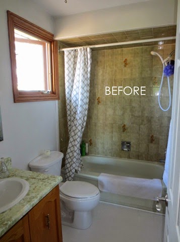
But let’s see the Before so that you can truly appreciate the After. 🙂
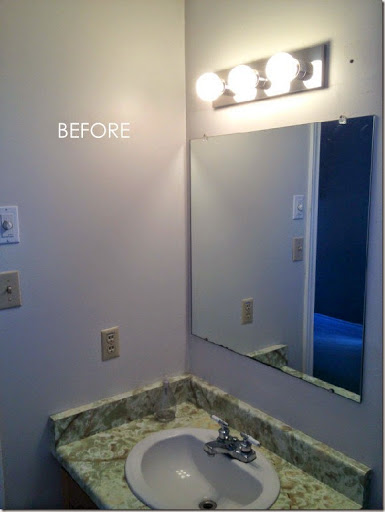
Yes, everything had to go!
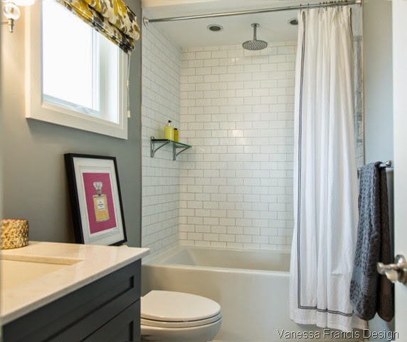
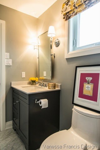
(Note: the client didn’t want to hang artwork and it looked so bare above the toilet so I brought one of my prints from home. You would probably never lean art on your toilet like this but I thought it filled in the space nicely.)
I have used the roman shade fabric on a number of projects over the last few years. Still love it! It’s from Tonic Living.
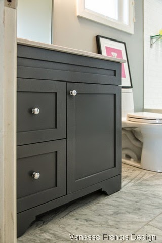
The vanity is custom and painted in Benjamin Moore’s Deep Space.
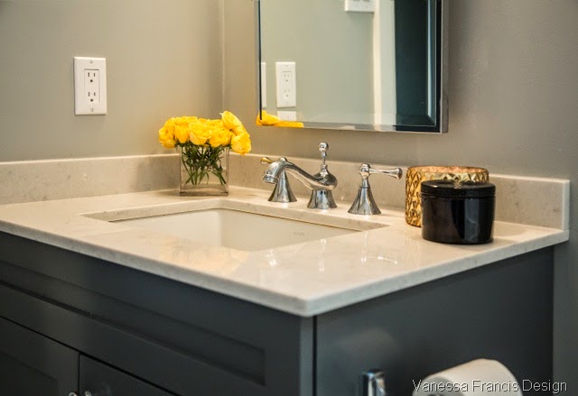
The counter is Silestone’s Lagoon, the same counter I have in my own bathroom.
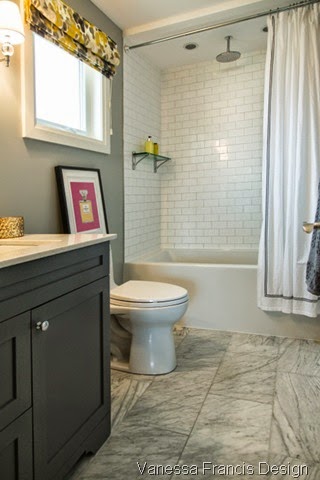
And one more last look at the pretty space.
Photos: Leah Kirin
Classic and simple is always the best route to go in a small bathroom, don’t you think?
If you require design advice, please contact me at vanessa(at)vanessafrancis(dot)com



Simply Modern Home
April 9, 2014Love it…and it reminds me of our kids’/ guest bath! Classic and simple. Great job!!
Vanessa@decor happy
April 10, 2014Thanks Susan! Need to go back and check out your bathroom. Classic and simple for the win!
Vanessa
April 9, 2014looks gorgeous! so crisp.
Vanessa@decor happy
April 10, 2014Thanks namesake!
Tiffany Leigh Interior Design
April 10, 2014Wow that before tile was SO BAD. You worked wonders :). It looks fantastic!
Vanessa@decor happy
April 10, 2014Thanks Tiffany. I cannot wait to see what beauty you will unleash on the world when you graduate from design school!
Tatiana Dokuchic
April 10, 2014What a transformation! Great new finishes, love the shower head positioned in the centre & I think the art on the back of the toilet really works (Chanel No, 5?). Thanks for sharing this.
Vanessa@decor happy
April 10, 2014Thanks for stopping by! Thanks re the art and yes Chanel, no. 5.
Robin Siegerman
April 10, 2014I love it, and you have proven what I always tell my own clients: you don’t have to blow out walls to make a big difference! Well done! (and I think the print in the space above the toilet is perfect! Hopefully when the clients see the photos, they’ll let you source one for them and put it up!)
Vanessa@decor happy
April 10, 2014Thanks so much Robin! Finishing touches like art can make a space but sometimes clients lose steam by then. 🙂
Cynthia Weber
April 10, 2014Love a fab before and after… you did not disappoint! Bravo!!
Vanessa@decor happy
April 10, 2014Well thank you Cynthia! I try my bestest!
Wendy Hicken
April 10, 2014Looks so great Vanessa, what a transformation!!
Vanessa@decor happy
April 10, 2014Thanks W! See you soon!
StagerLinda
April 11, 2014So fresh and bright! I love the roman shade and the picture on the loo. The tile on the ceiling of the shower in the before picture cracked me up!!! What was their tile man smokin’? LOL~
Mary Ann at classic•casual•home
April 13, 2014It’s a great bathroom!