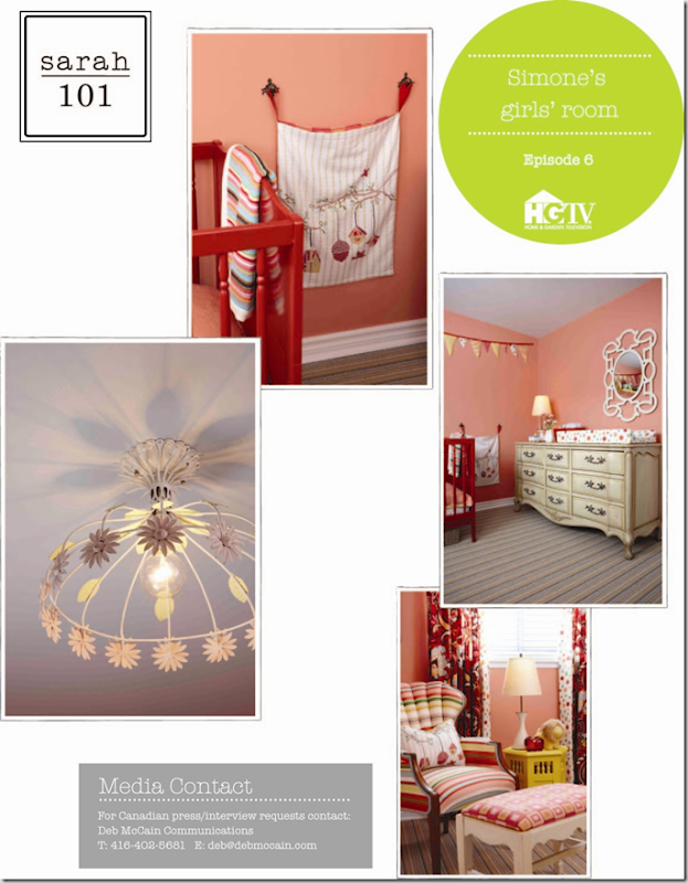
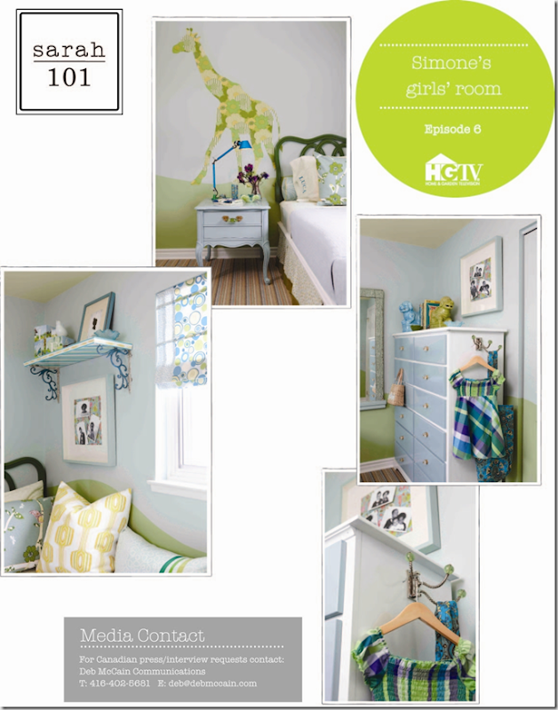
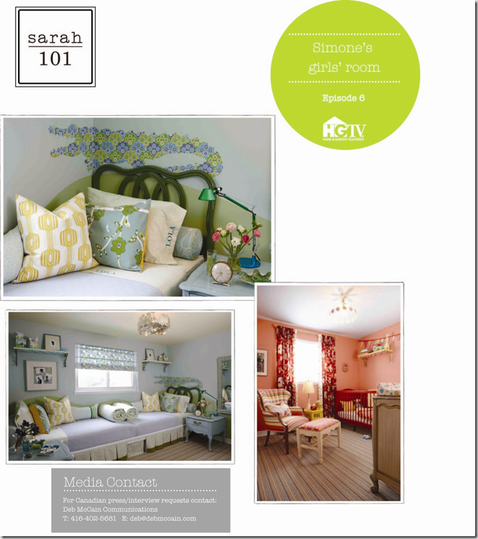
Did you catch episode 6 of Sarah 101 that aired tonight on HGTV? She took two lacklustre, small rooms and turned them into fun, playful spaces for three lucky sisters. A coral and mustard nursery and a blue, yellow and green bedroom for the two older girls.


Here’s what I loved about this episode and what we learned:
- tea towels from Anthropologie were used as the jumping off point for the colour scheme for both bedrooms. You can see this one made into a pillow on the bed above. Some tea towels even have a pom pom detail which would add to the cuteness factor if used for pillows.
- the mix of fabrics and pattern – I’m guessing that there are a dozen fabrics used in each room. Don’t be afraid to mix florals, geometrics and large and small prints – they don’t have to match exactly.
- the 100% wool striped broadloom which has all the colours used in both rooms
- placing the beds end to end and building the platform for under $200 was genius
- the vintage side tables,a steal at $65 for the pair, painted a robin’s egg blue with gorgeous handles from Anthropologie
- the scroll ceiling fixture (in the blue and green room) was beautiful and unique
And here’s what I wondered about:
At the end of the show, Tommy mentioned that he had an antler chandelier and herringbone wallpaper in his childhood bedroom; Sarah had a flokati rug and crochet details stapled to her bed. It’s no wonder that they both have great style and taste.
I think this was my favourite episode yet with useful advice for homeowners on how paint and fabric can transform a room. You can watch the video here and see the shopping guide here.
What did you think of the show?


Grace @ Sense and Simplicity
February 9, 2011Thanks for the overview. I love your summary and points you questioned. It is hard to see in small photos so I looked back after every tip or comment to see what you meant and they were often things I hadn’t noticed. I agree, this looked like a great episode. I loved the beds end to end.
*sarah berry design*
February 9, 2011I love the colour schemes, SO gorgeous. The rooms seem incredibly layered and pulled together, also not too childlike which I think is important, I think childrens rooms should be playful and charming but not dumbed down, they’ve achieved this really well.
Designwali
February 9, 2011Great recap…I wondered the same thing about the crib. All in all, I thought this show wasn’t so bad…maybe the mommy soaked it all up!
Razmataz
February 9, 2011Hi Vanessa. I thought I may run in to you at the IDS but didn;t spot you there. I also liked this room. I din;t like that random green stripe on the one bedroom wall, but loved the idea of the end to end beds for the girls.
You can tell she had a paint line now. I’ve never seen her use so many paint colors in a room. Fabric yes, but not paint. Love that Tommy has antlers in his room!
Ali Ryan - Let's Decorate
February 9, 2011I really enjoyed this episode. Love the end to end beds! What a fabulous idea and so cute with the matching headboards and side tables! Funny about that 70’s dresser, I was surprised she didn’t paint it either. The pulls on it are original too. (I still have my 3 drawer version of it which I painted Cloud White and added the glass pulls from Lee Valley. I have it in a hallway to hold linens). Overall, I think that these spaces turned out really well.
Ali
Kelly @ JAX does design
February 9, 2011Both rooms came out great 🙂 Love the look of tbe robin’s egg blue night tables with the gorgeous green glass handles, and the blue & white dresser looks fab too. I agree, the dresser in the nursery could have used a coat of paint in a fun colour to freshen it up.
I also really like the shelves, and the fact that they painted the bottoms too so they look good from all angles 🙂 And the wallpaper animals are too cute.
Hey, don’t forget to enter my giveaway!
christine, just bella
February 9, 2011Great recap! My favourite so far, Sarah always does a great job in kids rooms… those are 3 lucky little girls.
Emma at The Marion House Book
February 10, 2011Didn’t see the episode (we don’t have cable…gasp) but putting the beds end to end seems pretty ingenious!
Rambling Renovators
February 10, 2011These were my favourite rooms so far though I agree with you, that dresser should have been painted.
Staci Edwards
February 10, 2011Thought it was a great episode – so fun for little ones. Although I do agree with you on that dresser. Hope you are well, and your blog looks great!
Marcus Design
February 11, 2011This was so fun and colorful!! I loved the gren/blue/yellow palette, it was so refreshing!
Nancy xo
christine {bijouandboheme}
February 11, 2011I loved the colour palates and the vintage furniture. That striped chair was amazing and I thought the beds end to end was a great use of the space. I also loved loved the tea towels-such pretty motifs. All in all, I really enjoyed both rooms. Great recap Vanessa;) xo
Ann
February 12, 2011I’m really loving the cheerful vibe on the first one:)
Dolly
February 14, 2011Great!!!