I play a little game whenever I read a decor magazine. It’s called What House Could I Live in? Have you ever played? The object of the game is to discover what home in the magazine is closest to your decorating style.
Knowing what your decorating preferences are is the first step to having a home that makes you happy. The “game” involves looking at images and figuring out what is it about the image that speaks to you and what can you do without.
My decorating tastes are diverse. I love a home in all shades of white just as much as I love a home with colour and pattern. I like just enough accessories to make things interesting without being cluttered. I know what I love and what makes me cringe – and I think if you have been reading for awhile, you know that too!
Usually decor magazines feature 3-5 homes in each issue. The recent issue of Lonny features five homes, each having a different vibe. The one that is closest to my personal style was designed by Hillary Thomas for Marlien Rentmeester, fashion editor for Lucky Magazine. Granted, some of the details and furniture in the rooms were not my style but overall and out of the 5 homes, this one was hands down the closest to my personal style.
Thomas describes the home as having a “bohemian vibe with an East Coast, preppy flair.” They found 70% of the home’s furniture from thrift shops along the Dixie Highway in West Palm Beach.
I have listed a few reasons why I love this home and have linked to some previous posts to illustrate my point. (This exercise also identified areas which I haven’t blogged about previously but need to!)
1) White painted furniture + wainscoting + bold area rug: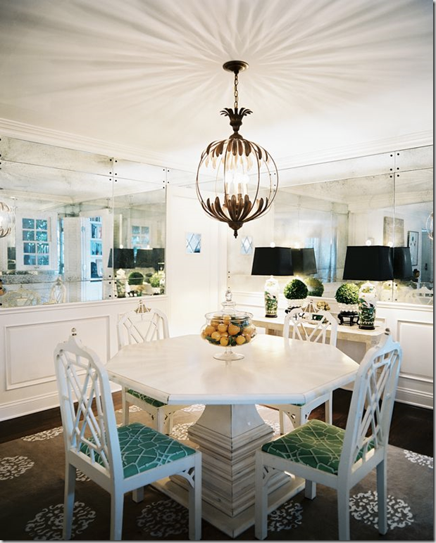
2) Ottomans + art walls: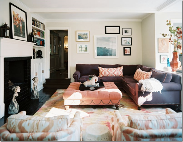
3) White kitchens + chalkboards: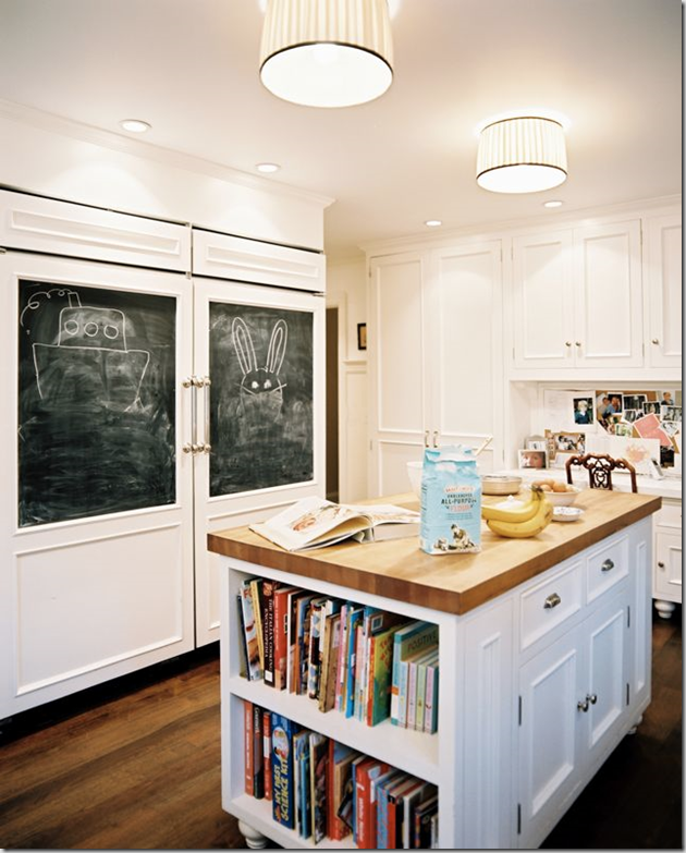
4) Children’s art + grass cloth: this reminds me of a playroom in the last issue of Lonny.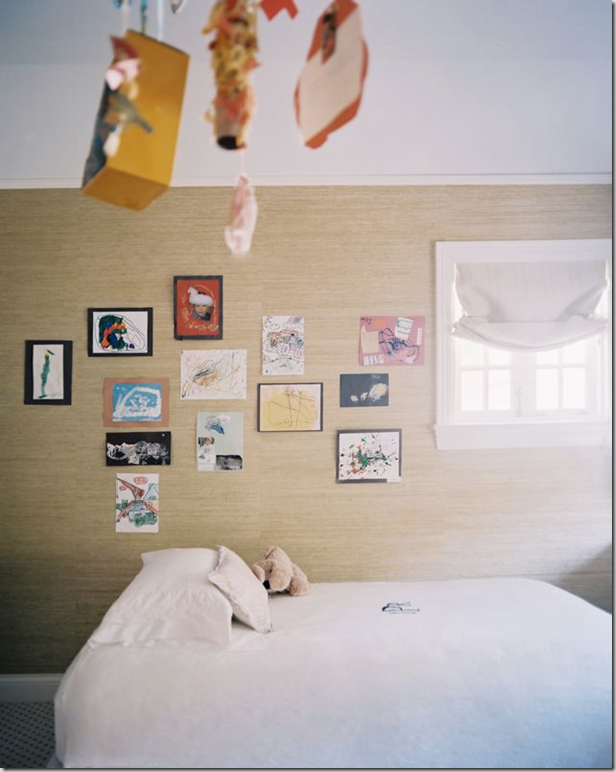
5) Vintage paintings of the sea: this reminds me of “My Style in One Picture.”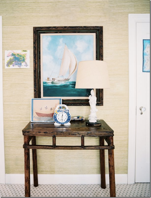
6) Well-styled bookcases (this reminds me that I have to find interesting bookcases like this to house my out-of-control magazine collection):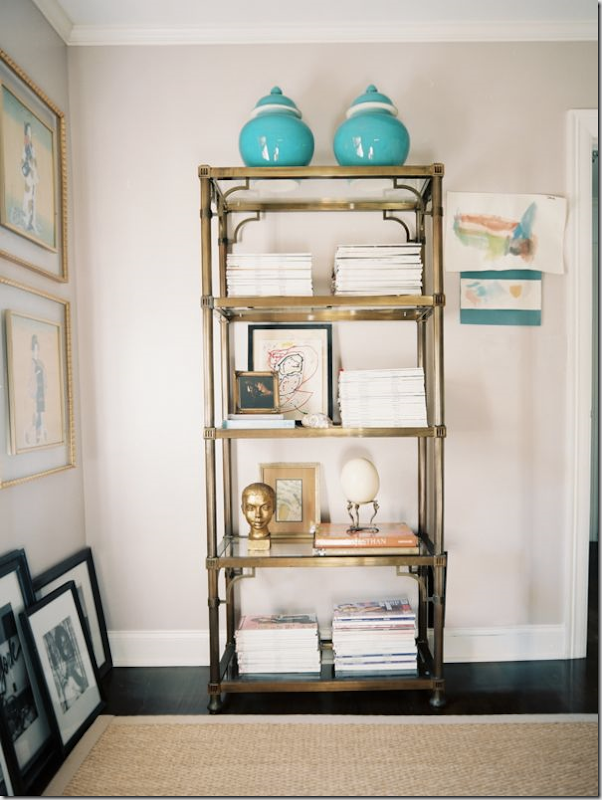
7) White bedding + beautiful fabric. Yes, that is leopard broadloom which wouldn’t be my first choice but it does add some interest.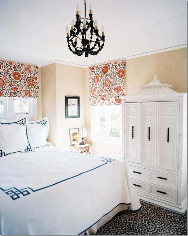
8) Upholstered Headboards:
9) Turquoise + beadboard (notice the absence of a mirror):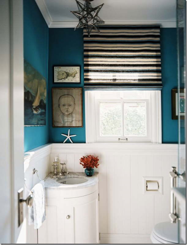
10) Built-in furniture + interesting chair + beautiful fabric: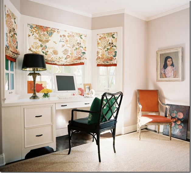
So, what did you think of this house? Did it speak to you or was there another home in Lonny that resonated with you more?
If you need help figuring out what your decorating style is, please contact me at vanessa@vanessafrancis.com.


Chasing Davies
January 11, 2011Love my some Lonny! This issue really captured great wall art all around and very much inspired me to get to bangin’ nails in my wall and hanging up some frames (oh my husband will LOVE that)!
the cinnamon post
January 11, 2011that bathroom has left me speechless.
actually Lonny just leaves me speechless.
great post.
Staci Edwards
January 11, 2011Great post – I love playing that game too!
TLC_Designs
January 11, 2011I like them all (minus the leopard print broadloom…). I think texture (both visual and tactile), natural finishes and interesting accessories are what comprise my favourite type of interior. I love the Javanese statues at the foot of the fireplace in the 2nd image – my kind of art!
*Tania @ Passport2Design.com
christine {bijouandboheme}
January 11, 2011Love this game and I thoroughly enjoyed this issue-lots of inspiration!
Layerstoo
January 11, 2011I love the dining room (#1), the bedroom(#8) and the office(#10)…looking forward to sitting down with Lonny very soon.
Ana Castanheira
January 11, 2011Great post, Vanessa. My game is called “Wish List” for when I win the lottery! Lonny makes it really hard to choose sometimes!
Connie @ SogniESorrisi
January 11, 2011I like this home. A little glam, a little eclectic, fun and comfrotable.
*sarah berry design*
January 11, 2011How funny, I have been drafting a post with the exact same title as this one! Great minds think alike! I always find people ask me what my style is when they discover I’m an interior designer, it’s actually hard to have a “decorating style” as clients are so diverse.
I love all of these images, you have great style.
SHERRY HART
January 11, 2011I am with you on this one sister…not much I would change!