I am so thrilled to have Leigh-Ann Allaire Perrault (don’t you just love her name?) as a guest here today on Work in Progress Wednesday. If you live in Canada, you may know Leigh-Ann as the Benjamin Moore Colour and Design Expert on Cityline. You can read her impressive bio here.
I had the good fortune to get to know Leigh-Ann not just here in cyberspace but also in real life. Besides being a design talent, she is witty and so much fun. Welcome Leigh-Ann!
****************************************************************************************************
Thank you to Vanessa for giving me the opportunity to share my personal “work in progress” on her FAB blog! I’m using this post as somewhat of a therapy session since the reality of tackling 3 complete bathroom renovations and a laundry room makeover all at once is starting to make me lose my Carrera marbles!
We’ve all heard so many times that bathrooms and kitchens offer the most return on investment in our homes. The kitchen was last year’s triumph for us, and while we’re not primed to sell anytime soon, we started to realize that after living in our mid 80’s home for almost 6 years, cosmetic “band aid” solutions just weren’t cutting it anymore in the bathrooms.
So, to avoid making our own DIY disaster, we opted to call my pal Bryan Baeumler from Baeumler Quality Construction and HGTV fame to tackle the projects for us. Since then, I have been a busy little beaver drawing up plans, sourcing materials, revising plans, changing my mind about the materials I already picked AND paid for….Argh! The one thing I have learned so far about being my own client is that I am the WORST client!!! Thank goodness for our incredible project manager, John Murdoch! I know he cringes every time I start a sentence with “Hey, I have an idea…”, but he has been so patient and offered a lot of great insight into the overall design.
Alas, I would like to share with you the bathroom that is currently in the biggest state of chaos, but definitely the one I am most excited about. You would think I’m talking about our master ensuite (which will be magnificent ;-), but no…the room that has me drooling on the newly installed porcelain is actually our guest/son’s bathroom.
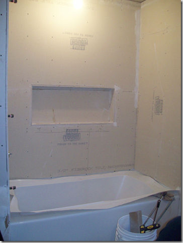
Before the renovations began, this bathroom was always very utilitarian for us. No bells and whistles, but got the job done. The mauve-gray tiles were screaming to be teleported back to the 80’s, and a quick coat of white melamine paint shortly after moving in helped to conceal a hideous peach laminate countertop. One of my biggest pet peeves was the bulk head over the shower! Since there wasn’t an installed light and the tiles were so dark, it was like showering in a cave.
BEFORES:![clip_image002[5] clip_image002[5]](http://lh6.ggpht.com/_Pp-4J9vThO8/TPZbXV0GF8I/AAAAAAAADcg/ffgc0dGdJHM/clip_image0025_thumb1.jpg?imgmax=800)
![clip_image002[7] clip_image002[7]](http://lh4.ggpht.com/_Pp-4J9vThO8/TPZbYwlqkJI/AAAAAAAADco/rzmqdQDoqCs/clip_image0027_thumb1.jpg?imgmax=800)
![clip_image002[9] clip_image002[9]](http://lh5.ggpht.com/_Pp-4J9vThO8/TPZbZutQmWI/AAAAAAAADcw/arYkuuTAcNc/clip_image0029_thumb1.jpg?imgmax=800)
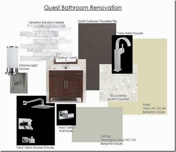
Because I am a colour girl through-and-through, I often think in terms of a colour palette when I start a project. Now, I know what you’re thinking…”you design peeps always tell us to pick paint colours last!” Well, you’re absolutely right! I don’t choose specific paint colours, but I do pull an inspirational palette that helps to drive my material and finishes selections. Paint colour is always my crowning jewel in a space and can be used to tie an entire look together! So, knowing that this was going to be a room predominantly used by two young boys, I wanted to create a more masculine feel…enter feathery grays, rich charcoals, and crisp whites. It’s also worth mentioning that whenever I attack an “investment” renovation project (in my own home or otherwise), I tend to stick with neutrals for the high priced finishes, and have a little fun with the inexpensive and easily replaced accents.
OUR FIXTURES AND FINISHES:
I started off on a hunt for a statement tile to really set the stage for the space. Knowing that gray was a key player in the palette, I was immediately drawn to traditional Carrera marble brick, but felt it was a little too mature for our young lads. I stumbled upon a random Venatino marble that had the perfect mix of a modern unsystematic configuration with the beauty and finish of marble.
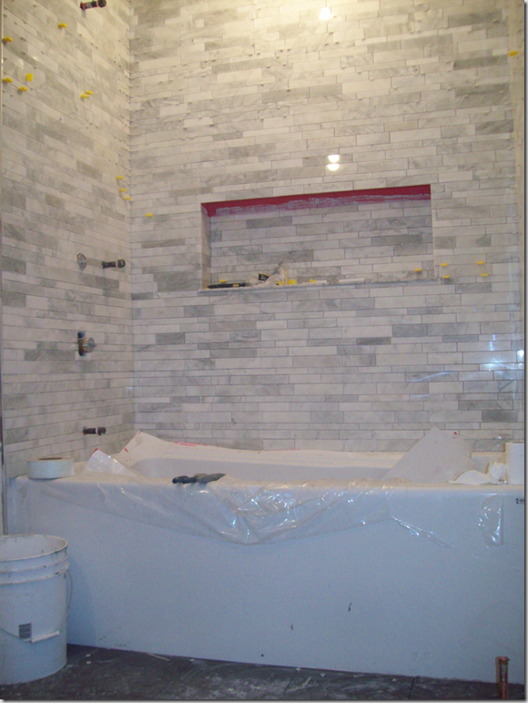
WARNING-WARNING-WARNING…although I am thrilled to bits with how the tile looks in the bath/shower surround, it took 3 days to install!!! Our contractor said it was the most difficult tile he has ever worked with…like putting together a puzzle without the picture on the box. It didn’t help that my wish list included a gorgeous 3’ long niche that needed to be trimmed and set with individual pieces (Sorry John!)
BYE BYE 1980’S!![clip_image002[1] clip_image002[1]](http://lh4.ggpht.com/_Pp-4J9vThO8/TPZbcCXhHxI/AAAAAAAADdA/bBl78umJ_Ts/clip_image0021_thumb.jpg?imgmax=800)
![clip_image002[3] clip_image002[3]](http://lh5.ggpht.com/_Pp-4J9vThO8/TPZbdpcQ-oI/AAAAAAAADdI/VRNTFC8wur4/clip_image0023_thumb.jpg?imgmax=800)
HELLO FABULOUS NICHE…
…AND GORGEOUS TILE!!!
WORK IN PROGRESS: The horrid bulk head is gone which completely opened up the room. Our new soaker tub is in place, and that reflection on the tile is our newly installed pot lights (3 in fact, plus 2 wall sconces). And can I just mention one more time how fabulous that marble is! Paired with the charcoal Carbone 12×24 porcelain floor tile, it is a marriage made in design heaven!!! *Pictures don’t do it justice
DISCLAIMER: This tile install may result in divorce if attempted by novice DIY-er’s 
![clip_image002[5] clip_image002[5]](http://lh4.ggpht.com/_Pp-4J9vThO8/TPZboeCUjnI/AAAAAAAADdo/8R5q4uozfuY/clip_image0025_thumb1%5B1%5D.jpg?imgmax=800)
We’re in the home stretch with this bathroom renovation…the vanity will be installed this week, followed by our shimmering chrome Delta faucets, a Kohler low flow toilet, and topped with a coat of Benjamin Moore’s Aura Bath and Spa paint. And then we start all over again with the next bathroom! BWAHAHAHA!!!
Thanks again to Vanessa for letting me share a piece of my chaos, and I look forward to sharing the finished product with all of her readers and CityLine viewers in the coming months!
Happy painting and decorating!!!
XO
Leigh-Ann
**********************************************************************************************
Thanks so much Leigh-Ann! If you ever want to change careers, I think you could make it as a comedienne – this was so witty and I’m sure a lot of us can relate. I love all of your finishes especially the marble clad tub area. It is going to be beautiful and I can’t wait to see the full reveal!
Thank you for stopping by. So glad you’re here. Décor Happy is a blog by Milton, Ont.-based interior decorator Vanessa Francis of Vanessa Francis Interior Design. On the blog, I share a behind-the-scenes look at client projects, along with design ideas and inspiration.
Categories
On Pinterest
Archives
Interior Design Services – Milton, Oakville, Burlington, Mississauga, Toronto
Copyright © 2023 Vanessa Francis Interior Design
Previous


Chyanne M.
December 1, 2010OMG I need that tile in my life. I’m a DIY’er and I know my limits. It looks tedious, but I love it.Wonder if I can find some comparable or maybe I can take that bathroom and put it in my home.
Good work!
Connie @ SogniESorrisi
December 1, 2010That tile is stunning!
*sarah berry design*
December 1, 2010Wow! Brilliant post!
Shannon @ What's Up Whimsy
December 1, 2010That marble tile is so unbelievable!!
Rambling Renovators
December 1, 2010Leigh-Ann writes the same as she appears on TV – funny and full of energy! Its so refreshing to read that even though she is a design expert, she brought in the professionals to do the actual construction. I liked hearing about how her skill in colour selection informed the design of the room. Can’t wait to see the After, Leigh-Ann!
Wendy
December 1, 2010wow – looking good!
Lisa
December 2, 2010Great to see your bathroom in progress Leigh-Ann! I love your random marble tiles!
christine {bijouandboheme}
December 2, 2010Oh Leigh-Ann it looks SOOOOO good! I am crazy bonkers for that tile wall- gorgeous!!! xo
Lisa Ferguson
December 3, 2010ooohhh lala! In LOVE with the wall tile choice. Can’t wait to see the final reveal!
Dee
April 24, 2013Beautiful wall tile Vanessa! I love the niche too, it just makes so much sense 🙂
Dee@
http://www.delolovesdesign.com