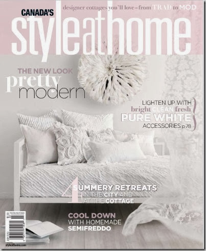
Margot Austin is the talented and witty Senior Design Editor of Style at Home magazine, who also blogs here. Style at Home brings design within reach for readers showcasing stylish yet liveable homes. Decor shops and finds, decorating advice and sinfully delicious recipes from Donna Hay all make for an inspirational read.
Her husband Kevin has a column in the magazine and owns the shop Chair, Table, Lamp (don’t you love that name?)
Margot kindly agreed to be interviewed and her unabridged responses are both thoughtful and informative. Enjoy.
How did you end up working at Style at Home?
MA: It’s a long winding story. Growing up I always wanted to work at a fashion magazine. Early in my career I had a chance to work on fashion and décor stories and learned that I liked both. Later I worked at IMAGES, a fashion and beauty mag. I loved it, and it was there that I had my first chance to style and produce beauty photo shoots. Not long after, my husband and I bought our first house and he opened his own antiques and home décor shop. Fixing up our first house together was when decorating started to eclipse fashion in my mind. Then the STYLE AT HOME opportunity came up. I started in Oct 2002 as a senior editor, handling stories and editing copy. A year later, then-editor Gail Johnston Habs gave me the opportunity to move away from the “words” dept and over to the styling side, leading the design department – scouting homes, styling shoots, dabbling in design. (phewf, and that’s the short version of the story!)
Do you also have your own decorating/styling clients?
MA: Right now I don’t have the time to devote to clients, but it’s something I’m open to doing in the future.
What gets you up every morning?
MA: My husband, Kevin – and I mean that literally and figuratively. Literally because I’m a night owl and stay up super late puttering, planning, drawing, blogging and writing, so I need him to get me up, since I can sleep through any alarm! And figuratively because he’s my best friend and my partner in everything this life has to offer. We are a great team!
Who inspires you?
MA: Wow, so many people! For each of my interests I have a different set of people who inspire me. Take your pick!
I love Barbara Barry for her commitment to living elegantly, her business acumen and the singularity and clarity of her creative vision.
I am inspired by other magazine journalists who create gorgeous content such as Stephen Drucker (formerly of House Beautiful, now editor of Town & Country – can’t wait to see what he does there!), Newell Turner of House Beautiful, Margaret Russell and Anita Sarsidi at Elle Décor. Everyone at UK Homes & Gardens and Vogue Living Australia!
Stylists whose work I study include Carlos Mota, Atlanta Bartlett, Randi Brookman Harris, Rebecca Thuss, Jen Gotch.
When it comes to design writing, I swoon when I read sentences written by Dominique Browning or Mayer Rus.
As for designers, I always turn to The Greats for the best inspiration: Elsie DeWolfe, Billy Baldwin, John Fowler, Dorothy Draper. Among today’s talents I love the work of Gil Schafer, Tom Scheerer, Thomas O’Brien, Darryl Carter, Tricia Foley, Amanda Nisbet, Celerie Kemble, Steven Gambrel….and so many more.
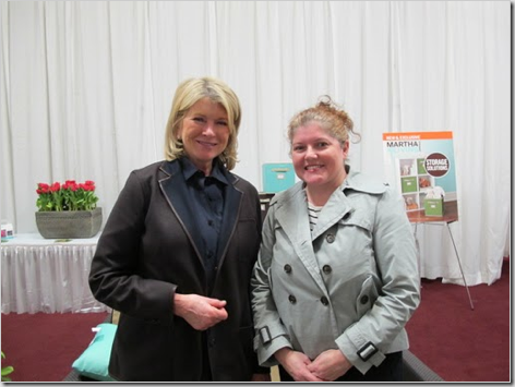
And yes, without a doubt I worship at the altar of Martha!
Click here to read Margot’s hilarious account of meeting up with Martha.
What dream do you still want to fulfill?
MA: So many, but if I told you they might not come true (I’m superstitious that way).
Tell us about your homes in Toronto and Tweed, ON?
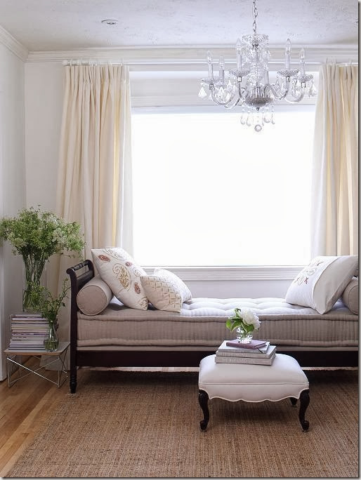
MA: In Toronto, we live in a petite bungalow that’s so charming – the bungalow really is such a wonderful house design. The décor is light and airy with all white walls and fabrics in a mix of greens, greys and natural linen with touches of yellow. It’s a happy but not hyper palette. The wood-burning fireplace sold me on the house from the minute I first saw it – and it’s still my favourite feature.
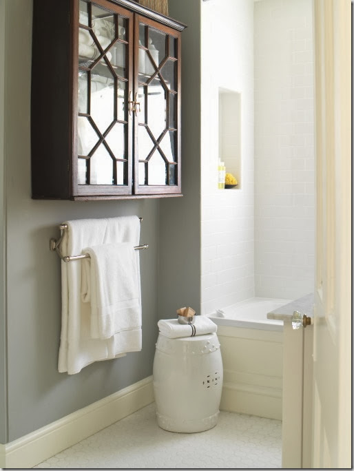
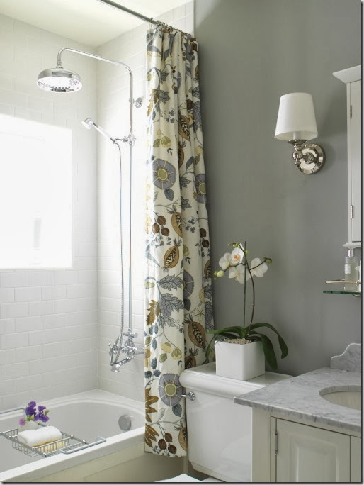
The Tweed house is a hundred-year old Edwardian with some Italianate details. The kitchen and bathroom are renovated and decorated, and now I’m finally in the thick of decorating the rest of the house. You’ll see it in future issues of STYLE AT HOME. I’m going for a relaxed new traditional vibe. We have some lovely antiques, thanks to my husband’s sourcing. I like the idea of tempering the formality of antiques by mixing them with humble natural materials like hemp, linen, cotton, jute, tumbled stone, painted wood panelling.
How would you describe your decorating style?
MA: Hmmm, I’m struggling to come up with one of those pithy two-word hybrids that say it all and I just can’t. I’m so very fickle. It’s an occupational hazard from learning to appreciate so many different styles. I like a Saarinen tulip table just as much as a Georgian double pedestal mahogany table. One thing I’ve learned is that the answer in most matters of design is “It depends.” This is one of those instances.
What is the most common mistake people make when decorating?
MA: I think many people don’t decorate at all, they merely furnish. To decorate – even for a modernist or minimalist – you need a plan (the furniture is only one part of that plan). To decorate is to create a whole environment – the walls, the floor, the ceiling, the art, the accessories, the windows etc etc etc. I compare it to eating a meal: Meal A is steak frites, Meal B is a 5-course bistro meal with aperitif, appetizer, entrée, cheese course etc etc. Both satisfy your body’s need for fuel (and can cost the same amount) but the 5-course meal is a complete and complex experience. Most people opt for the Meal A of interiors. It’s a missed opportunity.
What does every room need?
MA: Something that’s worth nothing in monetary terms but is priceless to you personally. I also think every room needs a touch of black – learned that one from The Greats and wholeheartedly agree.
What design rule do you often break?
MA: Ugh, I hate rules. People are freaked out enough about making a “mistake” without having to worry about rules. But if I had to choose one I’d say that many designers advise you not to be swayed by a paint colour name and instead focus on the colour itself and make sure it works with your light conditions blah blah blah. I disagree and have very often chosen a paint MAINLY for its name – and with great success I might add. I painted the kitchen in our first house Georgian Green and I swear our real estate value went up immediately thanks to the stately name of our kitchen paint!
What are your favourite design stores to shop (Canada, US even)?
MA: Here goes:
Canada: ChairTableLamp (my husband’s shop), IKEA, Crate & Barrel, West Elm, Hardware, Angus & Co, Absolutely North, InVU (I’m a fabric nut), Aberfoyle Antique Market, Dollarama
New York: Muji (my all-time fave store), ABC Home, Pearl River Mart, John Derian, Aero Studios.
What sets Style at Home apart from other decorating magazines?
MA: We are proud to be Canadian. We are proud to feature interiors that you can dream about AND some day actually have!
How do you go about selecting homes to appear in the magazine?
MA: It’s an ongoing process — we never ever stop looking. Some homes are submitted by homeowners or designers, some we visit to take our own scouting shots. As for what makes the final cut – that’s very hard to pin down in a few words. It always comes down to the story. What is the story of the home, the people, the designer, the design process, the setting? The story must be compelling.
What can readers expect in the months ahead?
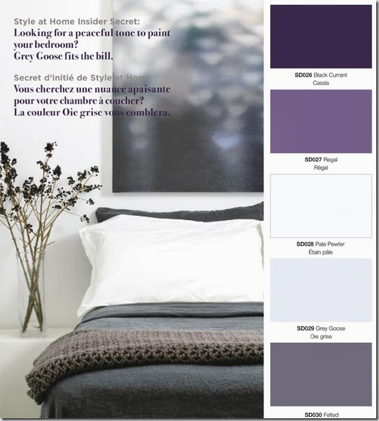
MA: A super fun DIY project story in the Aug issue, a bunch of gorgeous kitchens and some lovely before and after home features. In other exciting news, the first STYLE AT HOME paint colour collection is being launched this spring. It’s a partnership with Beauti-Tone paint and will be hitting Home Hardware stores across Canada over the next couple of weeks. Working on that collection was a career dream come true – lots of fun! Oh yes, and my Tweed house will be coming up in STYLE AT HOME in 2011. Must get back to work on that…
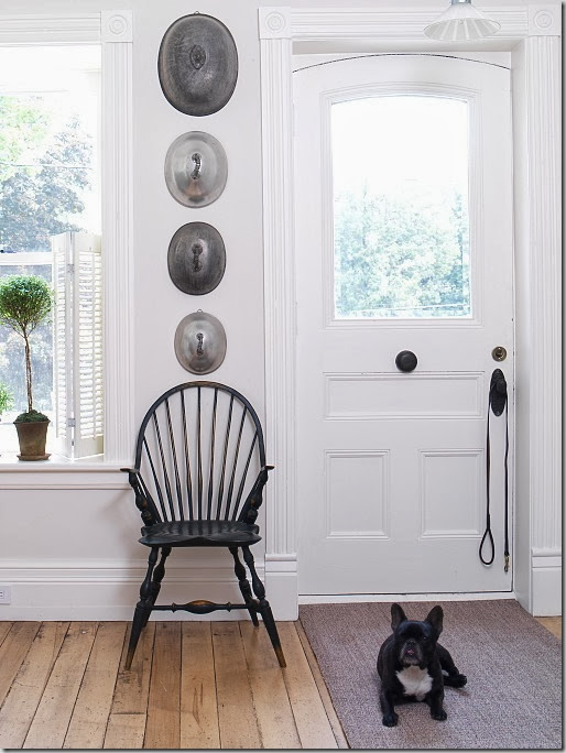
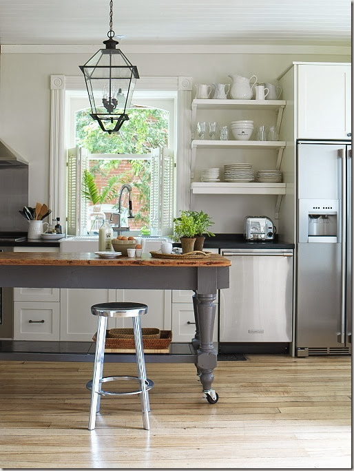
Thank you so much Margot for taking time out of your busy schedule to answer these questions. Click here to read more about Margot including her favourite restaurant (Le Reminet, Paris), favourite movie interior (Gosford Park) and favourite space that she designed (her Tweed kitchen, pictured above with her French bulldog and the gorgeous lantern.)
All images from Margot’s blog and Style at Home.





Erin
June 1, 2010Great interview! I love Style at Home so it was very cool to learn more about Margot. I can’t wait to check out her blog!
Marcus Design
June 1, 2010Love this interview Vanessa! I’ve been a Style at Home subscriber for years and it makes me proud to be a Canadian!! It was great to read more about Margot, what a great interview.
Nancy
Emma
June 1, 2010Great interview. I love reading Margot’s blog she has some great insights into the design business. When I’m not at work (which I am right now) I’ll check out your blog further! Looks like we have a bit in common – I’m a transplant from BC as well who went back to school for interior design.
McCarthy Designs
June 2, 2010Great interview Vanessa, I really enjoyed reading it and I love the images. Some really beautiful rooms. xx
margot
June 2, 2010Hi Vanessa, Thanks for the interview. It’s such a switch for me to be the interviewee not the interviewer! I wanted to clarify the only reason why I didn’t choose any Canadian designers among my faves is because my fave Canadian designers are in the pages of every issue of STYLE AT HOME 😉
Oliveaux
June 2, 2010Great interview! Love all the images…Ax
paula
June 2, 2010such a great interview! love the mag and she seems quite lovely.
pve design
June 2, 2010I love Margot and I am in agreement – one needs to select a varied menu, to taste and awake all one’s senses! Love to dine with Margot.
pve
DesignTies
June 2, 2010This is a fabulous interview Vanessa!! I ate-up everything Margot said!!
Victoria
Staci Edwards
June 2, 2010Fabulous interview Vanessa!
Thank you so much!