Hi there! Welcome to the final reveal of my kitchen which I transformed in six weeks (with a little help from my friends, aka trades) as part of the One Room Challenge (ORC.)
If you are a new reader, you can read the previous five weekly updates here to get a sense of what has transpired:
one | two | three | four | five
The layout of the kitchen was just fine as was the existing cabinetry. I just needed to change some of the finishes, appliances and fixtures – make it more me and more pretty (if that is even grammatically correct. 🙂 )
All “after” photos by the talented Stephani Buchman.
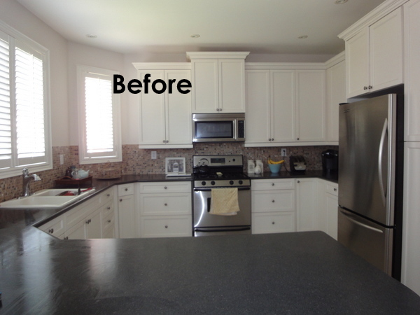
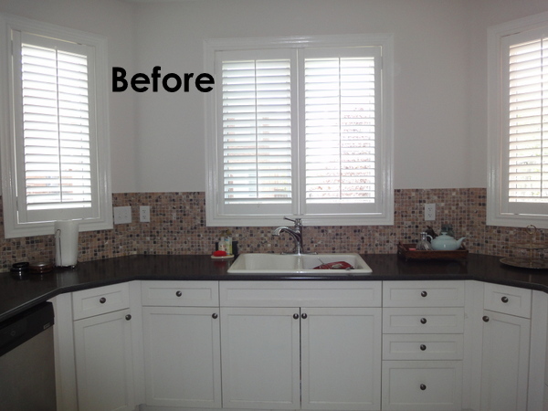
So let’s look at the Before and then the After, shall we?
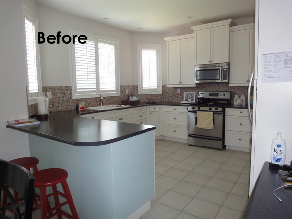
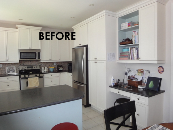
Kitchen circa 2005: cabinets don’t reach the ceiling, dated backsplash which divides the wall, laminate counters with the dreaded bullnose edge and curved corner, basic range, microwave over the range, ugly stools, all potlights and no pendant, plain peninsula, dirty grout, dull hardware, ugly, boring, blah…To this:
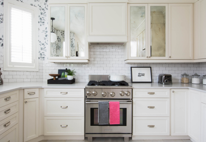
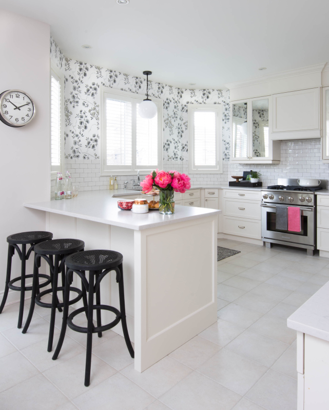
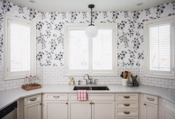
My black + white + (whatever colour I want to add, today it’s pink) kitchen.
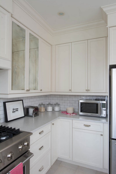
I have to give a huge shout out to my cabinetmaker who created the panels on the peninsula, the range hood and the riser and new crown. He is an absolute joy to work with and was able to match the new cabinetry paint colour to the old. (We also worked on the kitchen together that is in the Style at Home Makeovers with Style special issue out now.) His handiwork dramatically changed the kitchen. If you know me, I don’t personally like anything too embellished – simple, pretty and classic for the win is always my motto (for my own home anyway.)
Oh, and did you notice that the grout was cleaned? Yes, I splurged and had it professionally cleaned and sealed. What a huge difference. It’s back to it’s original white colour in most areas.
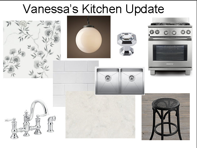
If you catch up on the previous posts, you can see my choices and my thinking behind them. The only design choice that changed from my original concept was the knobs.
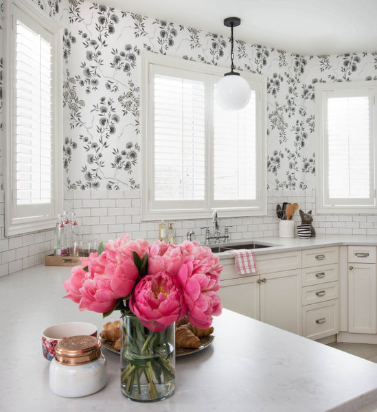
So the inspiration/vibe is sort of a French café meets an English countryside tea room. The stools, pendant, subway tiles and marble looking counter feel very French while the garden inspired wallpaper and faucet feel British (to me anyway!)
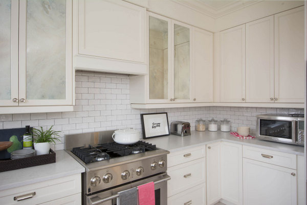
I think it’s the range that really ups the luxe factor in the kitchen. I love that it has a commercial feel while the legs make it look lighter in appearance. As I promised, stay tune for a post on the range. I couldn’t possibly go into all of its features here but I can say that it has been an absolute joy to cook with. It almost makes me like cooking!
I much prefer the look of a hood fan insert within cabinetry (rather than a stainless hood for example) as it looks understated and not so imposing. It was the perfect choice for my kitchen as it looks cleaner especially with the antique mirror. (We were going to do flashing on the bottom of the hood but it competed with the antique mirror so we nixed the idea.)
The antique mirror is one of my favourite things about the kitchen and I’m so glad I decided on this rather than going with plain glass. I think it adds that glam factor (and I can do a brocolli in the teeth check as well! 🙂 )
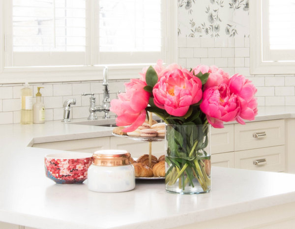
The counter is Silestone Lagoon in a suede finish (all sources linked to below.) I really love the matte look and how it pairs well with the glossy subway tile. It is made to mimic marble and I think it really does that. A couple of people have asked what the counter is and if it is marble.
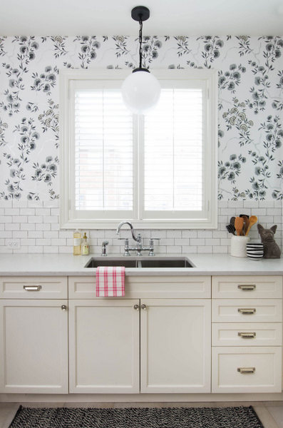
I’m so glad I decided to link up to the ORC because if I hadn’t I would be still debating over marble subway tile versus wallpaper. (Seems I’m not the only designer who can make quick decisions with clients but labours over decisions in our own home.) So glad I went with the wallpaper! The black and white colour way is perfect for my kitchen – it doesn’t commit me to any colour. My electrician was able to convert the pot light to a box for a pendant and I love the simplicity of this one.
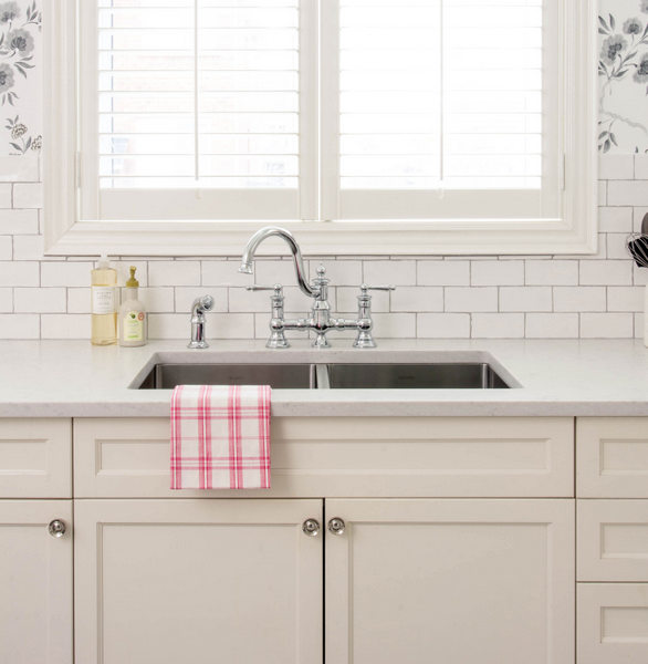
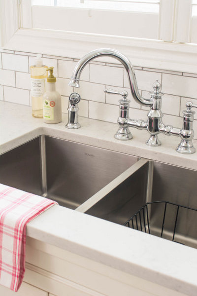
Let’s talk about that gorgeous faucet for a minute. It is the Waterhill in chrome by Moen. I knew I wanted a bridge faucet and nothing too modern and this was the perfect choice. Stay tuned for a post on faucets in the near future.
Check out the rounded corners on my Blanco sink – so in love with it (if one can be in love with a sink.)
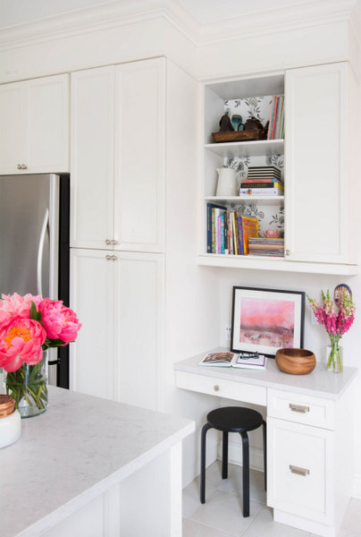
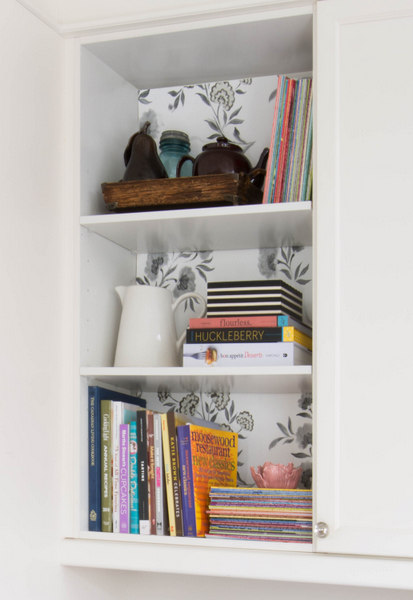
I pasted wallpaper to foam core (rather than wallpapering the cabinet) for the back of the bookcase. The beautiful print plus the Bon Appetit one is from Minted. I know I have mentioned them on the blog over the years as I am a huge fan.
Here you can see the electrical outlets that my electrician moved lower and horizontally.
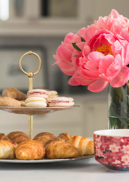
Those macarons were absolutely delicious!
To say I am pleased with the outcome is an understatement. I love my kitchen and wouldn’t change a thing. I just wished I had done it years ago!
I have to thank the generosity of the brands that partnered with me on this because without them, this makeover wouldn’t have the outcome it did and maybe wouldn’t have even happened. Check out their product range if you are undergoing a kitchen and/or bath reno/makeover:
Sources:
Counter: Silestone Lagoon in a suede finish
Range: Electrolux Icon Dual Fuel
Sink: Blanco Quatrus R15 U2
Faucet: Waterhill 2 handle, high arc faucet by Moen
Hardware: Button Faced Knob in polished nickel by Top Knobs
Wallpaper: Designers Guild Jacaranda in Noir
Paint colour (wall): Para P5223-24 Soaker Tub
Backsplash tile: Urban Zebra though Factory Tile, Milton
Stools, pendant and pulls: Restoration Hardware
Flowers: Fiori Oakville
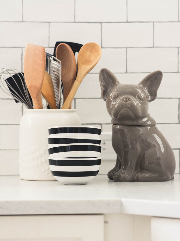
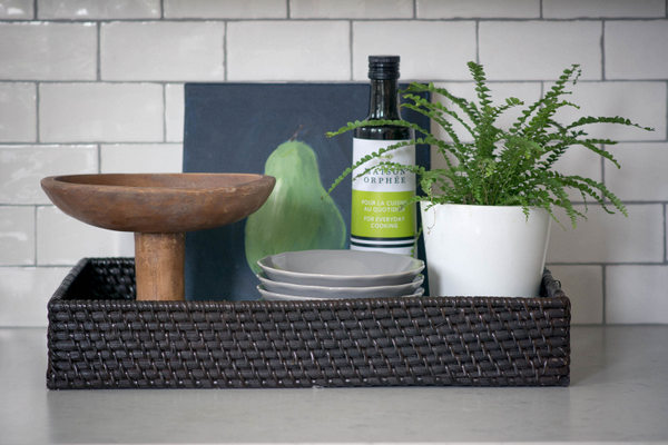
Accessories: Pottery Barn, Crate & Barrel, HomeSense, Zara Home, The Bay, Target, Ikea, Williams Sonoma and Anthropologie
Thanks so much for following along and leaving encouraging comments. It was so wonderful to “meet” all of you and see the projects you have been working on. And thanks to Linda at Calling it Home for coming up with this concept. Many beautiful spaces across North America (and beyond) have been created as a result! Now go here to see what the 20 bloggers revealed and go here to see what fabulosity the other linking participants got up to.
Please feel free to ask me any questions in the comments.
Chat soon!
If you require design advice like prettying up your kitchen, please contact me at vanessa(at)vanessafrancis(dot)com. I would love to work with you.
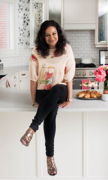
 (I had to add this photo again so the photo of me isn’t the last one as it shows up on my sidebar!)



barbara
November 6, 2014Amazing! Fabulous transformation!
Erin@Suburban Bitches
November 6, 2014It looks so, so good! And you have given me lots of inspiration for my own kitchen make over! Well done and congrats!
Krystine www.KrysitneEdwards.com/blog
November 6, 2014GORGEOUS transformation! It’s so fresh and bright! I love it all especially the mirror on the cabinets!
Carrie
November 6, 2014Beautiful job, Vanessa! This is outstanding!!! I love how you modernized it in such a classic way. I definitely feel the French café/English tea vibe. 🙂
Dayna
November 6, 2014Absolutely gorgeous Vanessa! That is NOT a builder basic kitchen anymore…wow. So classic and pretty, enjoy!
sherry hart
November 6, 2014It is stunning! Looks like a brand new kitchen! Love the mirrored doors….what a great idea to increase the light and open up the space. I love how you updated the microwave over the range situation. My sister has the same thing and I was just telling her to get a small on and put it on the counter so we can get a pretty hood. Really a beautiful space. Of course black and white gets me every time! That wallpaper is perfect also!
Danica
November 6, 2014I have been following along waiting for this final reveal! I have to admit I was so unsure about wall paper in the kitchen, BUT it makes your kitchen look so amazing!!! I love all of it! Especially that faucet! Amazing work as always!
ange
November 6, 2014So pretty! I love how soft it feels and sophisticated at the same time! The hood just makes the room seem much more custom and I wish I could talk my hubby into it. Enjoy your beautiful kitchen!
Jordana @WhiteCabana
November 6, 2014Wow, Vanessa, this kitchen transformation is beautiful. Congratulations! I love the range and range hood…that made such a big difference to the space. I bet you never want to leave the space now…
Lesley Metcalfe
November 6, 2014Oh wow! This is beautiful!!! You did a wonderful job. I’ve really enjoyed following along with your progress, so glad to see everything came together so beautifully!
Traci @ Coastalpines
November 6, 2014Beautifully done!!
Elle Woeller
November 6, 2014What a pretty kitchen! I installed that same faucet in my kitchen eight years ago and I still love it!
Jana Bek
November 6, 2014Wow! It looks 10x bigger & so bright & happy. I love the pops of black in the wallpaper & stools & the mirror on the cabinets is such a beautiful touch! awesome job Vanessa! XX jana
Jen @ RamblingRenovators
November 6, 2014Such a BEAUTIFUL transformation Vanessa! It is light, soft and pretty and very much feels like “you” (especially the wallpaper. So glad you went with it!). Love the simple but effective changes you made with the cabinetry.
Laura Ingalls Gunn
November 6, 2014Wow~ An absolutely stunning space! I love the mirrored cabinets too. As a fellow 6 week participant the six weeks was indeed a challenge and you rose up. Well done!
ERIN | HOLTWOOD HIPSTER
November 6, 2014I love this kitchen. So many kitchens now are tile and cabinets only and its refreshing to see these pretty walls in a space that quite frankly I would spend a LOT of time in. We have yet to fully makeover our kitchen (I’m still stuck with the original 1960’s square tiles). But when we redo our counters and backsplash, I’m going to borrow your socket solution. Genius to lower them and place them horizontally. Can’t wait to hear more about your range in a future post. Big fan of what you did here. Congrats on a beautiful space and 6 weeks of hard work.
Kate Collins
November 6, 2014Wow! Such a transformation. I absolutely love wallpaper in the kitchen. It really makes it stand out. It’s all really beautiful! Great job!!
Sarah Sofia Knepp
November 6, 2014Absolutely stunning transformation! You have my white dream kitchen! And who doesn’t love peonies?! I don’t know how you even got this time of year unless you special ordered them. 🙂 It’s been such a pleasure meeting you Vanessa through ORC! BRAVO on a job well done!!
Sarah Sofia Knepp
November 6, 2014P.S. I’ve already pinned some images so when I’m ready for my dream kitchen I know where to pull my inspiration! 🙂
Debra
November 6, 2014Beautiful job Vanessa!
Jodie @ Sypsie Designs
November 6, 2014I am in love with the subway/wallpaper combo! This room looks like it’s straight out of a magazine! Being able to switch up the accent color is such a fun idea (although I love the pink!) and turned out perfect. Amazing job! : )
Albertina || Mimosa Lane
November 6, 2014This is the prettiest kitchen!! I adore that wallpaper. I love anything Designer’s Guild and just really love how fresh that one looks in here. I would love to have this be my kitchen. I think wallpaper and subway tile make everything better. Congratulations!
Sue D.
November 6, 2014That wallpaper is stellar! congrats on the new kitchen.
Marty@A Stroll Thru Life
November 6, 2014What a fabulous makeover. I love everything. The wallpaper is such a great touch.
Anna @Annabode
November 6, 2014This is one of the most beautiful kitchen transformations I’ve ever seen. I can’t get over that wallpaper, and the mirror on the cabinets is genius. Love the pendant light too!
mrs. V | Chez V
November 6, 2014Vanessa!!!! You are knocking my socks off, girl. Such a vast improvement! Light, bright, and airy with that stunning wallpaper. Seriously, that wallpaper just makes it. Great attention to detail – range hood, wallpapered backs, that range – as a serious cook, I have some serious envy. No shame in my game! And um, I will be stealing those fabulous heels right off your feet, after I have virtually sent you copious amounts of celebratory wine and you can no longer make good decisions! Brava, my friend!
Amy C
November 6, 2014Wow! This kitchen is beautifully done! I love all the classic touches like the subway tiles and the white finishes but that wall paper is the show stopper! So pretty! Great job! 🙂
Sabrina @ Pink Little Notebook
November 6, 2014OMG your kitchen looks amazing!!!! Love what you did with the subway tile and wallpaper. It’s just stunning. Your details are perfection. Great job 🙂
Sherry
November 6, 2014Your kitchen makeover is gorgeous! I’ve never seen options for antique mirror for the face of the cabinets, so pretty! I love it!
Kim@ The Green Room Interiors
November 6, 2014I have been looking forward to this reveal since the beginning of the ORC. There are so many things I love about your kitchen makeover – but mostly I love how it “feels”. Fresh, happy and comfortable but sophisticated. Great job Vanessa!
emily pasquariello
November 6, 2014Enjoy that beautiful kitchen! I am amazed by you ladies that tackled HUGE reno’s in 6 weeks! Every little detail is just divine!
Erin
November 6, 2014Wow…what a beautiful kitchen! I love the crisp feeling that the white brings to the kitchen. Great job 🙂
stephani
November 6, 2014Vanessa, I love looking at the before pictures to see the transformation! What I think is particularly smart are the panels on the peninsula, raising the cabinet hight to the ceiling, and the antiqued mirrors! The wall paper is beautiful and mixes so well with the subway tile! The way you put everything together is perfect!
It was a pleasure to photograph this space. I only wish we could have actually spent more time honing in on some of the details.
And you look great sitting on the counter!
Steph
Vanessa
November 10, 2014Thanks so much Steph! It’s always a pleasure working with you and I appreciate your eye. There is never enough time is there? Maybe when you come back to shoot some other spaces in my home, we can shoot anything that was missed in the kitchen.
Jessie
November 6, 2014Such a beautiful transformation! Love the subway tiles, range, wallpaper and faucet! The kitchen looks so bright and fresh!
Good job!
Jessie
http://www.mixandchic.com
Michelle @ Eamonn & Jack
November 6, 2014Such a beautiful kitchen – you did a fabulous job! I love the wallpaper and the detail of adding the trim to the peninsula is genius.
Jessica @ Dear Emmeline
November 6, 2014Quite a transformation! The after is stunning!
Thalita @ The Learner Observer
November 6, 2014Every inch of this space is perfection, and you are a seriously talented designer. I can’t imagine the joy you must feel having this gorgeous kitchen, and can we talk about how adorable you are sitting on the counter? I mean… really. Watch out world, hot designer coming through (and I do mean hot as in talented and as in, you know, HOT!)
Elaine
November 6, 2014Love what you have done to the kitchen! I feel the same way about my foyer … I wish I did it years ago!! It took the ORC to kick me into action.
Best,
Elaine
Vanessa {Damask & Dentelle}
November 6, 2014Wow Vanessa, what a tremendous job you did, even without changing the footprint of the kitchen. It looks so much airier, bigger even, and definitely has a zest of feminine that is lovely! wow & wow! xx
Improvement List
November 6, 2014That wallpaper just makes the room. Great job on finishing a great looking kitchen.
Vanessa
November 6, 2014Eeeeek! It looks SO GOOD!!!!! Do you LOVE it?!?!?!
celine@aquahaus
November 6, 2014Wow!! I am so so impressed. It is worlds different! So fresh, so chic. Love the wallpaper and subway tile combo. This will still look great 20 years from now. Also really love the bar stools. Again, so chic. Congrats on transforming this into a stunning kitchen.
Carrie - Curate & Co.
November 6, 2014Wow!!! What an amazing transformation! It’s so classic & chic! Love it! Fantastic job! Kudos to you for getting this done in just 6 weeks!
Veronica
November 6, 2014Wow! That builder basic kitchen got some wow-ness! I love it! beautiful!
Delia @songthatdoesntend
November 7, 2014So very nice and bright. I love it 🙂
Lisa Goulet
November 7, 2014Stunning Vanessa! What a beautiful kitchen you’ve made. I love the simplicity and cleanness of it. It so makes me want to redo my kitchen. Enjoy!
heather meads
November 7, 2014That kitchen is gorgeous!! Well done and I love that wallpaper!!
Jo-Anna
November 7, 2014This is beautiful transformation Vanessa! I am especially in love with the subway tile and wall paper! Gorgeous!
Tracy Krunic
November 7, 2014Beautiful!!! And I love the shot of you sitting on the counter! 🙂
Michelle Holmes
November 7, 2014I’m pretty sure you can be in love with a sink, and a kitchen!!! This is truly one of my favorite kitchen’s ever!!!
Love everything about it, but those antique mirrors take it to a whole other level. Great job.
Stephanie
November 7, 2014Gorgeous! I love that you got big impact without redoing the whole kitchen!
The Pink Pagoda
November 8, 2014Vanessa, what an amazing transformation! The kitchen looks so bright and new – I LOVE it!
Grace @ sense and simplicity
November 7, 2014Gorgeous, gorgeous, gorgeous! I love that the background of our kitchen is black-and-white so you can change out the colour on a whim. The wallpaper is beautiful and goes so well with the pretty feel of the rest of the room. Well done!
m
November 8, 2014maybe you already answered this but I cant find where you got your antique mirrors amongst all the wonderful comments about your beautiful kitchen!
Kristen
November 8, 2014What a beautiful kitchen! I love it! So fresh and pretty. And what a GENIUS idea to put the wallpaper on foam core.
Congrats on a beautiful design!
Linda @ Calling it Home
November 8, 2014Vanessa, you did a superb job. I saw those countertops in person and will remember then in the future. Love all your details. Great pictures, too.
Naomi Stein
November 8, 2014looks great! the antique mirror is so classy. I love it paired with that paper. Smart move eliminating the metal at the bottom of the hood. It’s easy to want to do every element all special and snazzy but true skill comes with editing.
Shelia @ House of Highlands
November 9, 2014I love your new kitchen! I especially like the neutral colors – like you said, you can easily change the colors (but I love the pop of pink). Great job!
Shelia
Stacey
November 10, 2014That is one stunning kitchen! I love how light and bright it is. I also love that it’s a little bit traditional and a little bit modern. Beautiful!
tara // sproutzdesign
November 10, 2014ummmm….love would be an understatement! i am with you in keeping things simple and you totally nailed that concept here. there is so much to love but I will pick my favorites, pendant, range, cabinet hardware and my most most fav are those antique mirrored cabinet doors, yes please…a million times yes. hope you are back in the spring ORC!!
Elizabeth @ The Little Black Door
November 10, 2014So very well done Vanessa! Every last detail is absolutely fabulous. Love it!!
Sam @ Away She Went
November 10, 2014It looks amazing! I love everything about your kitchen! The tile and wallpaper combo looks awesome! The faucet, range, new light, and hardware are all fab too! Great job!
Stacey
November 11, 2014Vanessa! You did a FABULOUS job! I love all the details and you know how much I love subway tiles!! Well done!
Dagmara-GlamistaHome
November 13, 2014I love the make-over! You did really great. It’s amazing how little tweaks can make a huge impact in a room, especially kitchens. Changing the back splash transformed the kitchen from dark to bright and inviting. Now it seems it would be more fun to spend time there.
Tiffany
November 13, 2014Your kitchen is just gorgeous. What a transformation! That wallpaper and the mirrors are so gorgeous. Congrats.
Leslie Sinclair
November 13, 2014What a tremendous makeover! Well done- it looks SO fresh and pretty!!
xo. Leslie
Segreto Finishes
kate@willowinteriors
November 14, 2014Vanessa!!!! First, I’m so sorry I’m just getting here. I hit publish on my room and headed out the door on vacation. Okay, i would put one of those adorable stools smack in the middle of the kitchen and sit and stare at that sink/window/wallpaper wall all day, every day! Every once in a while i would reach over and pet that range, but I would mostly just stare and smile. 🙂 Absolutely gorgeous!!! I’m am so glad you went with that wallpaper and wish you many years of happiness in your kitchen!
Vel
November 17, 2014One of the best kitchen ORC I’ve seen so far!!! Love the mirrored cabinet fronts, glam-perfect!!! Wonderful job!
Rocio @ Casa Haus
November 18, 2014Wow, Vanessa, this is absolutely gorgeous! Great makeover, and in only 6 weeks? It’s amazing!!!!!
Laura @ Sweet Maple
December 2, 2014I love your kitchen Vanessa! Especially love the wallpaper and the single light over the sink. Great idea opting for the suede finish on the counter, never thought of that!! Beautiful work. 🙂
Terry
September 16, 2015i know i’m late to this game, but we’re in the throes of the kitchen countertop search and i’d love to hear how your suede finish silestone is holding up for you now that you’ve been living with it for a while? i’m planning on suede lagoon, but nervous about the dreaded ‘additional maintenance required.’ thanks!
Vanessa
September 17, 2015It is holding up perfectly! I had read that online too but so far so good! You will love it!
Scheherazade
April 27, 2016I wanted to thank you for this series of posts as it really helped provide a starting point for my own kitchen renovation. I did have a question: how do you clean/maintain the quartz countertops and get rid of water marks? There is conflicting advice on the internet!
Amy
May 30, 2017Oh my goodness, your kitchen is absolutely lovely. What a thrill to stumble across it as I am looking for ideas for remodeling my own kitchen. Can I ask the dimensions of your built in desk? I love it…all of it!!!
melissa
January 16, 2024very pretty !! the white is so fresh ! i only can dream lf a kitchen like this .