Hello friends,
{If you are new here, welcome! I’m an Interior Decorator living in Milton, ON, just outside of Toronto.}
Welcome to week 3 of the One Room Challenge where I am renovating and decorating my basement in five weeks and documenting the process in six weekly blog posts. The countdown is on – three weeks until reveal day (or 2.5 weeks until my photographer will be here to shoot the space. I didn’t even realize that until I typed it – oh my!) In previous posts, I have shared the Before photos of the space and inspiration photos as well as the floor plan and design concept. You can catch up on those posts here:
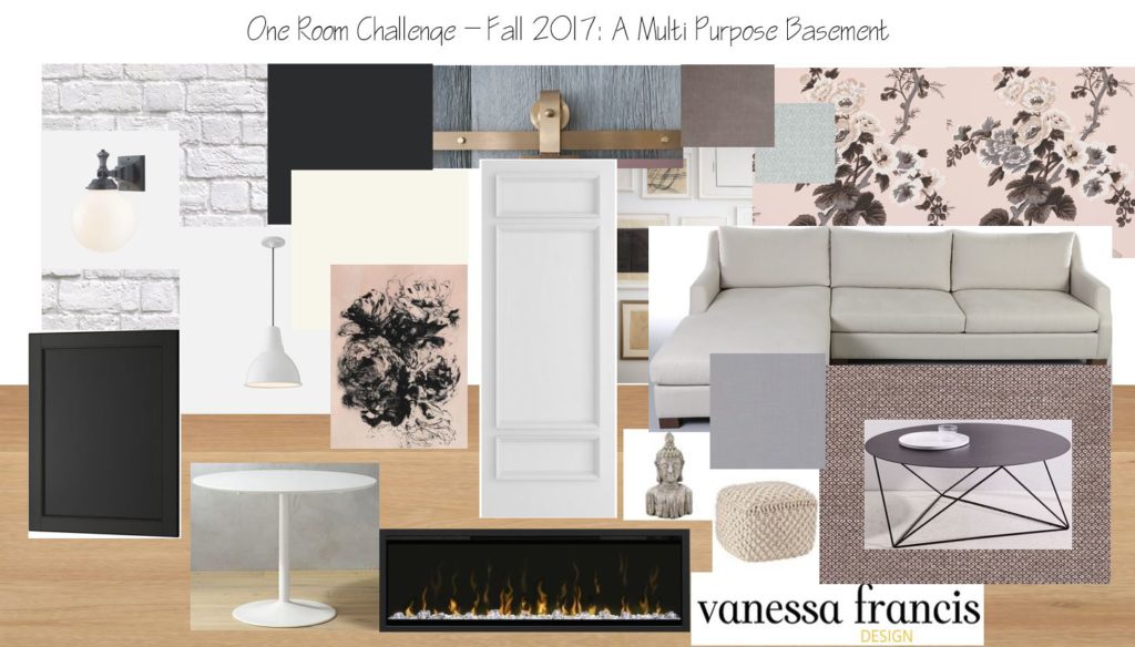
I tweaked the design a little from last week. Here is the revised design concept:
And these are some of the changes I made:
- I did a Poll in an Instagram story asking my followers which colour Annie Selke rug I should go with – grey or brown? Around 80% said grey but I sided with the minority and went with the brown as I felt it was different, a nice contrast to the darker grey sectional plus a little more forgiving in terms of spills and stains. It actually has small grey circles within it, so it goes perfectly with my black/white/grey/pink/brown colour scheme. I know that sounds like a rainbow of colours but as you can see it looks calm because other than the pink, the colours are neutrals (although I think blush pink is a neutral as well.) And did you know that brown is back? #brownisthenewblack
- I also chose a coffee table and I’m having it shipped to a UPS store across the border and I will drive there in the next week to pick it up. It would have taken 10 weeks to arrive in Canada if I had it delivered to my home and of course I didn’t have that sort of time. (Well, I could have had the time if I had my ducks in a row and ordered 10 weeks ago.)
- And I changed the door style in the kitchen as my TV console has flat panel doors so I thought it would be more interesting visually plus provide contrast. I love this pull from TopKnobs and feel it would look perfect on the shaker style door.
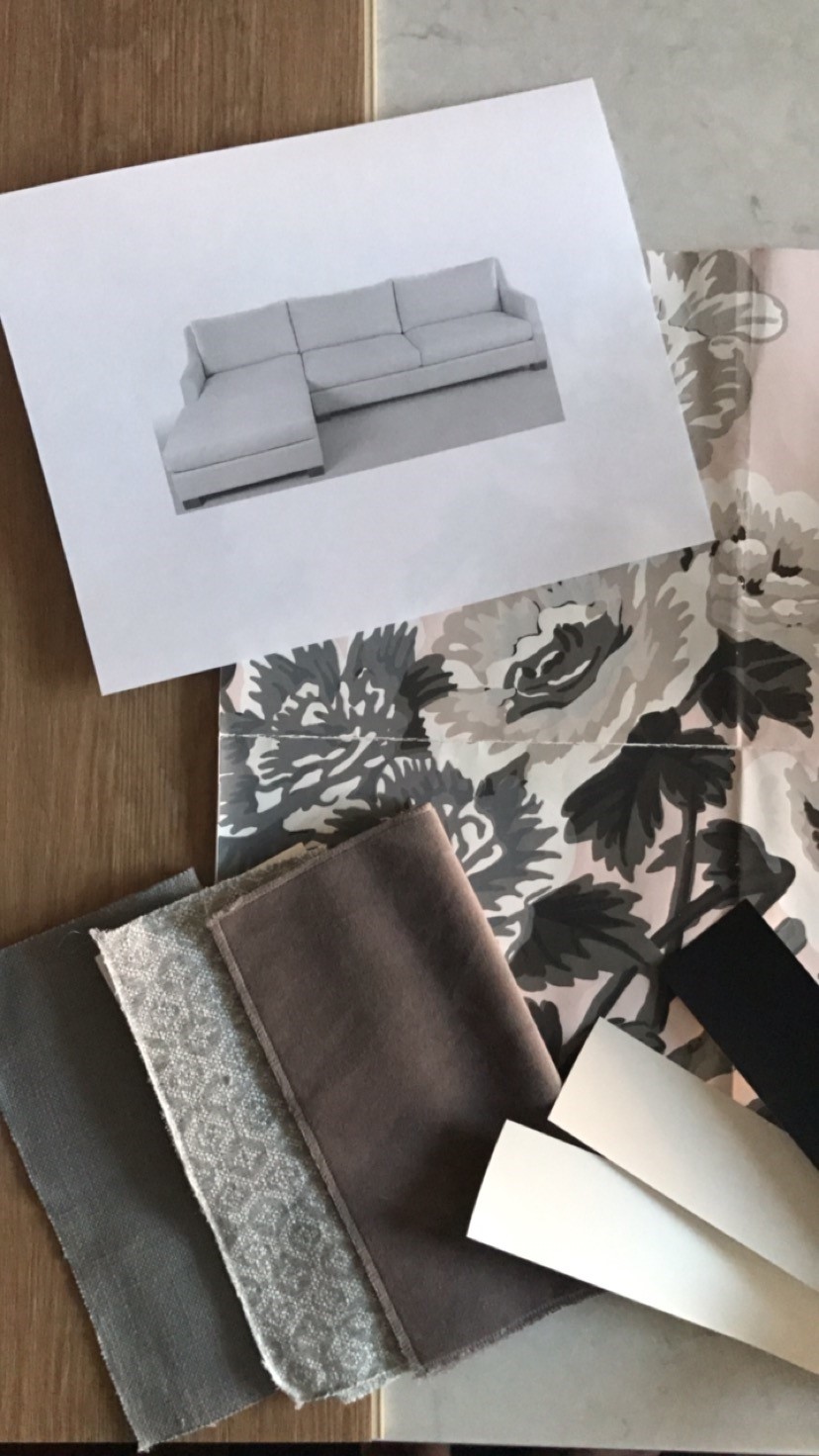
The jumping off point for the design scheme is the Schumacher wallpaper with its blush, grey, brown, black and white hues. Every space needs a jumping off point for colour and it’s usually a fabric, area rug or wallpaper. (PS if you click on the Schumacher link, you will see a photo of my ensuite with the grey version of the wallpaper.)
The space will be painted in Benjamin Moore Simply White OC-117. I knew the basement had to be white but I went back and forth between which one. Simply White is a colour I have used and recommended for years on trim especially and all the trim and doors in my house are this colour. My first floor is painted in a colour I hadn’t really heard of before – Gardenia AF-10 which I absolutely love. I think Simply White is a crisper white which is what I need for my dark basement. The colour shown beside it above is Balboa Mist OC-27 and this will be the colour of the two doors – it’s a light greige. The Black shown (HC-190) will be the colour of the three doors from Metrie that will act as a room divider.
The grey linen look Crypton fabric from JF Fabrics is Evan 64 and the gorgeous L-shaped sectional from Whittington’s will be covered in it. The photo above isn’t really the shape or style of my sectional. Next week, I will share more about the sectional and hopefully have an in progress photo of it to show you. The cocoa coloured velvetish fabric is this one from JF and the grey patterned one is this one from John Robshaw’s line with Duralee – they are for pillows. The wallpaper is the main pattern in the space and I didn’t want anything competing with it.
Flooring:
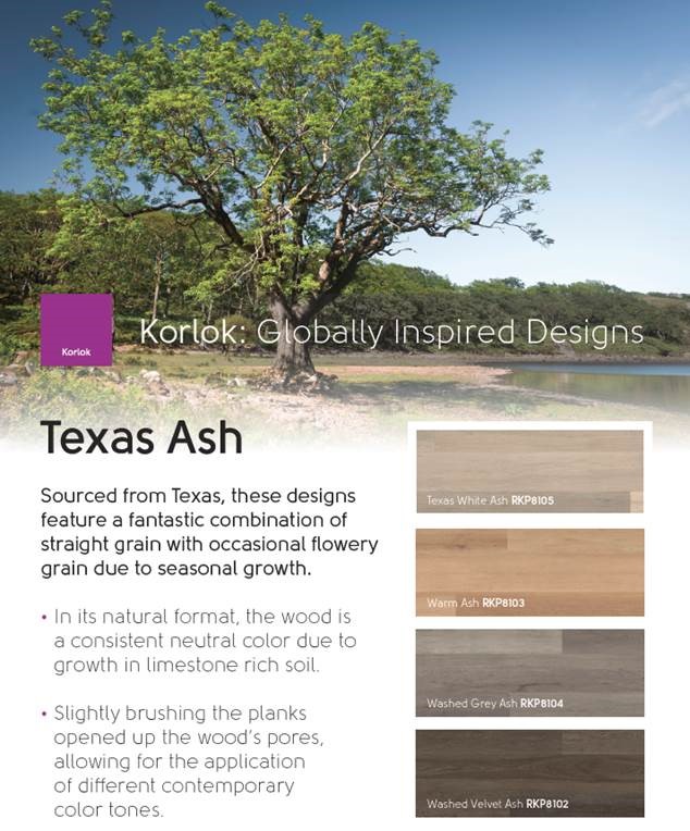
I was really hoping for the flooring to be installed at the time of writing this so that I could show you how it looks in my space. You can see the large sample in the image above. It is Karndean’s new product Korlok which has a rigid core different from its looselay luxury vinyl collections. Karndean gives you the look and feel of natural products, but with the durability and resilience of luxury vinyl.
I chose this product because it really mimics wood and doesn’t look fake or uniform. These are some of the properties and benefits of Korlok which made choosing this product an easy decision:
- Unlike laminate and wood flooring, Korlok is completely waterproof not just water resistant. You know that old adage, it’s not if your basement will flood, but when. In fact, I had two enquiries from prospective clients over the past few days saying they had a water pipe burst with damage everywhere including the basement. With this flooring, you wouldn’t have to worry about water damage.
- It is quiet underfoot as it has an acoustic foam backing – the perfect choice if you are looking to reduce noise transfer to rooms below.
- Korlok has a vertical click locking system allowing the installer to quickly drop and lock planks together.
- Korlok is low maintenance and easy to clean.
- It can be installed over existing hard surface floors such as tiles.
- Karndean continuously improves their manufacturing processes to ensure sustainability. Korlok is 100% recyclable! Not having to use any adhesive means there is no waste and the floor can be reused and recycled.
You can read more about the benefits of the Korlok product here and the benefits of this product over laminate here.
Now let’s talk about the colour and pattern. I have dark hardwood flooring throughout the house but thought I would change things up to something lighter in the basement which doesn’t have much natural light. I have always loved the look of French Oak floors and this one called Warm Ash is the perfect mid tone, neutral colour and really mimics the real thing. I didn’t want flooring with a pronounced pattern or variation in shades. This one is subtle and lends itself to the ever popular Scandi look.
Progress:
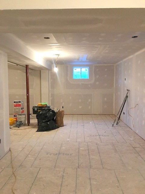
So here is where we are as of today. The walls and ceiling are up and they just need another skim coat before they can be painted. As you can see, there is a lot to do in only 2.5 weeks so wish me/the trades luck! By next week, I will have a whole lot more to show you – hopefully.
Don’t forget to check out the 20 featured bloggers here and the rest of the guest participants here. And as always, thank you for your support!
 Check out my former One Room Challenge Reveals here:
Prettying Up a Builder Kitchen (former home) – Fall 2014
Teen Daughter’s Bathroom (former home) – Spring 2015
My Parisian Bedroom (former home) – Fall 2015
Teen Daughter’s Bedroom (former home) – Spring 2016
My Charming Kitchen – Fall 2016
My Functional and Pretty Office – Spring 2017
Feel free to connect here:
Instagram | Pinterest | Facebook | Twitter
Happy decorating,



tim@designmaze
October 19, 2017Looking good V! blank canvas for your amazing touches! heated flooring too?
Carley Brandon
October 19, 2017This is a huge project and it’s looking amazing! I love that wallpaper!
Emily Vanderputten | chez V
October 19, 2017Coming together! Love the tweaks – and how smart to have the table delivered near the border for pick up!! Sending good vibes this week for progress!
Laura @ Sweet Maple
October 20, 2017Love how it is all coming together and the choice of the carpet! I just made my pick for the window treatments! Good luck to you for the next week ahead!
Joan S
October 23, 2017Wow! It’s looking good already. I love your selections, and appreciate how you’ve explained your thought process for each element. I love reading blogs, but admit that I don’t do it as much as I used to. I enjoy reading yours so much!