Hello there,
Where does the time go? We are just one week away from sharing the reveal of my sister’s kitchen renovation for the One Room Challenge. You can see the Befores, the design concept and progress so far in these previous posts:
Week 1 | Week 2 | Week 3 | Week 4
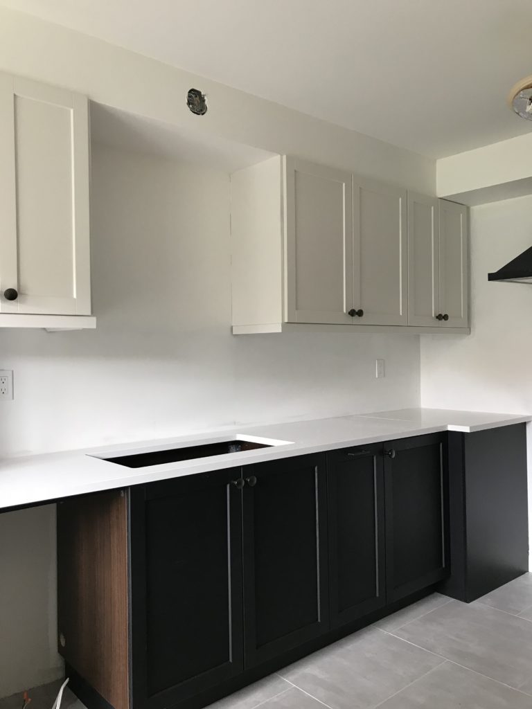
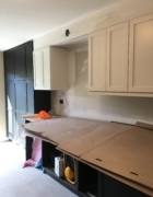
A lot has happened since last week. The counter was installed and it looks beautiful. It’s Organic White from Caesarstone and I used it in my daughter’s former bathroom. It is a creamy white with a little movement but not busy or speckly or veiny.
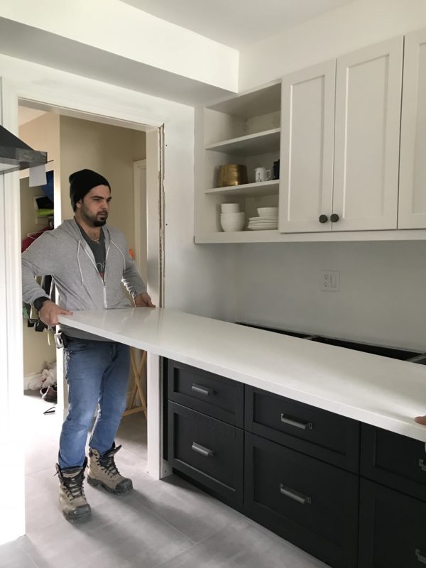
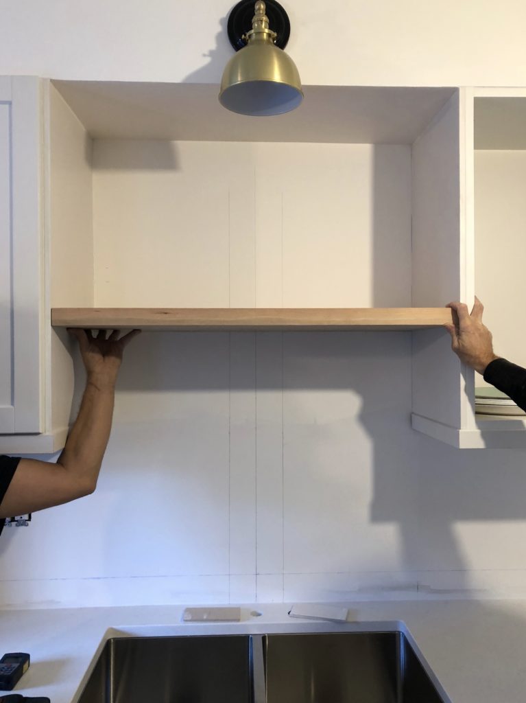
There are a million decisions that go into renovating a space and my sister and I Facetimed and texted constantly throughout this project. For example, “How high should we install the shelf?” My sister wanted it at this height as we both agreed that placing it in the center would not look as good. But I thought that the 19″ of space above the shelf was too large and items would get lost so we moved it up a few inches. Also, “Backsplash above the shelf or not?” We decided not to which is what I did in my kitchen. I thought the items would have more presence without the backsplash. There is no right or wrong answer to these types of questions. You sometimes have to go with your gut or what looks visually appealing to your eye.
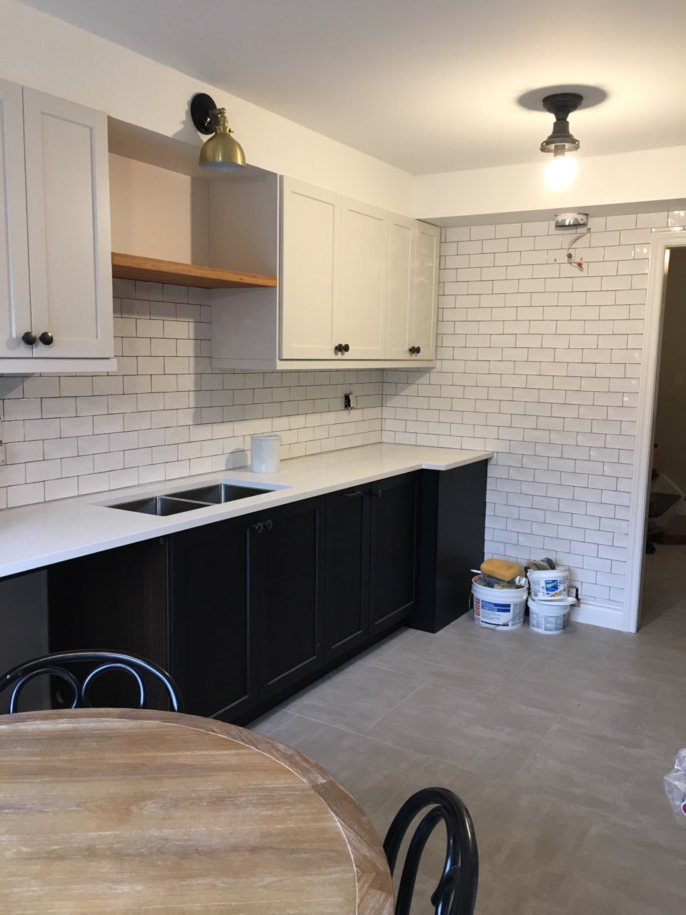
And then the backsplash went up (it’s not grouted yet), lighting (ceiling fixture shade not on) and the solid wood shelf which my sister oiled. This humble little kitchen is looking sooo good, don’t you think? I don’t want to give any more away before the big reveal next week. I kind of gave a lot away already. 🙂 And I cannot wait to style it all pretty.

I’m off to Vancouver for the next few days for my nephew’s wedding and I cannot wait.
Be sure to check out the featured designers here and the guest participants here. Thanks for following along. If you have any questions, please feel free to ask.

Check out my former One Room Challenge Reveals here:
Prettying Up a Builder Kitchen (former home) – Fall 2014
Teen Daughter’s Bathroom (former home) – Spring 2015
My Parisian Bedroom (former home) – Fall 2015
Teen Daughter’s Bedroom (former home) – Spring 2016
My Charming Kitchen – Fall 2016
My Functional and Pretty Office – Spring 2017
A Multi Purpose Basement – Fall 2017
A Teen Girl’s Bathroom – Spring 2018
Feel free to connect here:
Instagram | Pinterest | Facebook | Twitter
Happy designing and decorating,



tim@designmaze
October 31, 2018Looks fabulous! it’s just like your inspiration kitchen and that subway tile is perfect … and black steel hood, can’t wait to see it all next week. now here is a question V, how do you mount that floating shelf there for solid support without visible brackets?
Nicole Q-Schmitz
November 1, 2018Great progress so far! We’ll be doing open shelves (when we finally finish the kitchen) and I’m still undecided about tile going all the way behind, or stopping at the shelf like you did here.
Libbie@alifeunfolding
November 1, 2018Vanessa,
This is looking so so good! Love the subway tile and cabinets.
Crystal
August 21, 2019Yes I’d love to know how that floating shelf was mounted as well. Gorgeous!