I’m sure by now most of you have read the fourth issue of Lonny. I must say, it’s my favourite to date. Michelle Adams, founder and editor of the magazine, shares her home and describes it as “sophisticated yet quirky, relevant yet timeless.” I think this describes what the homes featured in Lonny are all about.
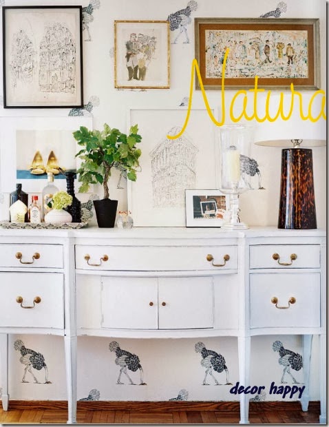
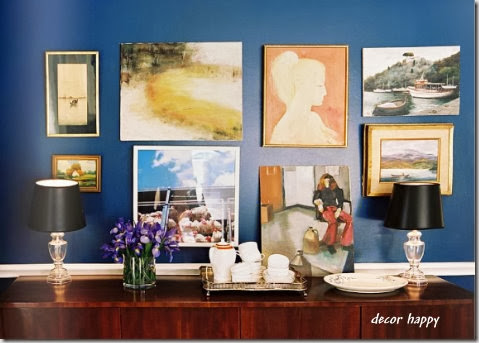
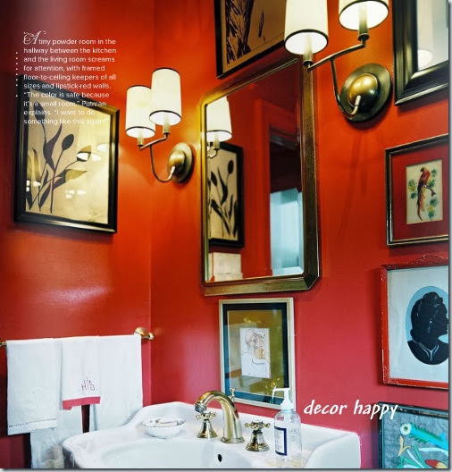
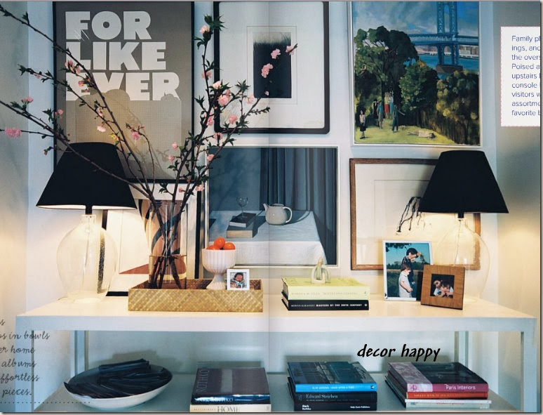
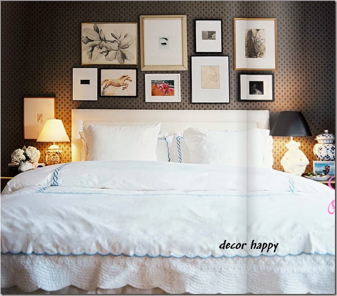
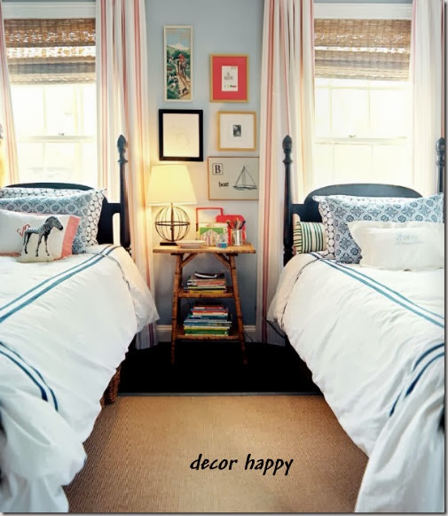
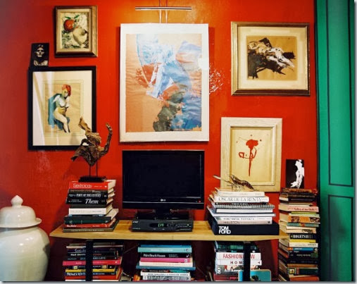
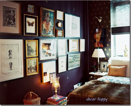
Did you notice all of the art hung randomly, in most of the featured homes, with mismatched frames or no frames and various styles of art – paintings, drawings, photography. It gives the impression that the art was lovingly collected over time from an antique store, flea market or on etsy. Original art adds an indescribable quality to a space – it takes a room to another level. What do you think?

DesignTies
April 13, 2010All walls should have art — and the more personal it is, the better!! You can get your digital photos printed in various sizes at Costco for a few cents up to few bucks, pick up some frames at Ikea or a garage sale, and voila, your very own personal artwork for your home 🙂
I kind of like the look of the mismatched frames and sizes. I think it adds character to the overall vignette.
Kelly
The Neo-Traditionalist
April 14, 2010I drooled over the issue all weekend! You selected some of my favorite images to share—the top on of Michelle’s apartment being my all-time favorite of the issue. The thin gilt bamboo frame in that shot made me weak in the news. SO chic! Always happy to find a fellow Lonny lover! xoxoxo katie
Nancy@marcusdesign
April 14, 2010Yes!! Great art in a space just takes a room to a whole new level! My dream is to own some amazing original pieces and get to look at them in my own home every day!! I agree with you, the mismatched frames is a very chich look, I once heard that this began in France where wealthy ‘art-collectors’ would hang a piece, and just continue to collect and hang pieces all the way around the first hung piece in a sort of random fashion!
paula
April 14, 2010I absolutely adore it. This is what we are trying to create now. Hope to have it done soon.
The Zhush
April 15, 2010Couldn’t agree more! Love the photos you chose here!
FROM THE RIGHT BANK
April 15, 2010This has been my obsession for the past couple of years and I loved all the ones in Lonny! Thank you for stopping by my blog recently. I’m having a gold mirror giveaway so please stop by if you’re interested!
barbara@hodge:podge
April 17, 2010Just discovered your blog via Design Ties. I too am loving the mismatched frame “look” as well. I love how it gives a feel of a collection that has taken time to grow. It also reminds me of France where in Paris I noticed that Parisians decorated their homes with layering of art, furniture and large opulent mirrors in such an unprententious way.
I have heard about Lonny. Is it an online magazine or in trade? I need to check it out
Barbara
DesignTies
April 17, 2010Love this look too. It’s funny… this is what my Mom would do with her art and other wall hangings. I remember helping her plan out how she’d hang things, but she didn’t want it to look contrived… she wanted to be sure that the pieces looked like they were hung randomly. She had a real eye!! I’m hoping to do something like this in my dining room. I hope I can channel a bit of my Mom’s talent when I do!!
Victoria
Renae
April 17, 2010I like this! I don’t like ‘matchy-matchy’, so this definitely speaks to me! I especially love that red bathroom!
Karen@StrictlySimpleStyle
April 19, 2010I love the look and the fact that it is achievable at any price point.