Late last year, I was happy to learn that Michael Penney, Style Editor at Canadian House and Home is writing a decorating blog, a private venture separate from his blog and work at the magazine.
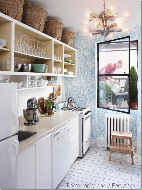
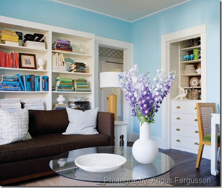
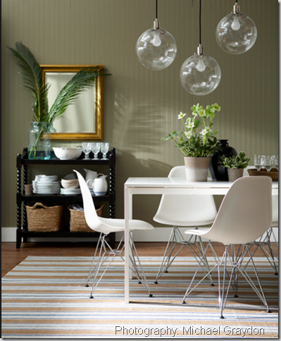
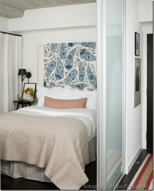
His home was featured in the magazine in June, 2009 and as a result was featured on a number of high profile blogs. Seems bloggers and readers alike resonated with his effortless ability to create a stylish home using finds via ebay, craigslist and thrift stores. Throw in some DIY, wallpaper and beautiful fabrics and you have a home that is comfortable, personal and fresh.
Michael and his wife Sara moved into their first home last year (the home featured in the magazine was a rental) and I can’t wait to see what he does with it.
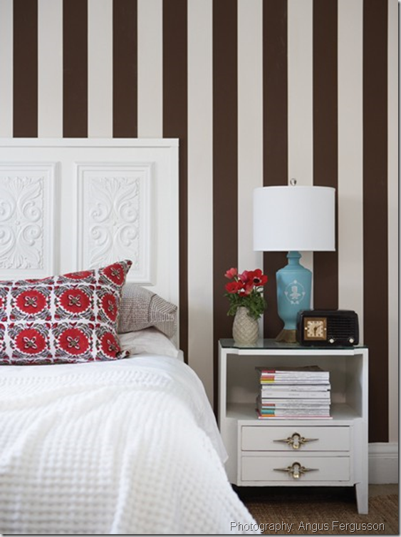
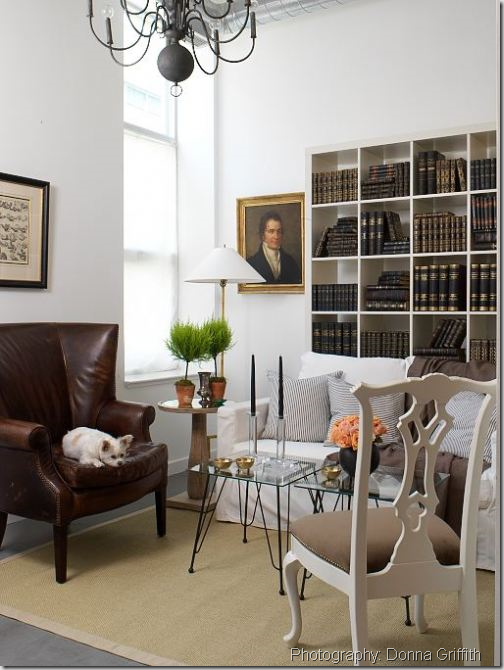
He took time out of his hectic schedule to answer some questions about his life, inspiration and decorating. Not only is he talented but approachable and affable too! (All photos from House and Home and Michael’s portfolio.)
How did you end up working at Canadian House and Home?
I have been living/breathing/sleeping design since I was a kid and I was always learning as much as I could from magazines, books and tv shows. Then in university, I got a little more serious about it as a career and started working during the spring/summers at a Rosedale shop that was frequented by lots of Canada’s most famous design personalities. I got the chance to work with amazing product and hone my design skills and even meet some of the staff from H&H.
That lead to a summer internship at the magazine when I graduated and I’ve been there ever since! I didn’t study design in school, in fact I studied Art History at Queen’s University in Kingston. Art History fuelled my love of the arts and architecture and gave me a fantastic foundation for what I do now.
I’ve been able to build on that foundation by always learning more and more as I go along and by trial and error. It’s been a fun and inspiring journey.
Can you share some decorating plans for your new home? Will we see it in on the pages of H&H one day?
Our new (old) house is totally us. My wife Sara and I have begun taking vacations in Kennebunkport Maine and that has really influenced the style of our home. Its got a dose of north-east prep, lots of fresh white and blue/greens and printed fabrics mixed with lots of stripes. It’s traditional with a fresh, young and casual spin. H&H? You’ll have to wait and see…
Name one thing about yourself that readers may be surprised to learn?
Before finding my place in design and decoration I studied Religious Studies and planned on being a counselor! Oh, and I am obsessed with Subway sandwiches.
How would you describe your decorating style?
My decorating style changes now and then, but the common thread is traditional elements mixed with fresh colours and casual comfort. I like to reinterpret the work of the decorating greats through a modern, more loose perspective. I can get into modern and edgy looks, but my heart strings are always pulled most by fresh, colorful and effortlessly comfortable rooms.
Who inspires you?
Decorating-wise I’m inspired by lots of people – oldies like Albert Hadley, Dorothy Draper, David Hicks, Sister Parish; the newer crop like John Derian, Windsor Smith, Peter Dunham, Steven Gambrel, Tom Scheerer, Celery Kemble, Ruthie Somers, Thomas O’Brien, Rita Konig, Miles Redd, Charlotte Moss, Bunny Williams, Nick Olsen, Eddie Ross and many more!
In Canada, I love Michael Angus, Anne Hepfer, Ray Staples, Sarah Richardson and Tommy Smythe, Michelle Lloyd and Christine Ralphs, and Cobi Ladner for the way she creates such a warm and inviting home.
We have a pretty wonderful group at House & Home and I’ve learned so much from the likes of Hilary Smyth, Meg Crossley and Sally Armstrong, whose house I was just at and it is so stylish! And of course, my style was basically formed by the pages of Martha Stewart Living.
What is the most common mistake people make when decorating?
People’s most common mistake decorating eh? Well I’d say Canadians need to get over taupe with accents of red. I get why they like it – it’s warm and cozy, but it’s done to death.
People seem to be stuck on the super rich, heavy heritage colours from the mid 90’s (ochre, forest green, burgundy, taupe, red) and I wish they’d branch out and try something fresher. Harsh, I know, but you asked!
What does every room need?
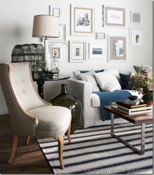
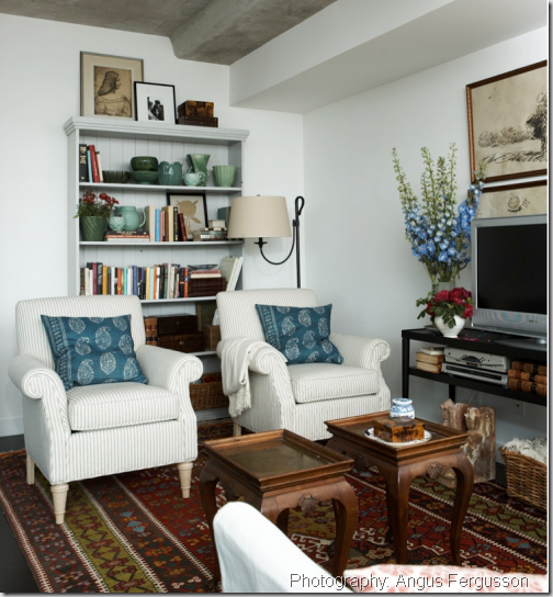
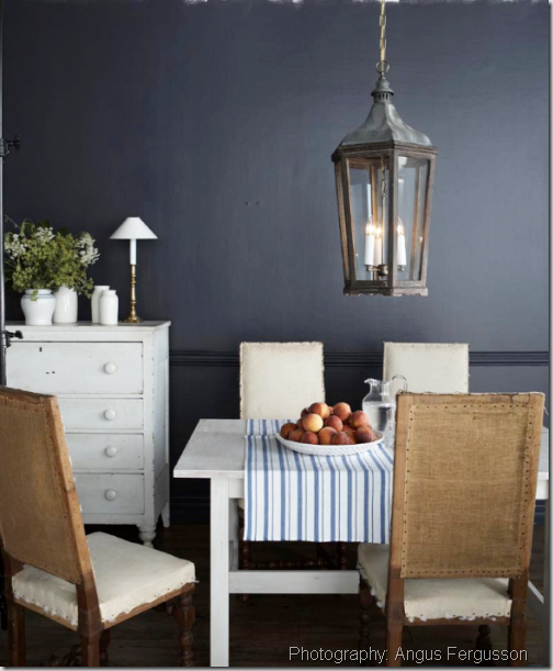
I always think most rooms can use a stripe. Stripes work so well with other patterns and solids and they add a clean, linear and masculine touch to any scheme. Ticking stripes never, ever go out of style and their vintage leanings help warm up a room. Everyone is into striped rugs right now and I love those too, but they’re likely a passing trend. But striped cushions, upholstery and drapes are here to stay.
What are three easy changes that a homeowner can make to update their space?
Obviously the first easy update is paint. Cliche? Yes, but true none the less. Paint will update, refresh and hold a space together. It’s cheap and easy and will make a world of difference.
Next, swap your matching love seat for a pair of armchairs. This is a no brainer and will give you more flexible seating, an airier appearance and will add variety instead of two rectangular blocks in a room.
Lastly, add natural fibers. Whether a jute carpet, baskets, a woven tray or bamboo roman blinds, natural materials are a cure-all. They warm up modern spaces and relax formal ones. You can’t go wrong!
What are your favourite shops/markets for unique decorating finds?
If you want unique, you should try going vintage. This can mean your local Salvation Army Thrift Shop or a flea market. I like thrift shops in the burbs because they aren’t picked over and you have to go often (with an open mind) before you find something good. I like the Aberfoyle flea market near Guelph and I’ve had some good luck at Antiques USA in Maine too. Anthropologie has really unique wares if you want to shop the chain stores and John Derian Dry Goods and ABC Carpet & Home in New York are inspirational.
What made you decide to write a blog in addition to your blog at H&H?
I started Michael Penney Style as a place where I could really explore my point of view as a decorator. I’m influenced by lots of styles, people and places and I wanted a space to muse about these many influences and ideas. It gives me a chance to update more regularly and let you see a little bit of my life outside of the magazine.
Plus in most cases, what I write about on my blog isn’t about high end, exclusive design. It’s usually more in touch with real budgets and even if it’s expensive, its about the idea or inspiration that we can all take and use in our own homes on a personal level. Because in the end, decorating for me, is about expressing personal style and creating a home that makes you feel good.
Well, Amen to that! Thank you Michael for sharing your insight and experience with us. It was really fun getting to know you a little more and to hear your thoughts on decorating.
Be sure to head over to Michael’s blog for glimpses into his personal life and more of his decorating wisdom.


christine {bijouandboheme}
January 25, 2011What a fabulous interview Vanessa- I loved reading this!!! I adore Michael’s home and his style- was great to learn more about him and his inspirations. Fabulous!! xo
Christine @ The Glam Blog
January 25, 2011Great interview Vanessa….I receive his daily blog update in my inbox everyday which I am quite enjoying! Have a lovely day darling!!
Shannon @ What's Up Whimsy
January 25, 2011Wow, what a great interview! I am a huge fan of Michael Penney and just found out about his personal blog in the last couple of weeks too…I’m hooked now!
Marcus Design
January 25, 2011Love this!!! I ate up every word, what a great interview! I really love reading Michael’s blogs and it is nice to learn more about him. Thank you for sharing this with us Vanessa 🙂
Nancy
christine, just bella
January 25, 2011Great interview! I’ve loved Michael’s style since I first saw his place in H&H!
Ana Castanheira
January 25, 2011It’s so nice to get to know Michael a bit more since following him online & in the magazine for some time now – you’re a great interviewer too!
Shannon
January 26, 2011Nice interview! Just started following Michael’s blog last week. Also saw him at the Oakville Princess Margaret Showhome in 2010. Thanks!
Shannon
{aka}|design
Designwali
January 26, 2011Fantastic interview! Love MP’s blog…
Design Love
January 26, 2011Great interview! He seems very “real” and personable! I love to see a designer offer inexpensive ideas that can help everyone have a gorgeous home! I like his blog, he is great!
Cindy
Grace @ Sense and Simplicity
January 26, 2011Great interview. I discovered Michael’s blog the other day when I was reading Decor Happy and I’ve really been enjoying it. Thanks for giving us a bit more insight into Michael’s design sense.
Rambling Renovators
January 26, 2011Fabulous interview Vanessa! Michael is a real talent and I think he’s only going to get bigger and better.
Kelly @ JAX does design
January 26, 2011Great interview! Thanks to you and to Michael for giving us a glimpse into his decorating world 🙂 Off to check out his blog now…
Marlo
January 26, 2011Very good interview and great advice!
Cecilia
January 26, 2011Vanessa,
I enjoy your interviews, and loved to learn about Michael Penny-esp. that he was an Art History major-something I can relate too. Your questions were great!
Razmataz
January 26, 2011Thank you for taking the time to do this interview Vanessa. I really enjoyed this.
Style Attic
January 26, 2011This is hands down one of the best posts I’ve read today! I loved this and am emailing myself the link 🙂 Thanks for the inspiration and education that blogging is sooo good for! He’s awesome!! XO
TLC_Designs
January 27, 2011Great interview, Vanessa. This was so much fun to read. I love Micheal’s tips about stripes, he’s so right. I like how striped carpets look, but I agree that it’s a huge commitment to make on a passing trend.
Kudos to both of you, loved reading this.
*Tania @ Passport2Design.com
*sarah berry design*
January 31, 2011Vanessa, I LOVED this! I’ve been saving it up until I had a free half hour to sit and take it all in. I love your questions and all of Michaels answers, he writes clearly and humourously and in a very charming and engaging manner and his style is just wonderful.
Also, LLLOVE the new header, so very glamourous and simple and chic and suits you perfectly!