Hi there! Hope you are well! There is a nasty bug going around and my little one (actually, she’s almost as tall as me!) has it. I have been drinking lots of orange juice in the hopes that I don’t get it.
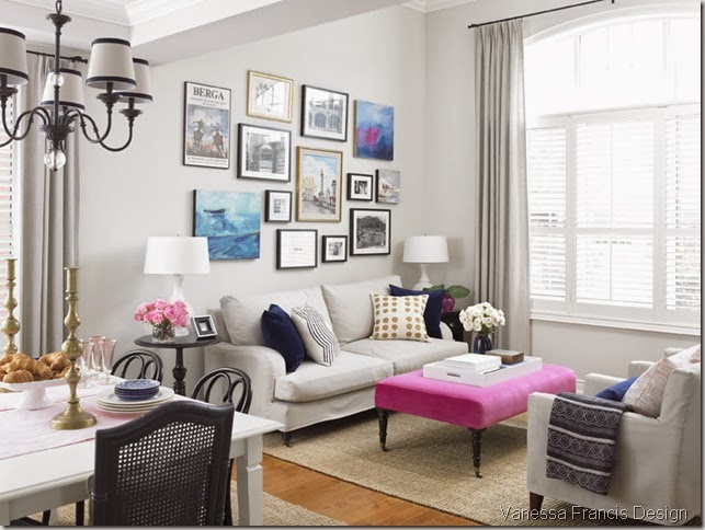
Just thought I would share this photo of my living room in case you didn’t get a chance to see it in the Style at Home Organizing issue which is on newsstands now.
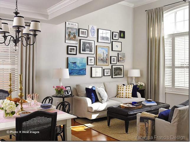
The above shot was taken in July and is how it looks now. The one below is how it looked for the Steven and Chris show and was taken in March of this year. I had purchased the leather ottoman from Crate and Barrel and although I do love the piece (and have recommended it both in the rectangular and square forms to clients), it was taking the room in a more masculine direction than I wanted. The room also needed another colour to play off the shades of blue. I had some pink going on in the adjoining dining room which I blogged about here. I then sourced the perfect pink velvet fabric for the ottoman from Kravet. Just the hit of colour the room needed!

I kept four of the original art pieces and added another two created by myself. The art wall needed to repeat the hot pink colour so I painted “Two Hearts” (because when I was done it kind of looked like two adjoined hearts) in the upper right corner (of the top photo.)
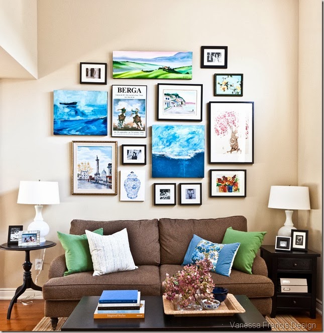
It’s funny, people are still pinning this image below of how my living room looked last year pre-slipcovers etc. It looked great then but I am finally happy with it (the curse of being a decorator, blogger, pinner…) and wouldn’t change a thing now (much to hubby’s happiness!)


Sheer Serendipity
September 13, 2012Your livingroom looks gorgeous! Congratulations on being featured in Style at Home.
Victoria @ ÉdinHome+Co
September 13, 2012I think the pink was a perfect addition Vanessa… so vibrant and full of life! I also think your gallery wall looks more curated with it’s fewer pieces 🙂
Lovely!!
Victoria
Will @ Bright.Bazaar
September 13, 2012I just love that pink ottoman! Hope your little one feels better soon. Will
Tiffany Leigh Interior Design
September 13, 2012I love the addition of pink to the room! I’m a firm believer that every room needs a touch of pink. While the leather ottoman you had before is nice, I think this one has a lot more personality!
CaseyinTO
September 13, 2012That pink ottoman is DIVINE!!!! I need a pop of pink in my place STAT
Amelia @ House Pretty
September 13, 2012It’s amazing how much the pink changes the look and feel of the room – love both versions though!
Julie Taylor and Danni Greenwalt
September 13, 2012I love the added pink. You also did a wonderful job on the art work.
jody vanB
September 13, 2012I think each version is lovely and a reflection of how your style slightly changes and matures each time. I believe the last image is being “pinned” more than the others because it’s such a dead on shot. It would be interesting to have your wall now, photographed the same way and see if you get just as much “pinterest interest” with a similar camera angle 😉
Kelly R.
September 13, 2012The pink was added so judiciously, in exactly the right amount and the absolute right places. I like the streamlined gallery wall, too – very nice editing :).
Lisa
September 13, 2012I love them all but I must admit that hit of pink looks fabulous! It is fresh and definitely not masculine. I am always changing up my rooms as well, though lately I haven’t had a lot of time to do so : ( Hope you don’t get the bug!
Alison Hodd @ Catherine Alison Interiors
September 13, 2012What a lovely room Vanessa. I love all your edits and additions. – Alison
Lisa Mackay
September 14, 2012Just beautiful Vanessa. I really think the choice of pink was inspired!
cecilia
September 14, 2012I love that in each gallery display, you’ve kept to the odd numbers, 13, 17 and the pinned image 15. I think each gallery is fantastic, and keeps the eye moving. I love the pear painting, and love the pinks. I agree with the comment that the bottom image is pinned alot because of the dead-on shot – but I personally love the 3 oil paintings (the placement of the blues) with the pop of pinks – is just so visually appealing.
How2home
September 14, 2012This is amazing Vanessa! You’re such a great designer. Im not a huge pink fan but that pink ottoman is AMAZING! Where is it from? Hope your little one will feel better soon.
Heather
September 18, 2012I love the pink ottoman! Definitely was the right move to make. Give the room that subtle touch of feminity!
Elisa of Fancy Free Me
November 4, 2013I like your ever evolving gallery wall. And the pink ottoman totally makes the space.
Improvement List
November 4, 2013That is the fun thing about design…you can keep changing until it is just right. Actually I like all the ways the room looked. Hard to pick just one to pin;)!
therelishedroost
November 4, 2013I love that pink ottoman , it complements the art work so well, makes the whole room pop, fabulous!
Great blog too!
Karolyn
Michelle Woeller
November 4, 2013I love your living room with the pink ottoman- it’s amazing what a punch of color will do. Perfect combination! Elle
Lisa - A Room with A View
November 4, 2013Beautifully done. With all the changes, the room looks warm and inviting and so interesting either way – no wonder it is still getting pinned.
Kathysue
November 4, 2013Great changd-outs, YES, I too change out for the seasons, keeps it fresh and fun for me. YOU did a fantastic job,
Kathysue