So, I have been slowly but surely working on Mr. DH’s den (aka the “man cave.” ) I received creative and inspiring input from my design savvy blogging friends and took something from each.
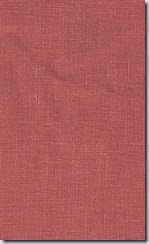
After I figured out the layout (it’s a small room, so this was easy), I put my mind to the colour/pattern scheme. Mr. DH likes navy and grey (and it’s manly – no pink allowed in this room) so I knew those would be the main colours. Interestingly enough, four out of the five blogger moodboards had a shot of orange/tangerine. So when I spied a linen called “Spice” at Tonic Living, I knew that had to be the “happy” colour in the room to balance the grey and navy. Even “man caves” need a happy colour so it doesn’t end up looking like, well, a cave! I would call this colour a “burnt orange” as it’s not bright and I think that’s why I like it.
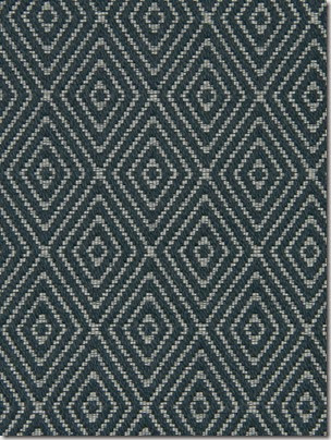
I fell in love with this Robert Allen fabric (below) and thought it would be perfect on a custom ottoman – every room meant for TV viewing and relaxing needs an ottoman, don’t you think? (I think I have designed one for almost every client’s family room!) I love the ethnic/tribal feel of the fabric.

I knew I wanted wallpaper on one wall. I love seeing all walls papered in a room but that is something that I just can’t commit to – so one wall would be enough. Which wall though? The idea of papering the TV wall in a dark wallpaper really appeals as in this image below. The TV just disappears on the Nina Campbell wallpaper.

But when I brought home samples of wallpaper with a black background, it just wasn’t Mr. DH’s cuppa. So, then I thought a lighter wallpaper on the daybed wall (the opposite wall.) That probably makes the most sense anyway since I am only doing one wall. What wallpaper? How to narrow down the thousands of choices? You know I love floral but this is Mr. DH’s room where he goes to chill, watch TV, read – no florals allowed. What about trees? Trees are manly, right? I narrowed it down to these two.
Nina Campbell’s new Woodsford papers are beautiful (they are so new that they aren’t even on the Osborne and Little site at the time of writing.) They have a real hand painted quality and when you touch it you can feel the “paint,” i.e. it’s not smooth.
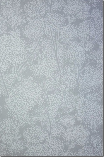
But I have always been a huge fan of Cole & Son’s Cow Parsley papers so when I heard they recently came out with five new colourways, I headed off to Kravet to see them. (One of my first posts included an image with Cow Parsley which I loved.)

Isn’t it lovely? It’s like a mural so that kind of justifies my “one wall” plan. I was going to choose a hex print (you probably know the one I mean!) which was very cool and manly but I think this tree/plant wallpaper/painting is more fitting for a one wall application.
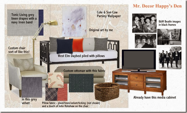
This is how everything will look when complete. The Daybed is for napping but this room also doubles as a guest room and a room where I can go when Mr. DH’s snoring is too loud. 🙂 (He is not going to be happy when he reads this!)


barbara@hodge:podge
October 31, 2012Oooh, I like it! And in an online newspaper! yay! Your are a rock star!
Pam @ Cherish Toronto
October 31, 2012The mood board looks fabulous, Vanessa, and I can’t wait to see it all come together. Keep us posted as to when & where the room will be appearing online!!
Lisa
October 31, 2012Looks great Vanessa! And congrats on it being revealed on an online newspaper!
Kelly @ JAX does design
October 31, 2012Love the wallpaper you selected – in fact, all of your choices for the room look great! Looking forward to seeing it done, and I know what you mean about scary “before” picture – my craft room before pics are beyond scary! But I guess the scarier the before, the more impressive the after 🙂
Happy Hallowe’en!
Tim
November 1, 2012looking good V! Glad you make “blunt orange” into the manly room for Mr. DH. Loving the brass floor lamp and that Robert Allen fabric on an ottoman will look fantastic! Can’t wait to see it all put together!
InteriorGroupie
November 1, 2012Looking so great. Love all your choices and hope your DH does too. Keep us updated on the publication!
Taylor Greenwalt
November 1, 2012looking good! Cant wait to see it….
cecilia
November 3, 2012Vanessa, I love both the Nina Campbell and the Cole & Sons paper. Both because they have that organic feel and are monochromatic and bold, but not “floral.” Anything with branches and trees in the pattern really strike me! Great choice! I love the Robert Allen fabric too…and can’t wait to see the completed design!
The Artistic Bowl
November 3, 2012I love the color combo you picked. Can’t wait to see the finished result! 🙂
modmissy.com
November 4, 2012Looks great. I look forward to the final product. (Although is any decor project ever ‘final’ rather in a continuous state of change!)