Since the ceiling height in my living room is 12’, hanging a large piece of art over the sofa makes perfect design sense. An original piece of art this large would cost a pretty penny but an art wall comprised of different pieces wouldn’t break the bank.
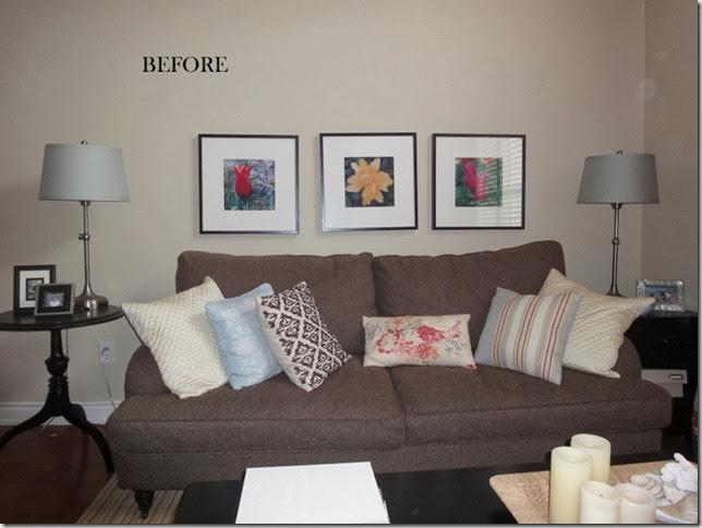
This is how it looked recently. The three photographs were taken by a friend and although I really love them, it was time for a change.
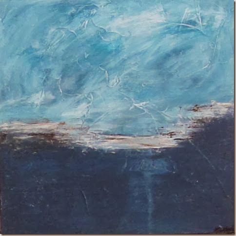
I was inspired when I received the abstract painting I bought in support of Matt Leblanc’s Art for Life campaign. (He raised over $35,000 for the fight against cancer!)

I didn’t really have a wall that would suit just this one painting (24” x 24”), so I shopped my house for art and photos that would work with the abstract. I have always loved the work of Anne Harwell and Laura Trevey, so I purchased prints from their Etsy shops as well.
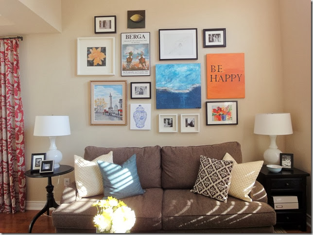
This is how it looks now and I just love it! I had some girlfriends over recently and they said it really warms up the space. That’s the beauty of art – it gives a home soul and personality.
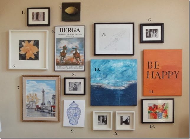
Below is a breakdown of what is on the wall. All of it has beauty, meaning or both. I smile every time I look at it. (I have moved the Be Happy up an inch since this photo was taken.)
I played around with the composition on the floor until this one felt right. There is no right or wrong with this. I didn’t want it to be perfect and tried real hard to make it look like the art was hung randomly – like it was collected over time. I think it’s much easier to hang art in a grid with even spacing in between than to hang art randomly.
The best thing about this arrangement is that I can change some of the photos and can add to it on top if I feel the need.
1. Photograph of a 15th century building, Portugal – Vanessa Francis
2. Lemon (acrylic) – Vanessa Francis
3. Photograph – taken by a friend
4. Poster from a Paris art gallery (backpacking trip in the 1980’s)
5. Nude (contours and foreshortening) done at art school – Vanessa Francis
6. Photo of my Dad as a young boy in India (only photo that exists of my Dad as a child)
7. Oil painting of Montreal done by a dear family member (in the 70’s) who has since passed.
8. My Mum in her early 20’s in England. (1960’s)
9. Print on Canvas – Anne Harwell
10. Original abstract – Matt Leblanc
11. Life’s too short not to be happy, right? – Vanessa Francis (I may change this to a reddish background and stencil “Joy, Peace, Family” or something like that for the holiday season.)
12. Photographs of Venice and the Acropolis, Greece – taken with a very amateur camera on a backpacking trip. Like how it is grainy and moody.
13. Watercolour print – Laura Trevey
What do you think?
I’m linking up here and here and here.
If you need decorating help, please contact me at vanessa@vanessafrancis.com.


Giggles
November 8, 2010Looks great. You balanced it well by taking out some pillows and adding more art! Good job!
Karena
November 8, 2010Vanessa, very nice arrangement of your art. I love the thought put into it!
Come read a great interview, then enter my latest giveaway!
xoxo
Karena
Art by Karena
FROM THE RIGHT BANK
November 8, 2010Great job! I think you already know how much I love art walls. 🙂
Jen
November 8, 2010I love it! It’s not really such a big change, but it really makes the atmosphere warmer. 🙂 I like the new lamps too.
Wendy
November 9, 2010i love it! art walls are hard to pull off but you’ve nailed it – congrats!!! i too want to do a combination of art and photos somewhere in my house… for now, i have this as my stepping stone into art / photo wall!
http://www.desiretodecorate.com/2010/09/art-picture-wall-done.html
Marcus Design
November 9, 2010My goodness, I LOVE this gallery wall! I want to do something like this in my home office but I’ve been so timid so far. I love how it turned out, and I love #9, what a cool print!
Nancy xo
Grace @ Sense and Simplicity
November 9, 2010I love your new arrangement – lots of interesting detail and things to focus on.
*sarah berry design*
November 9, 2010Ah perfection! YOu really do have such a great eye, I love how you say you moved ‘Be Happy’ up by an inch (I do that sort of minute shuffling of objects all the time and am told other people wouldn’t even notice)!!
Kelly @ JAX does design
November 9, 2010I think your art wall looks fab-u-lous! And I’m so happy that Matt’s painting inspired you 🙂 It looks wonderful grouped with your other pieces of art. I think art should represent who we are and what we love, and I think your art wall is exactly that 🙂
Good luck in my Fifi Flowers giveaway!
Kelly
Arlene
November 10, 2010Vanessa,
Wow, love the idea of shopping around your home for all this artwork. It has inspired me to do this up my stairway. It changes to look of the room, makes it more interesting.
Kelli @ RTSM
December 29, 2010I love this! I think the original inspiration and #11 are my favorites:)
the cape on the corner
December 29, 2010that looks fantastic! a really great way to use your height…and i’m loving that sofa.