My first guest blogger for this series is the one and only Christine DaCosta who is a talented Interior Decorator aka GlamaMama on twitter. She recently launched her own informative online decorating show Decorating Big with GlamaMama where you can get a sense of her fun personality! Welcome Christine.
*********************************************************************************************
Today I’m honoured that my good friend Vanessa asked me to be the first guest blogger for her new series called “Work in Progress Wednesdays” where a designer/design blogger can showcase a project they are currently working on. The project I have chosen is a client’s Kitchen Reno and I am very excited to share it with you all!
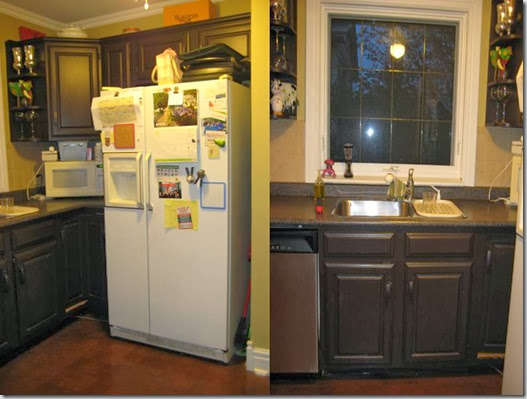
My client lives in an older bungalow and wanted to update her home which included a total ‘gutting’ of her basement bathroom (a future blog posting) and her kitchen. Her needs for the kitchen reno were the following:
· Lots of storage
· Simple lines for cupboards
· The colour green to factor into the kitchen in some way
· Overall, the design plan objective was to design an upscale but functional kitchen….with a touch of glam!!
Take a look below at some of the before pictures:
![clip_image002[5] clip_image002[5]](http://lh5.ggpht.com/_Pp-4J9vThO8/TNF_ZDpfd4I/AAAAAAAADN8/8RheQYYtpkQ/clip_image002%5B5%5D_thumb%5B3%5D.jpg?imgmax=800)
Because the square footage of the kitchen was only approximately 240 sq. feet – including the eating area, I couldn’t really stray too far from the initial footprint of the kitchen. But we did reconfigure a few things: the stove would be relocated to the outside wall of the house to allow for a built-in microwave fan over the stove and breakfast bar/prep area where the stove used to be. And of course, we gave her lots of cabinets and drawers with creative storage solutions to maximize her small kitchen.
Below is my floor plan for the kitchen. I recommended to my client that we use the far wall opposite the stove to install a custom made banquette – which would also allow for easy traffic flow from the kitchen entrance to the new sliding doors with access to the exterior of the home.![clip_image002[7] clip_image002[7]](http://lh4.ggpht.com/_Pp-4J9vThO8/TNF_Zn00jfI/AAAAAAAADOE/P6lX2TdUrPY/clip_image002%5B7%5D_thumb%5B1%5D.jpg?imgmax=800)
I also like doing 3D floor plans for my clients which should give you a better idea of what I was going for!![clip_image002[9] clip_image002[9]](http://lh5.ggpht.com/_Pp-4J9vThO8/TNF_a-KcVoI/AAAAAAAADOM/5HoKgPE0BSc/clip_image002%5B9%5D_thumb%5B1%5D.jpg?imgmax=800)
At the time the client was still undecided whether she wanted a full upholstered wall panel or just toss cushions with a large piece of art above. So for her floor plan I just showed a banquette with a cushion and decorative pillows and a frame above so she could see visually what the new eating area could look like.![clip_image002[11] clip_image002[11]](http://lh6.ggpht.com/_Pp-4J9vThO8/TNF_bfpfPHI/AAAAAAAADOU/8sxDe-umhhQ/clip_image002%5B11%5D_thumb%5B1%5D.jpg?imgmax=800)
![clip_image002[13] clip_image002[13]](http://lh5.ggpht.com/_Pp-4J9vThO8/TNF_b5s4qhI/AAAAAAAADOc/idsKPWFsqCM/clip_image002%5B13%5D_thumb%5B1%5D.jpg?imgmax=800)
However, when I showed my client the following inspiration photo of this absolutely gorgeous banquette designed by Tobi Fairley….and told her that I could design a similar wall panel for her kitchen wall – that was it!! Decision made! Her banquette was going to be the wow factor of this kitchen….we were going to go for the glam but yet make it functional as this was her family’s only eating area in the whole house. So it was going to serve as her eat-in area AND her dining room! So we needed function AND Glamour! ![clip_image002[15] clip_image002[15]](http://lh4.ggpht.com/_Pp-4J9vThO8/TNF_cvg8kiI/AAAAAAAADOk/sbi3HHtP174/clip_image002%5B15%5D_thumb%5B1%5D.jpg?imgmax=800)
Design by Tobi Fairley
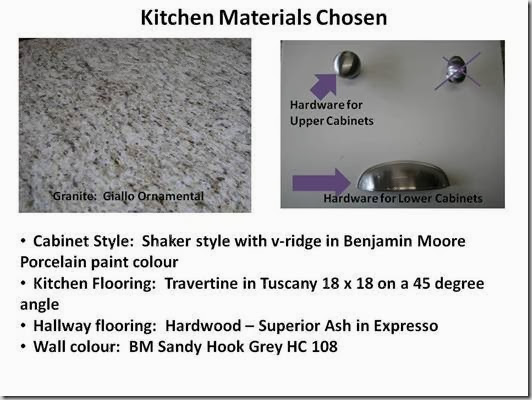
Once the final kitchen design was approved by the client, I brought many different samples of counter tops, cabinet styles, flooring for kitchen and hallway leading from main entrance into kitchen, hardware, wall colour for her review and approval. Below is just a quick summary of some of the materials chosen.
Imagine my excitement a couple of months later when I walked into her house to see the kitchen cabinets and the base of the banquette installed….I was on cloud 9 to see my vision come to life. My client was equally as excited and thrilled with the results. Take a look!![clip_image002[17] clip_image002[17]](http://lh4.ggpht.com/_Pp-4J9vThO8/TNF_eRupYAI/AAAAAAAADO0/Is9L2J682BM/clip_image002%5B17%5D_thumb%5B1%5D.jpg?imgmax=800)
You’ll notice that we took her upper cabinets all the way to the ceiling since the ceiling height was only 8 feet high and we wanted to maximize her storage capabilities. It’s a much cleaner look….and no more dust bunnies or god-awful tins to display up there anymore!!![clip_image002[19] clip_image002[19]](http://lh5.ggpht.com/_Pp-4J9vThO8/TNF_e_DYYlI/AAAAAAAADO8/QrlntH74VbQ/clip_image002%5B19%5D_thumb%5B1%5D.jpg?imgmax=800)
Now I know it looks naked because the walls aren’t painted, the granite isn’t in and of course, the stainless steel appliances are missing….but WOW…what a huge difference!! And can you imagine how huge the banquette is going to be?? The back upholstered wall panel – or huge headboard – measures 120 3/8” W by 74 3/8 H, along with a 3” high seat cushion. And the wall panel will be diamond tufted —- SO GLAM!
For the fabric we chose to go with a faux leather ostrich texture in creamy white. It cleans easily with a quick wipe and the seat cushion can be unzipped and put into the washing machine – on a delicate cycle of course.
Pictures never do fabric justice…but here is a photo of the fabric we chose for the banquette:![clip_image002[21] clip_image002[21]](http://lh4.ggpht.com/_Pp-4J9vThO8/TNF_fXzVQ0I/AAAAAAAADPE/kpqhxIygsvo/clip_image002%5B21%5D_thumb%5B1%5D.jpg?imgmax=800)
And voila: a custom Decor by Christine banquette was created. The wall panel and seat cushion are wrapped in plastic ready to be delivered to my client, so again, the pictures don’t do it justice. Are you ready to see the ‘piece de resistance”?![clip_image002[23] clip_image002[23]](http://lh6.ggpht.com/_Pp-4J9vThO8/TNF_gC9IKLI/AAAAAAAADPM/6jEghfrqkAg/clip_image002%5B23%5D_thumb%5B1%5D.jpg?imgmax=800)
So what do you think…are you as excited as I am to see this baby installed, along with the granite, backsplash, wall colour and appliances?? And I haven’t even gotten into details about the table or chandelier which in my book equals more glamour!!
Anyway, I thoroughly enjoyed sharing this client project with you…and I hope you will stay tuned to see the final unveiling on my blog in the next few weeks!! Thanks Vanessa for inviting me to share my design adventure here at your blog today! It was a total blast!!
**************************************************************************************
Thanks so much Christine for sharing this project with my readers. What can I say about the banquette? It’s the perfect solution for the space and I can see why your clients are beyond happy. I will post the After here once you have done so on your blog. Thanks again for being so generous with your time and sharing the “behind the scenes” of a kitchen reno.
Next week, Lisa Ferguson will be sharing a kitchen and dining room reno.

Rambling Renovators
November 3, 2010Ooh, fabulous banquette! It IS glam! Great post. Its fun to see how one inspiring image can spark a whole new design direction.
Shannon
November 3, 2010WOWEE!!
That kitchen is going to be amazing!!!!
Banquette is incredible!
Wendy
November 3, 2010wow! it’s going to be good — can’t wait for the reveal!!
Connie @ SogniESorrisi
November 3, 2010I love the banquette and the white “ostrich” fabric! I’ve been searching for fabric for my own chairs torn between things I love and what’s practical. This seems to be a combo of both.
Shannon @ What's Up Whimsy
November 3, 2010This is so amazing Christine!!!! I can’t wait to see the final photo!
Vanessa, I know I am really going to love this new feature because I loved reading about Christine’s thought process behind the design and then seeing the room come to life!!
Looking forward to the next one!
Kelly @ JAX does design
November 3, 2010Wow!! LOVE the tufted wall panel. I remember Candice Olson doing something similar on Divine Design, and it was totally fab!
I used a similar faux ostrich leather on my dining room chairs, but in lavender. It’s one sexy fabric!
GlamaMama is certainly living up to her name with this kitchen makeover! Looking forward to seeing it all done 🙂
Kelly
Christine Da Costa
November 3, 2010Hey Gals,
Sooo, sooo glad you are as excited about this kitchen reno as I am. And thanks for all your great comments!!! Tons of xoxo’s for Vanessa and her great new series
Can’t wait to see/meet all of you in the next month or at IDS10 in TO!!!
xo
Chistine/GlamaMama!!
*sarah berry design*
November 4, 2010What an absolutely brilliantly insightful and interesting post!! I love seeing all of the details and planning.
Anonymous
November 4, 2010Can not wait to see the final after once it is done and styled. Great choice of materials. I just did my kitchen two years ago and it is also white. My knobs are the same but I chose a chocolate color for my granite. I love it and your client is going to love hers…..thanks for sharing.
TLC_Designs @ Passport2Design
November 4, 2010Great post, Vanessa and Christine! I remember talking to Christine about the upholstery fabric for this project over twitter – so great to see the entire project illustrated here.
I love tufted upholstery – it’s so GLAM (and what else would we expect from the GlamaMama herself?).
*Tania
condosbycanning.com
November 5, 2010I agree! Tufted upholstery is so glam. Can’t wait to see the revel Christine, and Vanessa great feature! -Lisa
Ann
November 5, 2010What a lovely banquette… I can’t wait to see the final outcome of the whole kitchen.
Great post.
Marcus Design
November 5, 2010What a fabulous post! I LOVE this banquette, it is going to be nothing short of perfection. Lovely!
Nancy xo
2 Hounds Design
November 5, 2010The kitchen is going to be outstanding! So nice to see a hit of glamour, you have some very lucky clients.
Can’t wait to see the final product Christine!
*bisous*
Dane